Accordion Item
The Accordion Item is a header row with a title and a chevron. A click on
it opens or closes it, and the state is written to open. Use it as the
heading of a section in a list that the operator can open and close. It is
found in the Embedding - OpenBridge section of the Perspective Component
Palette as Accordion Item.
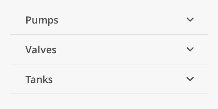
The parts of the item:
- Title — the text in
title. - Chevron — points down when the item is closed and up when it is open.
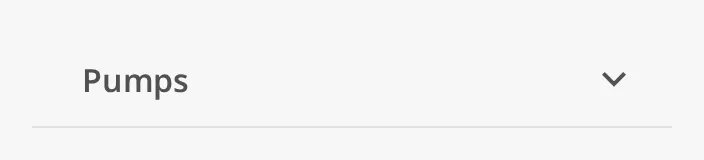
- Divider — an optional line below the item. See Divider.
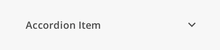
An Accordion Item dropped from the palette is closed and has the title
Accordion Item:
Content
Section titled “Content”The content of an open item is another view, not components dropped onto the
item: the Accordion Item is not a container. Set viewPath to the view to show
below the header, and viewParams to the parameters passed to it; the names in
viewParams must match the parameters of that view. With viewPath empty,
opening the item only turns the chevron (animated, unless the operator’s system
is set to reduce motion) and nothing appears below it.
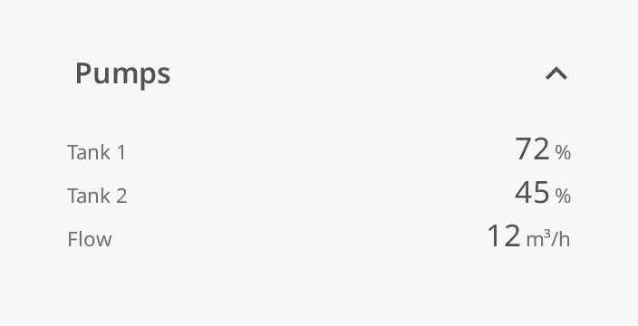
The view is shown at its own default height and the item’s width. A view cannot embed the view it is placed in: the item then shows Perspective’s error state instead of the view.
The item does not grow its box when it opens, so the view overflows a box sized
for the header. Put the item in a Flex Container with position.basis set to
auto, or bind the height of the box to open, so the components below move
down (see Example 1).
For a card with a description, a status label and an icon, use the Accordion Card instead.
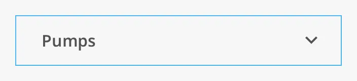
The item fills the width of its box (the blue frame) and is 48 px tall (1 px more when open); the box of a new item is 320 × 48.
Opening and Closing
Section titled “Opening and Closing”A click anywhere on the item toggles it. The item writes the new state to
open and fires onActionPerformed. Set or bind open to open or close the
item from elsewhere.
| Closed | 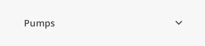 |
| Open | 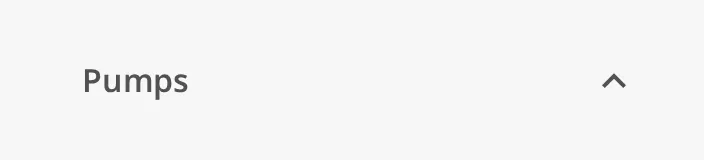 |
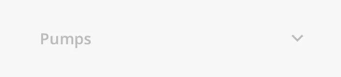
disabled greys the item out and ignores clicks on it: open is not changed
and no event is fired.
Note: A click writes
open. In the Designer, a click in Preview Mode changes the property, and the change is saved with the view.
Properties
Section titled “Properties”| Name | Description | Property Type |
|---|---|---|
| title | Text of the item. Default Accordion Item. |
value |
| open | Whether the item is open. Written by the item when the operator clicks it. Default false. |
value |
| disabled | Grey the item out and ignore clicks. Default false. |
value |
Divider
Section titled “Divider”showDivider draws a line along the bottom of the item, to separate the items
of a list:
Properties
Section titled “Properties”| Name | Description | Property Type |
|---|---|---|
| showDivider | Draw a line below the item. Default false. |
value |
Properties
Section titled “Properties”Properties not covered in the sections above:
| Name | Description | Property Type |
|---|---|---|
| style | Standard Perspective style object. | object |
Component Events
Section titled “Component Events”| Event | Description | Event Object |
|---|---|---|
| onActionPerformed | Fired when the operator opens or closes the item, after open is written. Not fired when the item is disabled, nor when open is changed by a binding or a script. |
— |
To act on the new state, read self.props.open in the event script.
Examples
Section titled “Examples”Example 1 — A Section That Opens and Closes
Section titled “Example 1 — A Section That Opens and Closes”- Add a Flex Container with direction column.
- Drop an Accordion Item into it, set
titletoPumpsandshowDividertotrue, and set itsposition.basistoauto. - Set
viewPathto the pump overview, for exampleMachinery/Pumps. The view is shown below the header when the item is open, and the items below move down. - Repeat for
ValvesandTanksto build a list of sections.
Found an error or something unclear?
Tell us what is wrong, confusing or missing on this page.
Built on the OpenBridge Design System