Breadcrumb
The Breadcrumb shows where the current page is in a hierarchy: a row of levels separated by chevrons, ending with the current page. It is found in the Input - OpenBridge section of the Perspective Component Palette as Breadcrumb.
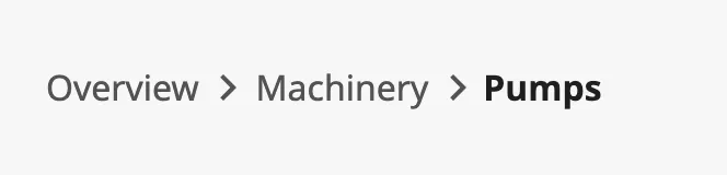
From left to right:
- Levels — the pages above the current one. The operator can click them. See Items.
- Current page — the last item, in bold. It cannot be clicked.
A Breadcrumb dropped from the palette has three placeholder items:
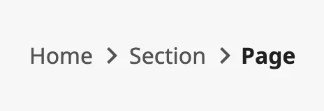
The Breadcrumb does not know the pages of the project and does not navigate by
itself. You list the levels in items, and decide in the
onBreadcrumbClick event what a click does.
items is the trail, from the top level to the current page. Each item is an
object:
| Name | Description | Property Type |
|---|---|---|
| label | Text of the item. | value |
| href | A value of your choice that is passed to the event when the item is clicked, typically the URL of the page. | value |
The last item is always drawn as the current page. All other items are
links: a click, or Enter when the item has keyboard focus, fires
onBreadcrumbClick with the label and href of that item.

href is not used by the Breadcrumb itself. Leave it empty if the label is
enough to tell the items apart in the event script.
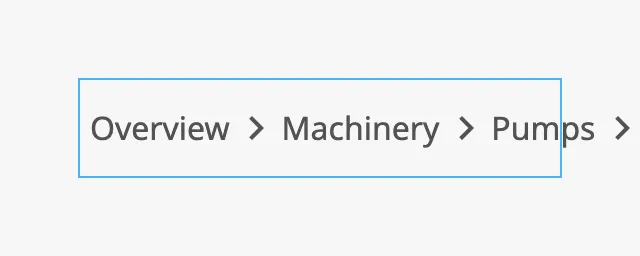
The Breadcrumb is as wide as its items need and is drawn from the left edge of the component. It does not shorten or wrap the trail: items that do not fit continue outside the component’s box (the blue frame in the image). Make the component wide enough for the deepest trail you show.
Properties
Section titled “Properties”| Name | Description | Property Type |
|---|---|---|
| items | The trail, from the top level to the current page. Three placeholder items by default. | array |
Icon Only
Section titled “Icon Only”iconOnly hides the label of every item except the current page.
| iconOnly | |
|---|---|
false (default) |
|
true |
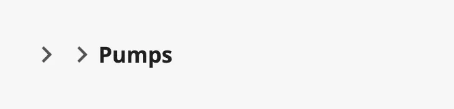 |
Note: An item cannot be given an icon yet, so with
iconOnlyset totrueonly the chevrons and the current page remain. Leave itfalse.
Properties
Section titled “Properties”| Name | Description | Property Type |
|---|---|---|
| iconOnly | Hide the labels of all items except the current page. Default false. |
value |
Common Properties
Section titled “Common Properties”Described in Input Components — Common Features:
- In the Designer — the items react to clicks only in Preview Mode.
- Appearance —
style, and the palette:

The Breadcrumb has no disabled property.
Component Events
Section titled “Component Events”| Event | Description | Event Object |
|---|---|---|
| onBreadcrumbClick | Fired when the operator clicks an item. Not fired for the last item, the current page. | See below |
The event object:
| Name | Description | Property Type |
|---|---|---|
| label | label of the clicked item. |
value |
| href | href of the clicked item. An empty text if it has none. |
value |
Examples
Section titled “Examples”Example 1 — Navigate to the Clicked Level
Section titled “Example 1 — Navigate to the Clicked Level”The page /machinery/pumps shows a trail back to the overview.
-
Drop a Breadcrumb at the top of the view and set
items:[{"label": "Overview", "href": "/"},{"label": "Machinery", "href": "/machinery"},{"label": "Pumps", "href": "/machinery/pumps"}] -
Configure the
onBreadcrumbClickevent with a script action:def runAction(self, event):if event.href:system.perspective.navigate(page=event.href)
A click on Machinery now opens /machinery. Pumps, the current page,
does nothing.
Example 2 — One Breadcrumb for All Pages
Section titled “Example 2 — One Breadcrumb for All Pages”Place the Breadcrumb in a docked view that is shared by all pages, and bind
items to an expression or a script transform on page.props.path that returns
the trail of the page the operator is on.
Found an error or something unclear?
Tell us what is wrong, confusing or missing on this page.
Built on the OpenBridge Design System