Alert Frame Container
The Alert Frame Container draws an OpenBridge alert frame around the component you place in it. Use it to mark a panel, a group of readouts or a whole section of a view as being in alarm, without changing the content. It is a container. It is found in the Embedding - OpenBridge section of the Perspective Component Palette as Alert Frame Container.
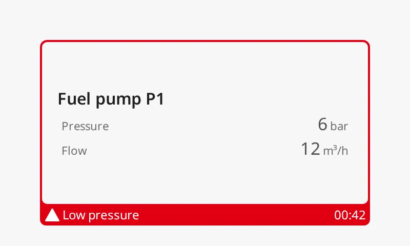
The parts of the container:
- Content — the component you place in the container. See Content.
- Frame — the coloured outline. Its colour and icon follow the alert status. See Alert Frame.
- Flap — on some frame types, a tab on the side, top or bottom of the frame with the alert icon, and optionally an icon, a label and a timer. See Type and Flap Content.
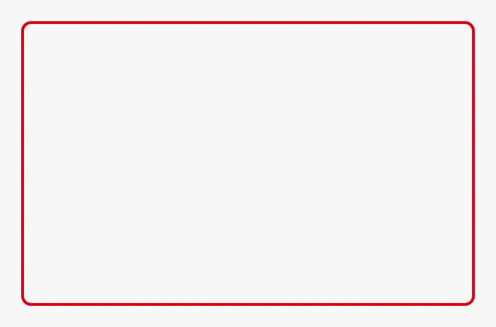
An Alert Frame Container dropped from the palette is 320 × 200, has no content
and draws a regular frame with the level-high status:
Content
Section titled “Content”Drop a component onto the container to place it inside. The container shows one child, stretched to fill the container’s box. To frame several components, make the child a container — a Flex Container or a Coordinate Container — and place the components in that. An Embedded View as the child frames another view.
Note: Only the first child is shown. Further children dropped onto the container are not drawn.
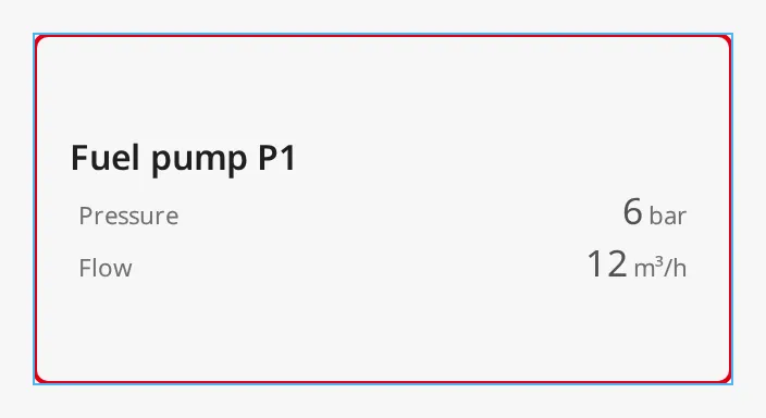
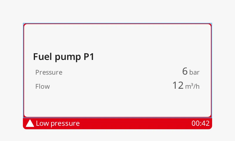
The frame is drawn on the edge of the box (the blue frame), and the child fills the box exactly. The flaps are drawn outside the box, about 20 px beyond its edge. Leave that much room next to the container, or the flap overlaps the components beside it:
regular |
 |
bottom-flip |
 |
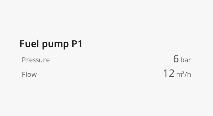
showFrame turns the frame off and leaves the content as it is. Bind it to
whether the alert is active, so the content does not move or change size when
an alert starts or ends:
Properties
Section titled “Properties”| Name | Description | Property Type |
|---|---|---|
| showFrame | Draw the alert frame. When false, only the content is shown. Default true. |
value |
Alert Frame
Section titled “Alert Frame”The frame is the same as the alert frame of the automation buttons; see Alert Frame on the Automation Button page. The values of type, status, mode and thickness are the same and look the same. What differs on the Alert Frame Container:
- The properties have shorter names:
type,status,modeandthicknessinstead ofalertFrameType,alertFrameStatus,alertFrameModeandalertFrameThickness.showFramereplacesalert. - The frame is on by default (
showFrameistrue), and the defaulttypeisregular, notsmall-side-flip. - The frame surrounds the whole content, not a symbol.
- The flap can show a custom icon, a label and a timer (see Flap Content), and each corner can be made square (see Corners). The automation buttons have neither.
All properties in this section are only shown when showFrame is true.
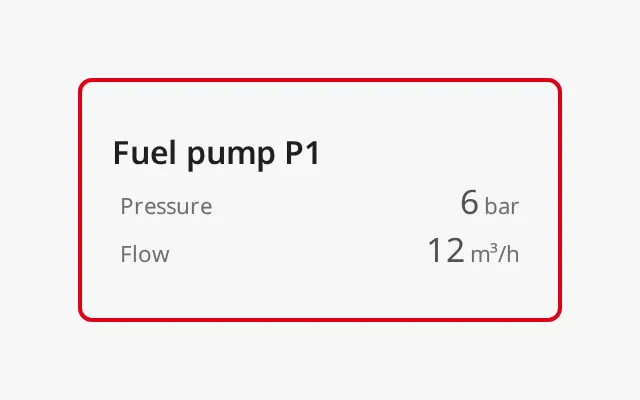
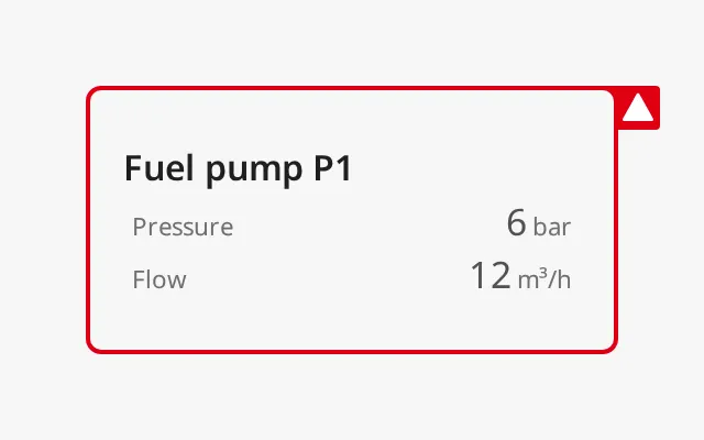
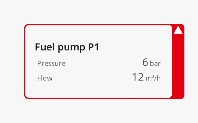
type selects the shape of the frame and where the flap is:
| type | |
|---|---|
regular (default) |
 |
small-side-flip |
 |
large-side-flip |
 |
bottom-flip |
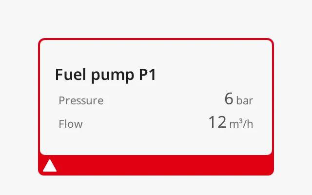 |
top-flip |
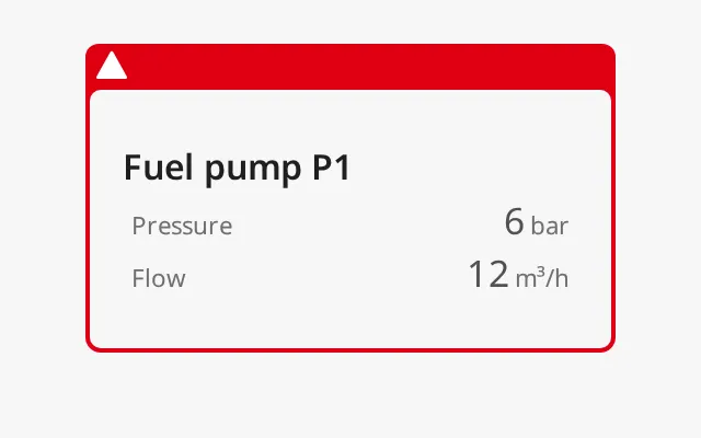 |
Status
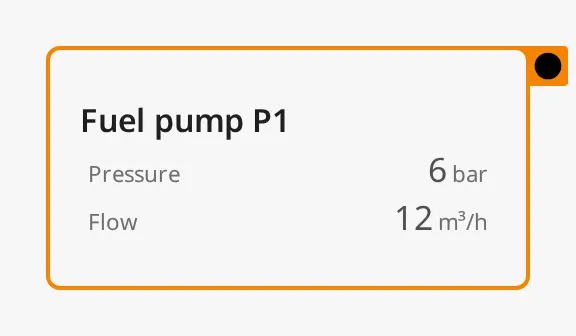
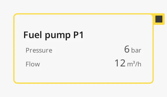
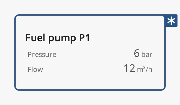
Section titled “Status”status selects the colour and the icon. The Designer offers the level-* values. alarm, warning and caution
are legacy values: they still work when bound or typed in, and look the same
as level-high, level-medium and level-low. The images use small-side-flip, which shows
the icon.
| status | |
|---|---|
level-critical |
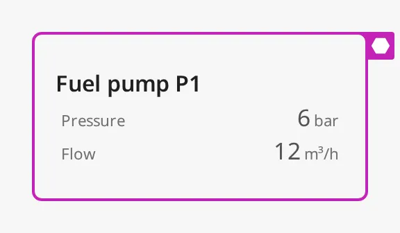 |
level-high (default) |
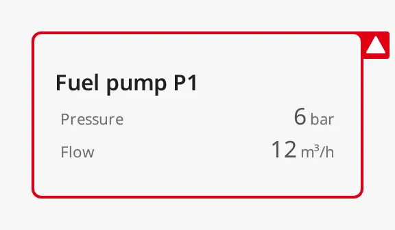 |
level-medium |
 |
level-low |
 |
level-diagnostic |
 |
alarm (legacy) |
|
warning (legacy) |
|
caution (legacy) |
|
mode shows where the alert is in its life cycle:
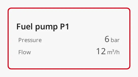
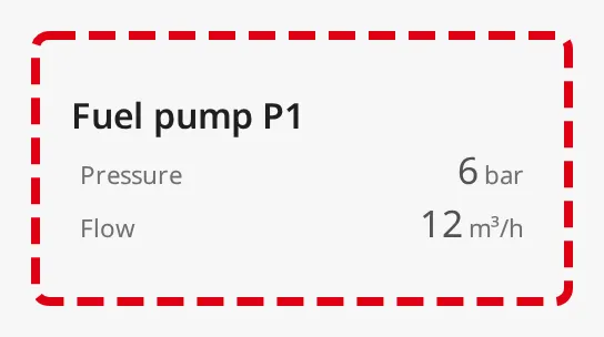
acked-active(default) — the alert is active and acknowledged. The frame is steady.unacked-active— the alert is active and not acknowledged. The frame flashes.unacked-rectified— the condition has cleared, but the alert is not acknowledged. The frame is dashed and flashes; the dash also flashes between thin and thick, and the image shows it thick.
| mode | |
|---|---|
acked-active |
 |
unacked-rectified |
 |
Thickness
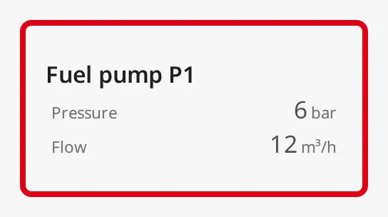
Section titled “Thickness”thickness set to large draws a thicker frame for more emphasis:
Properties
Section titled “Properties”| Name | Description | Property Type |
|---|---|---|
| type | Shape of the frame: regular, small-side-flip, large-side-flip, bottom-flip or top-flip. Default regular. |
value |
| status | Severity, which selects colour and icon: a level-* value (the legacy alarm, warning and caution still work when bound or typed in). Default level-high. |
value |
| mode | Life cycle state: acked-active, unacked-active or unacked-rectified. Default acked-active. |
value |
| thickness | Thickness of the frame: small or large. Default small. |
value |
Flap Content
Section titled “Flap Content”Alert Icon
Section titled “Alert Icon”The flap shows the icon of the status. With showAlertCategoryIcon set to
false the icon is removed. When the flap then has nothing left to show (no
custom icon, label or timer), it disappears on every type and a plain frame
is drawn:
| type | |
|---|---|
small-side-flip |
|
large-side-flip |
|
bottom-flip |
|
top-flip |
|
Custom Icon
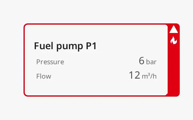
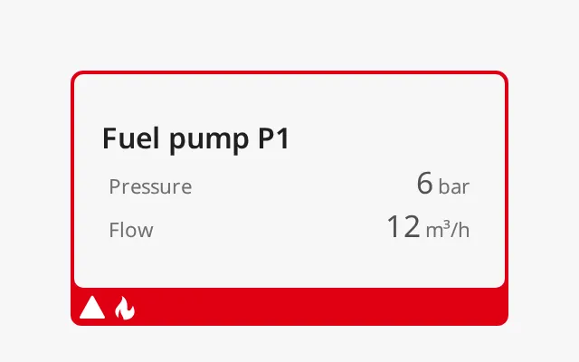
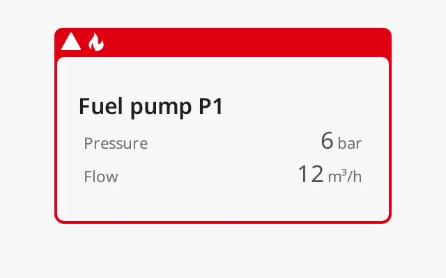
Section titled “Custom Icon”With showIcon set to true, the icon chosen in icon is shown in the flap
next to the alert icon, on large-side-flip, bottom-flip and top-flip.
icon is an icon-picker object (icon.path). The images use the fire icon:
| type | |
|---|---|
large-side-flip |
 |
bottom-flip |
 |
top-flip |
 |
Label and Timer
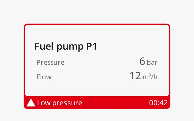
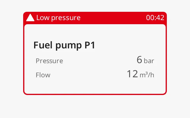
Section titled “Label and Timer”On bottom-flip and top-flip the flap shows label after the icons and
timer at the right end. Use the label for the alert text and the timer for
how long the alert has been active. The container shows the text as it is; bind
both to your alarm data. Other types do not show them.
bottom-flip |
 |
top-flip |
 |
Properties
Section titled “Properties”All properties in this section are only shown when showFrame is true,
except icon, which is shown when showIcon is true.
| Name | Description | Property Type |
|---|---|---|
| showAlertCategoryIcon | Show the alert icon of the status in the flap. Default true. |
value |
| showIcon | Show a custom icon in the flap of large-side-flip, bottom-flip and top-flip. Default false. |
value |
| icon | The custom icon, chosen with the icon picker (icon.path). |
object |
| label | Text in the flap of bottom-flip and top-flip. Default empty. |
value |
| timer | Text at the right end of the flap of bottom-flip and top-flip, for example 00:42. Default empty. |
value |
Corners
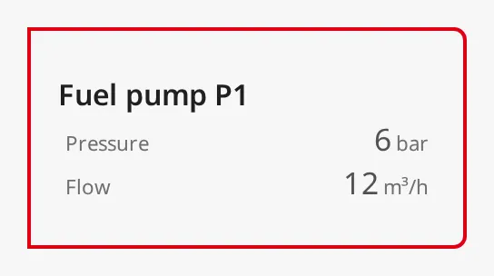
Section titled “Corners”Each corner of the frame can be made square, so the frame fits against an adjacent panel or the edge of a view. The image has the two left corners square:
Properties
Section titled “Properties”All are only shown when showFrame is true.
| Name | Description | Property Type |
|---|---|---|
| sharpEdgeTopLeft | Make the top-left corner square. Default false. |
value |
| sharpEdgeTopRight | Make the top-right corner square. Default false. |
value |
| sharpEdgeBottomLeft | Make the bottom-left corner square. Default false. |
value |
| sharpEdgeBottomRight | Make the bottom-right corner square. Default false. |
value |
Properties
Section titled “Properties”Properties not covered in the sections above:
| Name | Description | Property Type |
|---|---|---|
| style | Standard Perspective style object. | object |
Component Events
Section titled “Component Events”The Alert Frame Container has no component events.
Examples
Section titled “Examples”Example 1 — Frame a Pump Panel While Its Alarm Is Active
Section titled “Example 1 — Frame a Pump Panel While Its Alarm Is Active”- Drop an Alert Frame Container into the view and size it to the panel, leaving about 20 px below it for the flap.
- Drop a Flex Container onto it and place the pump’s readouts in that.
- Set
typetobottom-flip. - Bind
showFrameto whether the pump has an active alarm, for example an expression on[default]Pump01/Alarm/Active. - Bind
statusto the alarm’s priority mapped to alevel-*value, andmodetounacked-activewhile the alarm is not acknowledged andacked-activeonce it is. - Bind
labelto the alarm text, for exampleLow pressure.
Found an error or something unclear?
Tell us what is wrong, confusing or missing on this page.
Built on the OpenBridge Design System