Integration Bar
The Integration Bar is the header of a system that integrates several vessels, or several systems. The operator chooses the fleet or one vessel in it, and the bar shows the status of that choice, next to the buttons and menus that belong to the whole system. It is found in the App - OpenBridge section of the Perspective Component Palette as Integration Bar (Experimental).
Note: This component is experimental: its properties may change in a later version.
The Integration Bar is designed to be placed once, in a top dock that is shared by all pages. It is the counterpart of the Top Bar, which is the header of a single application.

From left to right:
- Home button — see Buttons.
- Vessel selector — chooses the fleet or a vessel. See Vessel Selector.
- Status fields — the status of the chosen fleet or vessel. See Status Fields.
- Command indicator — shows whether this workstation is in command. See Command Indicator.
- Buttons — alert, notification, screen, system, dimming and user. See Buttons, Brilliance Menu and User Menu.
- Clock — see Clock.
The bar belongs with the Fleet Button and the Integration Button, which stand for the fleet and for one vessel on the pages below the bar, and with the App Bar, which switches between applications. See App Components — Overview for how docked views are used.
An Integration Bar dropped from the palette shows the home button, an empty vessel selector and the dimming button. It is 160 px wide; make it as wide as the view:
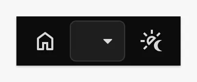
The bar is 48 px high and as wide as the component. It does not hide or shorten its parts when they do not fit: the status texts wrap onto two lines and the parts at the right end are pushed out of the bar. The bar below has every part turned on and is 712 px wide:

Turn on only the parts that fit the narrowest screen the project is used on, and keep the status texts short.
Note: In the Designer, the bar is only interactive in Preview Mode. Choosing a vessel or a palette writes to the component’s properties, so a click in Preview Mode is saved with the view. Reset those properties before saving if needed.
Vessel Selector
Section titled “Vessel Selector”The vessel selector is a dropdown with the fleet at the top and one row per vessel. A click on the selector opens the list:
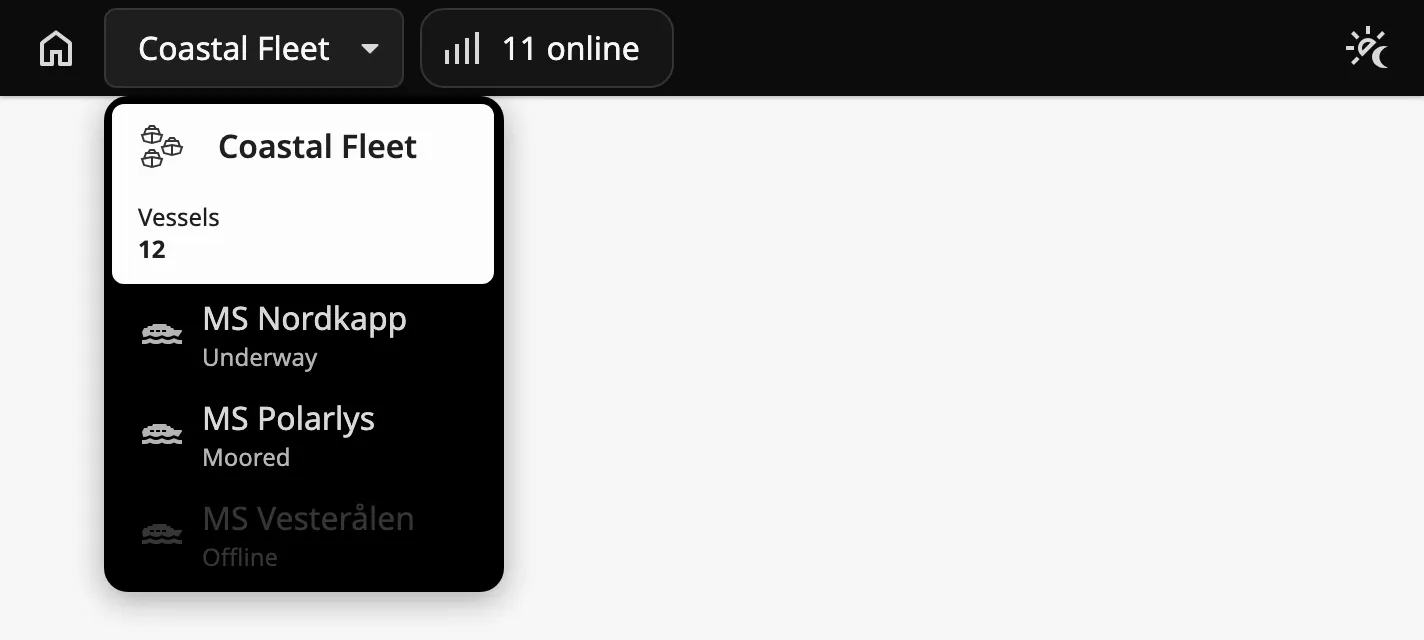
selectedVessel holds the choice. It is empty when the fleet is chosen, and the
value of a vessel when that vessel is chosen. The bar writes it when the
operator chooses; bind it bidirectionally to a session property, and bind the
content of the pages to the same property.
selectedVessel |
|
|---|---|
| Empty |  |
nordkapp |
 |
Choosing a vessel fires no event: react to the change of selectedVessel.
Choosing the fleet also fires onFleetButtonClick.
Note: The list is a browser dropdown, and the Designer does not open browser dropdowns, not even in Preview Mode. Set
selectedVesselin the Property Editor to see the bar with a vessel chosen, and test the selector in a session.
fleet describes the first row of the list:
| Name | Description | Property Type |
|---|---|---|
| name | Name of the fleet. Shown in the selector while the fleet is chosen. | value |
| label | A label under the name in the list, for example Vessels. |
value |
| status | A value under the label, in bold, for example 12. |
value |
| icon | Icon of the fleet, chosen with the icon picker. | object |
| statuses | The status fields shown while the fleet is chosen. See Status Fields. | array |
Set showFleet to false for a system without a fleet level. The list then has
only the vessels:
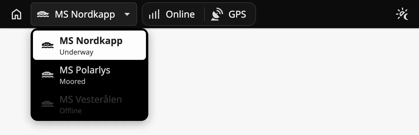
Without the fleet, set selectedVessel to one of the vessels. While it is
empty the bar still shows the name and the status fields of fleet.
Vessels
Section titled “Vessels”vessels is the list of vessels. Each vessel is an object:
| Name | Description | Property Type |
|---|---|---|
| value | The value written to selectedVessel when the vessel is chosen. Must be unique. |
value |
| label | Name of the vessel. | value |
| status | Text under the name in the list. | value |
| icon | Icon of the vessel, chosen with the icon picker. | object |
| disabled | Show the vessel dimmed; it cannot be chosen. Default false. |
value |
| statuses | The status fields shown while the vessel is chosen. See Status Fields. | array |
Use a text for value.
Properties
Section titled “Properties”| Name | Description | Property Type |
|---|---|---|
| selectedVessel | The value of the chosen vessel, or empty for the fleet. Written when the operator chooses. Empty by default. |
value |
| showFleet | Show the fleet as the first row of the list. Default true. |
value |
| fleet | The fleet. See above. | object |
| vessels | The vessels. Empty by default. | array |
Status Fields
Section titled “Status Fields”Next to the selector the bar shows the status fields of what is chosen: the
statuses of fleet while the fleet is chosen, and the statuses of the
vessel while a vessel is chosen. Each status is an object:
| Name | Description | Property Type |
|---|---|---|
| label | Text of the field. | value |
| icon | Icon before the text, chosen with the icon picker. Clear icon.path for text only. |
object |
The fleet with one status, a vessel with two, a status without an icon, and a vessel without status fields:
| Fleet | |
| Vessel | |
| No icon |  |
| No status |  |
The bar does not read the status from anywhere itself. Bind each label, and the
icon.path where the icon shows a state, to tags of the vessel.
Command Indicator
Section titled “Command Indicator”Set showInCommand to true to add a command indicator after the status
fields. It shows whether this workstation is in command, with the text in
inCommandText or noCommandText.
| inCommand | |
|---|---|
true |
 |
false |
 |
A click on the indicator fires onCommandClick and does nothing else. The bar
does not change inCommand: bind it to the state of your command transfer.
Properties
Section titled “Properties”| Name | Description | Property Type |
|---|---|---|
| showInCommand | Show the command indicator. Default false. |
value |
| inCommand | Whether the workstation is in command. Default false. Only shown when showInCommand is true. |
value |
| inCommandText | Text when in command. Default In Command. Only shown when showInCommand is true. |
value |
| noCommandText | Text when not in command. Default No Command. Only shown when showInCommand is true. |
value |
Buttons
Section titled “Buttons”The bar has eight buttons, each turned on with a show… property:

From left to right: home and link before the vessel selector; alert, notification, screen, system, dimming and user at the right.
The home, link, alert, notification, screen and system buttons only fire an event. What they do is up to your script: navigate home, open a dock, open a popup. The dimming and user buttons open a menu of the bar; see Brilliance Menu and User Menu.
The link, alert, notification, screen and system buttons each have an
…Activated property that shows the button as pressed. The bar does not change
it on a click. Set it from your script, or bind it to what the button opened,
for example whether a dock is open:

Notification Count
Section titled “Notification Count”The notification button can show a count. The count is shown only while
notificationButtonActivated is true and showNotificationCount is true:
| Activated | |
|---|---|
true |
 |
false |
 |
Properties
Section titled “Properties”| Name | Description | Property Type |
|---|---|---|
| showHomeButton | Show the home button. Default true. |
value |
| showLinkButton | Show the link button. Default false. |
value |
| linkButtonActivated | Show the link button as pressed. Default false. Only shown when showLinkButton is true. |
value |
| showAlertButton | Show the alert button. Default false. |
value |
| alertButtonActivated | Show the alert button as pressed. Default false. Only shown when showAlertButton is true. |
value |
| showNotificationButton | Show the notification button. Default false. |
value |
| notificationButtonActivated | Show the notification button as pressed. Default false. Only shown when showNotificationButton is true. |
value |
| showNotificationCount | Show the count on the notification button. Default false. Only shown when notificationButtonActivated is true. |
value |
| notificationCount | The count. Default 0. Only shown when showNotificationCount is true. |
value |
| showScreenButton | Show the screen button. Default false. |
value |
| screenButtonActivated | Show the screen button as pressed. Default false. Only shown when showScreenButton is true. |
value |
| showSystemButton | Show the system button. Default false. |
value |
| systemButtonActivated | Show the system button as pressed. Default false. Only shown when showSystemButton is true. |
value |
Menu Behavior
Section titled “Menu Behavior”The brilliance menu and the user menu behave the same way:
- Clicking the button opens its menu; clicking the same button again closes it.
- A menu also closes when the operator presses Escape or clicks anywhere outside it.
- Only one of the two menus is open at a time. Opening one closes the other.
- The button of the open menu is shown highlighted.
Brilliance Menu
Section titled “Brilliance Menu”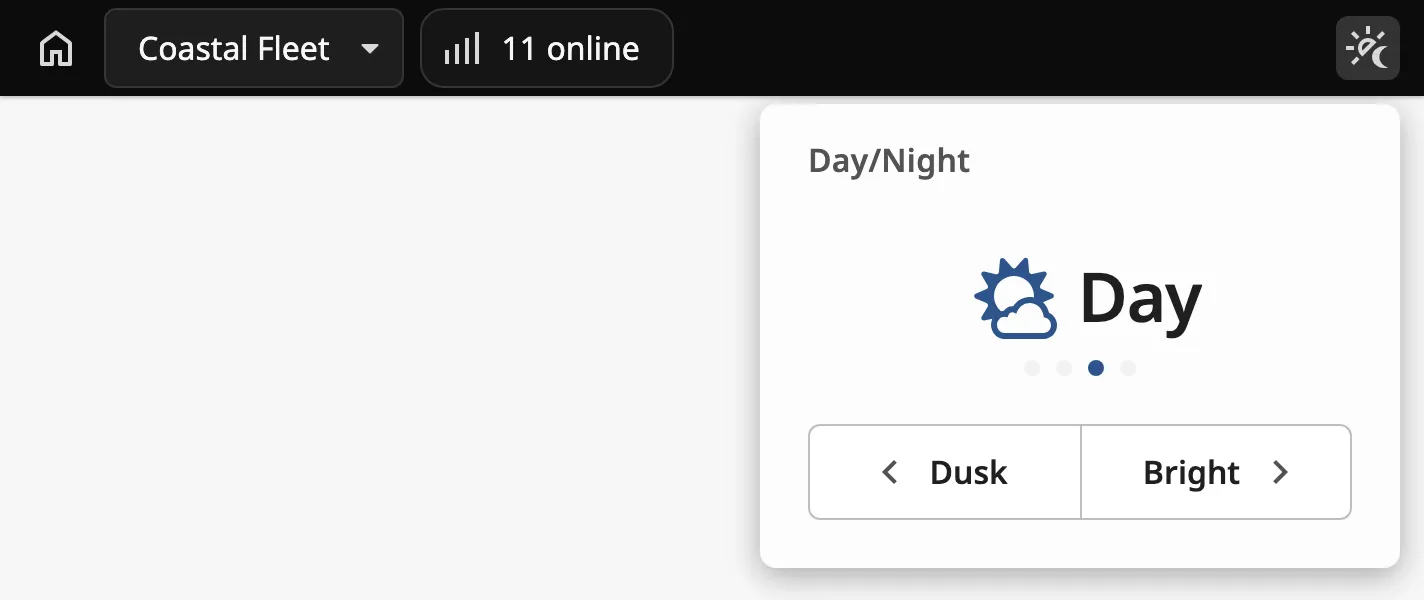
The dimming button opens the brilliance menu, where the operator steps
between the four OpenBridge palettes: night, dusk, day and bright. The bar
writes the choice to palette and applies the palette to the whole page, so
every OpenBridge component in the session follows.
Place the bar in a dock that is shared by all pages, and bind palette
bidirectionally to a session property to keep the choice when the operator
reloads the page.
Set showBrillianceMenu to false to hide the dimming button. The bar then
does not apply palette: set the palette with another component, such as a
Top Bar.
The menu of the Integration Bar has no brightness slider.
Properties
Section titled “Properties”| Name | Description | Property Type |
|---|---|---|
| showBrillianceMenu | Show the dimming button, and apply palette to the page. Default true. |
value |
| palette | bright, day, dusk or night. Written when the operator chooses. Default day. |
value |
User Menu
Section titled “User Menu”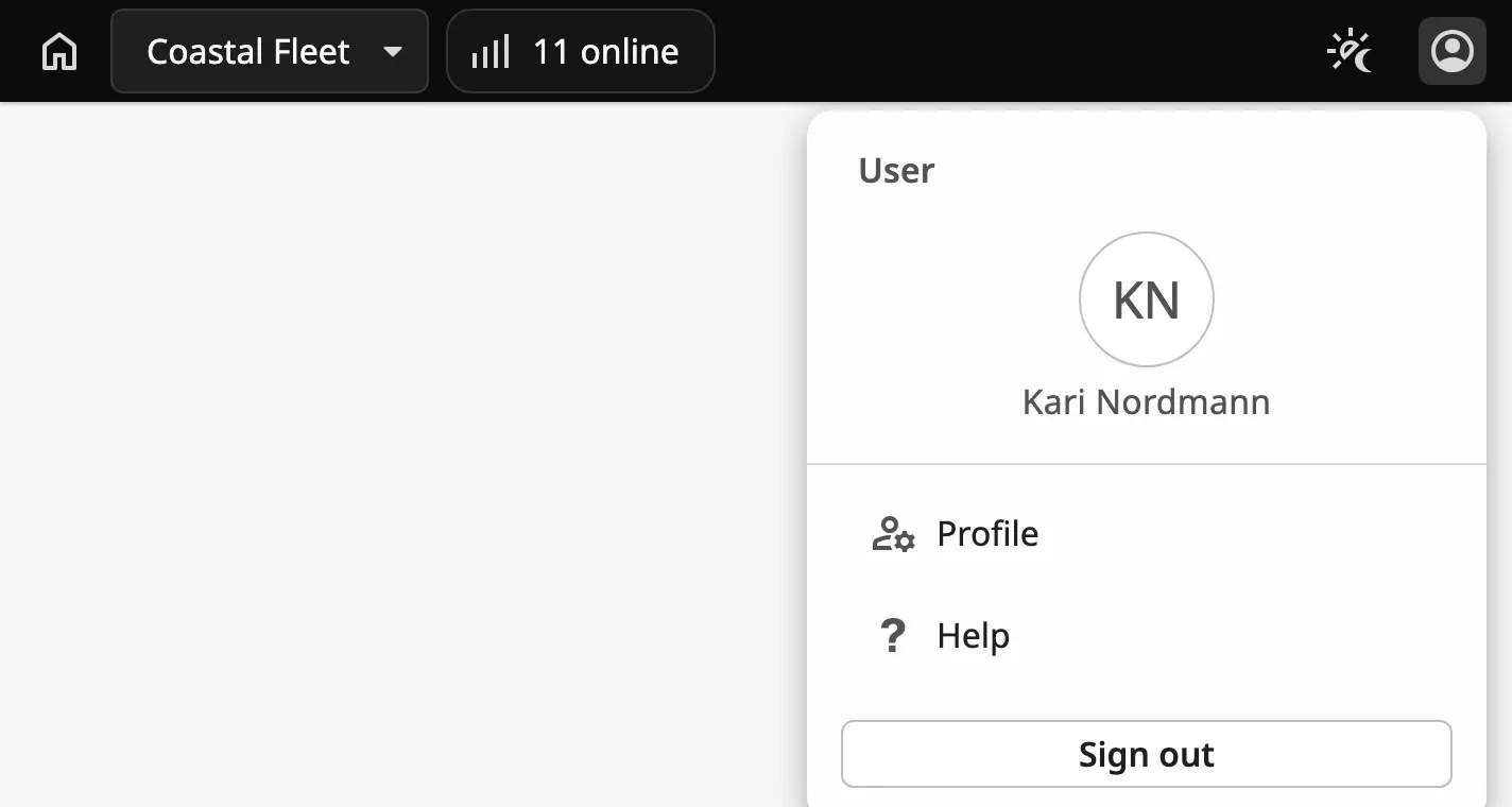
Set showUserButton to true to show the user button. It opens the user
menu, which shows who is signed in, a list of actions and a Sign out
button.
The bar does not read the user from the session. Bind userMenu.userInitials
and userMenu.userLabel, for example to {session.props.auth.user.userName}.
userMenu.signedInActions is the list of actions. Each action is an object:
| Name | Description | Property Type |
|---|---|---|
| id | Identifies the action in the event. Must be unique. | value |
| label | Text of the row. | value |
| hasIcon | Show an icon before the text. Default false. |
value |
| icon | The icon, chosen with the icon picker. Only shown when hasIcon is true. |
object |
A click on an action fires onSignedInActionClick with the id and label of
the action. A click on Sign out fires onSignOutClick. The bar does nothing
else: it does not sign the user out and it leaves the menu open. See
Example 2.
Properties
Section titled “Properties”| Name | Description | Property Type |
|---|---|---|
| showUserButton | Show the user button. Default false. |
value |
| userMenu | The user menu. Only shown when showUserButton is true. See below. |
object |
userMenu sub-properties:
| Name | Description | Property Type |
|---|---|---|
| userInitials | Initials shown in the circle. Empty by default. | value |
| userLabel | Name shown under the circle. Empty by default. | value |
| signedInActions | The actions of the menu. Empty by default. | array |
Set showClock to true to show a clock at the right end of the bar. clock.showSeconds
adds the seconds and clock.showTimezone the time zone:
| Neither |  |
| Seconds |  |
| Both |  |
By default the clock shows the current time of the operator’s computer, shifted
to the time zone in clock.utcHourOffset. To show another time — the time of
the gateway, or of the chosen vessel — bind clock.time to it.
Properties
Section titled “Properties”| Name | Description | Property Type |
|---|---|---|
| showClock | Show the clock. Default false. |
value |
| clock | The clock. Only shown when showClock is true. See below. |
object |
clock sub-properties:
| Name | Description | Property Type |
|---|---|---|
| showTimezone | Show the time zone after the time, as UTC+1. Default true. |
value |
| showSeconds | Show seconds. Default true. |
value |
| utcHourOffset | Time zone of the clock, in hours from UTC. Default 0. |
value |
| time | The time to show, as an ISO 8601 text such as 2026-03-14T09:26:53Z. Empty, and the current time, by default. |
value |
Properties
Section titled “Properties”Properties not covered in the sections above:
| Name | Description | Property Type |
|---|---|---|
| style | Standard Perspective style object. | object |
Component Events
Section titled “Component Events”| Event | Description | Event Object |
|---|---|---|
| homeButtonClick | Fired when the home button is clicked. | — |
| linkButtonClick | Fired when the link button is clicked. | — |
| onFleetButtonClick | Fired when the operator chooses the fleet in the vessel selector. | — |
| onCommandClick | Fired when the command indicator is clicked. | — |
| alertButtonClick | Fired when the alert button is clicked. | — |
| notificationButtonClick | Fired when the notification button is clicked. | — |
| screenButtonClick | Fired when the screen button is clicked. | — |
| systemButtonClick | Fired when the system button is clicked. | — |
| brillianceButtonClick | Fired when the dimming button is clicked, both when it opens and closes the menu. | — |
| userButtonClick | Fired when the user button is clicked, both when it opens and closes the menu. | — |
| onSignedInActionClick | Fired when an action in the user menu is clicked. | id, label |
| onSignOutClick | Fired when Sign out in the user menu is clicked. | — |
There is no event for choosing a vessel. Use a property change script on
selectedVessel.
Examples
Section titled “Examples”Example 1 — Integration Bar in a Shared Dock
Section titled “Example 1 — Integration Bar in a Shared Dock”-
Create a view
Framework/IntegrationBar, 48 px high, and add an Integration Bar as its only component, as wide as the view. -
Set
fleet.nametoCoastal Fleet, andvessels:[{"value": "nordkapp","label": "MS Nordkapp","status": "Underway","icon": {"path": "openbridge/ship-passenger"},"disabled": false,"statuses": [{"label": "Online", "icon": {"path": "openbridge/connection-4-bars"}}]},{"value": "polarlys","label": "MS Polarlys","status": "Moored","icon": {"path": "openbridge/ship-passenger"},"disabled": false,"statuses": []}] -
Add a session custom property
vesselwith an empty text as its value, and bindselectedVesselbidirectionally to{session.custom.vessel}. -
Add a session custom property
palettewith the valueday, and bindpalettebidirectionally to it. -
In Page Configuration → Shared Settings, add a top dock with this view, Display
visible, Size48and Contentpush. -
Add a script to
homeButtonClick:system.perspective.navigate('/')
The pages read {session.custom.vessel} to show the fleet or the chosen vessel.
Example 2 — Sign Out from the User Menu
Section titled “Example 2 — Sign Out from the User Menu”-
Set
showUserButtontotrue. -
Bind
userMenu.userLabelto{session.props.auth.user.userName}, anduserMenu.userInitialsto the expressionupper(substring({session.props.auth.user.userName}, 0, 2)). -
Add a script to
onSignOutClick:system.perspective.logout() -
Set
userMenu.signedInActionsto[{"id": "profile", "label": "Profile", "hasIcon": false}], and add a script toonSignedInActionClick:if event.id == 'profile':system.perspective.navigate('/profile')
Found an error or something unclear?
Tell us what is wrong, confusing or missing on this page.
Built on the OpenBridge Design System