Icon Check Button
The Icon Check Button is a toggle button that shows an icon. Each click switches it between checked and unchecked. It is found in the Input - OpenBridge section of the Perspective Component Palette as Icon Check Button.
The Icon Check Button is one of the input components. Values, events, disabling, icons and the behavior in the Designer are shared by all of them and are described in Input Components — Common Features. This page covers what is specific to the Icon Check Button.
An Icon Check Button with default properties:
A new Icon Check Button has the placeholder icon. Choose the icon first.
Checked
Section titled “Checked”checked is the value of the button. When the operator clicks the button, the
component writes the opposite value to checked and then fires
onActionPerformed once.
checked |
Enabled | Disabled |
|---|---|---|
false |
 |
 |
true |
 |
 |
Bind checked bidirectionally to a tag to switch the tag with the button; see
Values. A disabled button does not change and does not fire
the event.
Properties
Section titled “Properties”| Name | Description | Property Type |
|---|---|---|
| checked | Whether the button is checked. Written when the operator clicks. Default false. |
value |
Icon and Label
Section titled “Icon and Label”icon is an icon picker: choose the icon in the property editor, which sets
icon.path, for example openbridge/sound-muted. See
Icons.
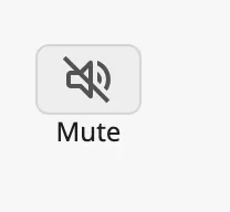
Set hasLabel to true to show a text under the icon, and type the text in
label:
| Unchecked | Checked |
|---|---|
 |
|
With a label the button is 56 px tall instead of 48, and the label can be wider than the button. Make the component’s box large enough for both.
Properties
Section titled “Properties”| Name | Description | Property Type |
|---|---|---|
| icon | The icon on the button. An icon picker; see icon.path. |
object |
| icon.path | Path of the icon. Default openbridge/placeholder. |
value |
| hasLabel | Show a label under the icon. Default false. |
value |
| label | Text of the label. Empty by default. Only shown when hasLabel is true. |
value |
Set hasAlert to true to draw a red frame around the button, to draw the
operator’s attention to it. The frame does not change how the button works.
| Unchecked | Checked |
|---|---|
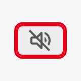 |
 |
Properties
Section titled “Properties”| Name | Description | Property Type |
|---|---|---|
| hasAlert | Draw a red alert frame around the button. Default false. |
value |
Common Properties
Section titled “Common Properties”These work in the same way on every input component, and are described in Input Components — Common Features:
- Disabled —
disabled. - Appearance —
style.
Component Events
Section titled “Component Events”| Event | Description | Event Object |
|---|---|---|
| onActionPerformed | Fired when the operator clicks the button, after checked has been written. |
— |
See Events.
Examples
Section titled “Examples”Example 1 — Mute Button
Section titled “Example 1 — Mute Button”- Drop an Icon Check Button into the view and choose the icon
openbridge/sound-mutedforicon. - Set
hasLabeltotrueandlabeltoMute, and set the size of the component to 72 × 56. - Bind
checkedto the tag[default]Audio/Mutedand enable Bidirectional.
Example 2 — Act on the New State
Section titled “Example 2 — Act on the New State”-
Configure the
onActionPerformedevent with a script action. The new state is read from the component:def runAction(self, event):if self.props.checked:system.perspective.print('Muted')
Found an error or something unclear?
Tell us what is wrong, confusing or missing on this page.
Built on the OpenBridge Design System