Tag
The Tag is a small colored label, used to mark or categorize something: an equipment number, a state, a category. It is found in the Input - OpenBridge section of the Perspective Component Palette as Tag.
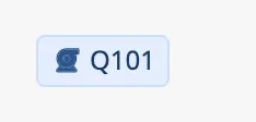
The Tag has an optional icon followed by a label.
The Tag only shows something: it takes no input from the operator, writes no property back and has no component events.
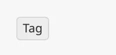
A Tag with default properties and label set to Tag:
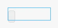
A Tag dropped from the palette has no label and is only a small empty box. Set
label first. The blue frame is the component’s box:
label is the text of the tag. It can also be bound to a number or a boolean,
which is shown as text.
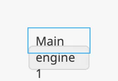
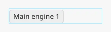
The tag is as wide as its label needs, and is placed at the top left of the component’s box. It is never wider than the box: a label that does not fit is wrapped onto several lines and runs out of the box. Make the component wide enough for the longest label. The blue frame in the images is the component’s box:
| Box too narrow | Box wide enough |
|---|---|
 |
 |
Properties
Section titled “Properties”| Name | Description | Property Type |
|---|---|---|
| label | Text of the tag. Empty by default. | value |
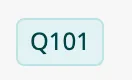
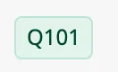
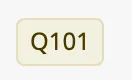
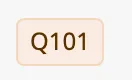
color selects one of ten colors. The colors have no fixed meaning; choose one
per category and use it consistently.
| color | |
|---|---|
gray (default) |
 |
blue |
 |
cyan |
 |
teal |
 |
green |
 |
yellow |
 |
orange |
 |
red |
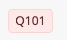 |
purple |
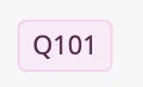 |
indigo |
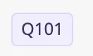 |
The colors follow the OpenBridge palette of the session. A blue tag in the night palette:

Properties
Section titled “Properties”| Name | Description | Property Type |
|---|---|---|
| color | gray, blue, cyan, teal, green, yellow, orange, red, purple or indigo. Default gray. |
value |
| size | Label only | With an icon | |
|---|---|---|---|
regular (default) |
24 pixels high. | 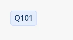 |
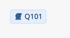 |
large |
32 pixels high. | 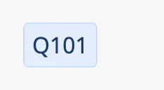 |
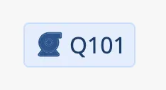 |
A new Tag is 24 pixels high; make the component higher for a large tag.
Properties
Section titled “Properties”| Name | Description | Property Type |
|---|---|---|
| size | regular or large. Default regular. |
value |
Set hasIcon to true to show an icon before the label, and choose it with
icon.path.
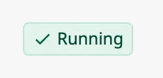
icon.path is an icon picker: choose an icon from the openbridge library
in the property editor, for example openbridge/check-google. See
Icons. Until an icon is chosen, the placeholder icon is
shown:
Properties
Section titled “Properties”| Name | Description | Property Type |
|---|---|---|
| hasIcon | Show an icon before the label. Default false. |
value |
| icon | The icon to show. Only shown when hasIcon is true. |
object |
| icon.path | Path of the icon: openbridge/ and the name of the icon. Default openbridge/placeholder. |
value |
Properties
Section titled “Properties”Properties not covered in the sections above:
| Name | Description | Property Type |
|---|---|---|
| style | Standard Perspective style object. See Appearance. | object |
Component Events
Section titled “Component Events”The Tag has no component events.
Examples
Section titled “Examples”Example 1 — Equipment Number
Section titled “Example 1 — Equipment Number”- Drop a Tag beside a pump symbol and make it about 60 pixels wide.
- Set
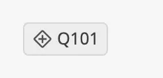
labeltoQ101andcolortoblue.
Example 2 — State From a Tag
Section titled “Example 2 — State From a Tag”Show Running in green while the pump runs, and Stopped in gray otherwise.
- Drop a Tag into the view and make it wide enough for the longer label.
- Bind
labelto the expressionif({[default]Pump01/Running}, "Running", "Stopped"). - Bind
colorto the expressionif({[default]Pump01/Running}, "green", "gray").
Found an error or something unclear?
Tell us what is wrong, confusing or missing on this page.
Built on the OpenBridge Design System