Checkbox List
The Checkbox List is a vertical list of checkboxes, one per row. The rows can be indented to form a tree whose groups the operator can collapse. It is found in the Input - OpenBridge section of the Perspective Component Palette as Checkbox List.
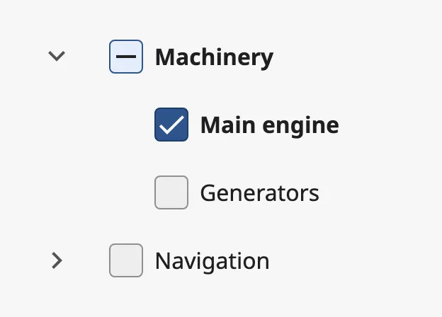
Each row has:
- A chevron — only on a row that is a group. It shows and hides the rows beneath. See Groups.
- A checkbox — unchecked, checked or mixed. See Status.
- A label, and optionally a description under it. See Rows.
The Checkbox List is one of the input components. How values are written back and the behavior in the Designer are shared by all of them and are described in Input Components — Common Features. This page covers what is specific to the Checkbox List.
A Checkbox List with default properties. A new list comes with four example rows; replace them with your own:
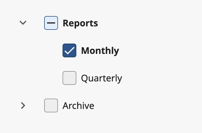
rows is the list of rows, from top to bottom. Each row is an object:
| Name | Description | Property Type |
|---|---|---|
| label | Text of the row. Give every row a label. Default empty. | value |
| description | A second, smaller line under the label. Not shown when empty. Default empty. | value |
| status | State of the checkbox: unchecked, checked or mixed. Written when the operator clicks the row. Default unchecked. |
value |
| level | Indentation of the row. See Levels. Default 0. |
value |
| expandable | Makes the row a group: it gets a chevron that shows and hides the rows beneath it. See Groups. Default false. |
value |
| expanded | Whether the rows beneath the group are shown. Written when the operator clicks the chevron. Default false. |
value |
| disabled | Disable the row. See Disabled Rows. Default false. |
value |
A plain list has all rows on level 0:
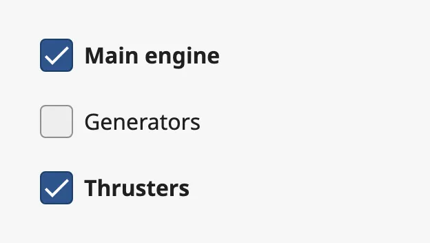
A row is 48 px high, so a list needs 48 px of height per row that is shown. The component does not scroll: rows that do not fit are drawn below its box.
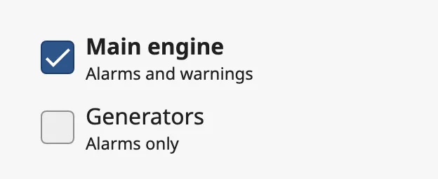
With a description:
Properties
Section titled “Properties”| Name | Description | Property Type |
|---|---|---|
| rows | The rows of the list, from top to bottom. Each row is an object. | array |
Status
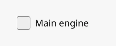
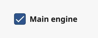
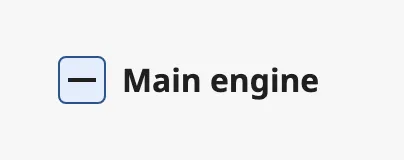
Section titled “Status”status of a row sets its checkbox:
unchecked |
checked |
mixed |
|---|---|---|
 |
 |
 |
A click anywhere on a row — the checkbox or the label — toggles it. The new
status is written to status of that row, and then onActionPerformed fires.
A click on a mixed row checks it; after that, clicks alternate between unchecked
and checked. The operator cannot set the mixed status.
Note: Every row is on its own. Checking a group does not check the rows beneath it, and checking the rows beneath a group does not change the group. If a group is to show
mixedwhen only some of its rows are checked, set itsstatusfrom a binding or a script. See Example 2.
Because the operator’s click is written into the rows array, bind rows
bidirectionally — for instance to a custom property of the view — to use the
selection elsewhere. See Values.
Levels
Section titled “Levels”level indents a row. The rows are always listed flat in rows; the tree is
made by the levels alone.
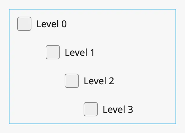
0— no indentation. Use it for every row of a plain list.1— leaves room for a chevron in front of the checkbox.2and up — each level indents the row one step further.
In a list with groups, start at level 1, so that the checkboxes of rows with
and without a chevron line up.
Groups
Section titled “Groups”A row with expandable set to true is a group. It gets a chevron, and the
rows beneath it that have a higher level belong to it — up to the next row
on the same or a lower level.
Group open (expanded is true) |
Groups closed |
|---|---|
|
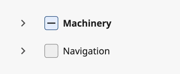 |
A click on the chevron opens or closes the group and writes the new state to
expanded of that row. It does not change the checkbox and does not fire
onActionPerformed. The rows of a closed group take no space, so the rows below
move up.
Disabled Rows
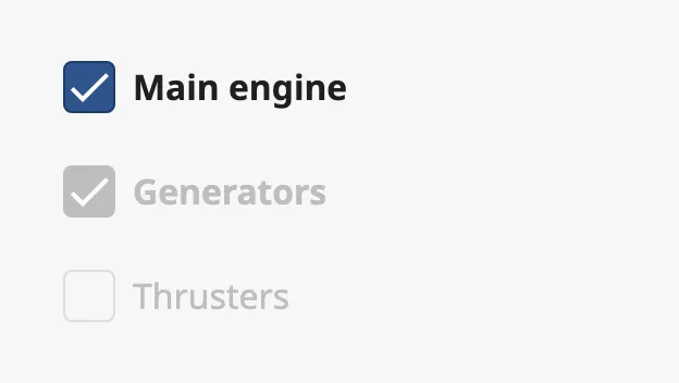
Section titled “Disabled Rows”A row with disabled set to true is dimmed and does not react to a click.
There is no property that disables the whole list: set disabled on every row.
Hover Style
Section titled “Hover Style”hoverStyle sets what is highlighted when the pointer is over a row or the row
has keyboard focus:
| Value | Description | With the pointer on the second row |
|---|---|---|
touch-target |
The whole row is highlighted. The default. | 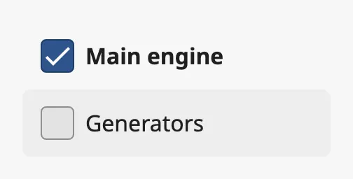 |
visual-target |
Only the checkbox is highlighted. | 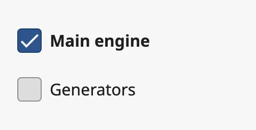 |
In both cases a click anywhere on the row toggles it.
Properties
Section titled “Properties”| Name | Description | Property Type |
|---|---|---|
| hoverStyle | What is highlighted on hover and focus: touch-target or visual-target. Default touch-target. |
value |
Common Properties
Section titled “Common Properties”These work in the same way on every input component, and are described in Input Components — Common Features:
- Appearance —
style.
Component Events
Section titled “Component Events”| Event | Description | Event Object |
|---|---|---|
| onActionPerformed | Fired when the operator toggles the checkbox of a row, after the new status is written to rows. |
See below |
The event object tells which row was toggled:
| Name | Description | Property Type |
|---|---|---|
| index | Position of the row in rows, starting at 0. |
value |
| label | label of the row. |
value |
| status | The new status of the row: checked or unchecked. |
value |
Opening or closing a group does not fire the event.
Examples
Section titled “Examples”Example 1 — Choosing What to Show
Section titled “Example 1 — Choosing What to Show”- Drop a Checkbox List into the view and make it 280 px wide and 144 px high.
- Replace
rowswith three rows withlevel0and the labelsMain engine,GeneratorsandThrusters. - Add a custom property
selectionto the view, bindrowsto it and enable Bidirectional.
view.custom.selection now holds the rows with the status the operator has
chosen, for other components to bind to.
Example 2 — Group That Follows Its Rows
Section titled “Example 2 — Group That Follows Its Rows”A group Machinery on level 1 with the rows Main engine and Generators on
level 2 beneath it (rows 0, 1 and 2).
Add this script to the onActionPerformed event of the list:
def runAction(self, event): rows = self.props.rows if event.index == 0: # The group was clicked: give its rows the same status. for i in (1, 2): rows[i].status = event.status else: checked = [rows[i].status == 'checked' for i in (1, 2)] if all(checked): rows[0].status = 'checked' elif any(checked): rows[0].status = 'mixed' else: rows[0].status = 'unchecked'The group now checks and unchecks its rows, and shows mixed when only one of
them is checked.
Found an error or something unclear?
Tell us what is wrong, confusing or missing on this page.
Built on the OpenBridge Design System