Readout
The Readout shows one value as a number, with a label and unit under it, and optionally a setpoint, an advice value and the source of the value. It is the stand-alone readout of the OpenBridge instruments: speed, heading, depth, pitch. It is found in the Maritime - OpenBridge section of the Perspective Component Palette as Readout (Experimental).
Note: This component is experimental: its properties may change in a later version.
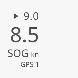
The parts of the readout, from the top:
- Setpoint — the ordered value, with a small triangle. See Setpoint.
- Value — the number. See Value.
- Label and unit — see Label and Unit.
- Source — where the value comes from. See Source.
For rows of label and value in a list or table, use the Readout List Item. The Readout replaces the deprecated Instrument Field.
A Readout dropped from the palette shows the value 10 with the label Label:
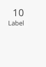
Bind value to the number to show. It is rounded to the decimals of
numberFormat (see Number Format); the default shows no
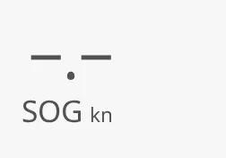
decimals. A binding that returns null, or valueUndefined set to true,
shows a dash instead of a number:
Text Values
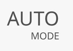
Section titled “Text Values”Set valueType to text to show a text instead of a number, bound to text:
a mode, a state, a name. It is shown as it is, on one line, in the place and
colour of the number; numberFormat, maxDigits and the hinted zeros do not
apply to it, and an empty text shows a dash. The setpoint and the advice stay
numbers.
Number Format
Section titled “Number Format”numberFormat decides how many decimals are shown:
| numberFormat | 1234.5678 is shown as |
|---|---|
#,##0 (default) |
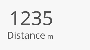 |
0.0 |
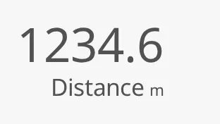 |
#,##0.## |
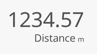 |
The format is written as a Java DecimalFormat pattern, as elsewhere in Ignition, but the Readout reads only the number of characters after the decimal point from it, and always shows that many decimals:
| numberFormat | 1234.5678 | 0.5 | -42 |
|---|---|---|---|
#,##0 (default) |
1235 |
1 |
-42 |
0 |
1235 |
1 |
-42 |
0.0 |
1234.6 |
0.5 |
-42.0 |
#,##0.00 |
1234.57 |
0.50 |
-42.00 |
0.00 |
1234.57 |
0.50 |
-42.00 |
#,##0.## |
1234.57 |
0.50 |
-42.00 |
0.### |
1234.568 |
0.500 |
-42.000 |
000.0 |
1234.6 |
0.5 |
-42.0 |
Things to know:
#after the decimal point works like0:0.##always shows two decimals, not “up to two”.- There is never a thousands separator, whether or not the pattern has a comma.
- The decimal separator is always a point, whatever the language of the
browser (a Norwegian browser also shows
1234.50). - Leading zeros in the pattern (
000.0) are ignored. To pad the number, usemaxDigitswithhintedZeros, below. - An empty
numberFormatis treated as#,##0. - The setpoint and the advice use the same number of decimals as the value.
Digits and Degrees
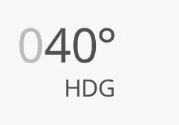
Section titled “Digits and Degrees”maxDigits reserves room for that many digits before the decimal point, so
the readout keeps its width as the value changes. With
valueOptions.hintedZeros the unused places are drawn as faint zeros.
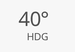
hasDegree adds a degree sign after the value (not after the setpoint or
advice).
hasDegree = false |
hasDegree = true |
hasDegree, maxDigits 3 and hintedZeros |
|---|---|---|
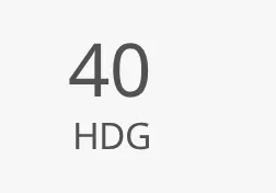 |
 |
 |
hasDegreeSpacer reserves the room of a degree sign without drawing it, so a
readout without a degree lines up with readouts that have one.
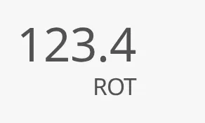
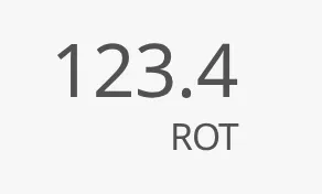
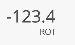
valueOptions.hasSignSpacer reserves the room of a minus sign in front of a
value that is not negative, so the digits do not move when the value turns
negative. setpointOptions and adviceOptions have the same sub-property.
| Without | hasSignSpacer |
Negative |
|---|---|---|
 |
 |
 |
Properties
Section titled “Properties”| Name | Description | Property Type |
|---|---|---|
| value | The number. A binding that returns null shows a dash. Only shown when valueType is number. Default 10. |
value |
| valueType | number or text. Default number. |
value |
| text | The text to show when valueType is text. Only shown then. Default empty. |
value |
| valueUndefined | Show a dash instead of the value. Default false. |
value |
| valueOptions.hasSignSpacer | Reserve the room of a minus sign in front of a value that is not negative. Default false. |
value |
| numberFormat | DecimalFormat pattern; only the number of decimals is used. Default #,##0. |
value |
| maxDigits | Digits before the decimal point to reserve room for. Default 0. |
value |
| hasDegree | Show a degree sign after the value. Default false. |
value |
| hasDegreeSpacer | Reserve the room of a degree sign. Only shown when hasDegree is false. Default false. |
value |
| hasValue | Show the value. false gives a readout with only the label and unit. Default true. |
value |
Label and Unit
Section titled “Label and Unit”label is the short name of the value (SOG, HDG, Depth) and unit its
unit (kn, m). They are shown under the value. Leave unit empty for values
without a unit, and use hasDegree rather than a ° unit for angles.
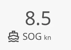
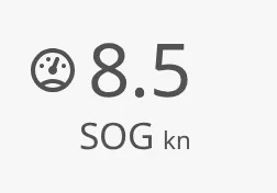
hasLeadingIcon draws an icon before the label, chosen in leadingIcon: an
icon picker with the path of the icon and useCssColor, which draws the
icon in its own colours instead of the text colour. The readout needs a label
or a unit for the icon to appear. valueOptions.hasIcon and
valueOptions.icon do the same before the value.
hasLeadingIcon |
valueOptions.hasIcon |
|---|---|
 |
 |
Properties
Section titled “Properties”| Name | Description | Property Type |
|---|---|---|
| label | Name of the value. Default Label. |
value |
| unit | Unit of the value. Default empty. | value |
| hasLeadingIcon | Show an icon before the label. Default false. |
value |
| leadingIcon.path | The icon, from the icon picker. Only shown when hasLeadingIcon is true. Default openbridge/placeholder. |
value |
| leadingIcon.useCssColor | Draw the icon in its own colours instead of the text colour. Default false. |
value |
Size and Layout
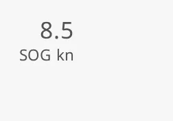
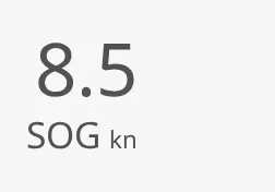
Section titled “Size and Layout”size sets the size of the text:
small (default) |
medium |
large |
|---|---|---|
 |
 |
 |
direction places the label and unit under the value (vertical, default) or
beside it (horizontal). A horizontal readout always has the large size;
size is not used then.
vertical (default) |
horizontal |
|---|---|
|
 |
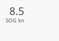
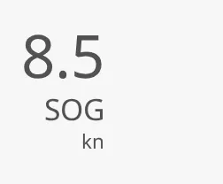
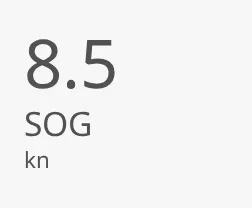
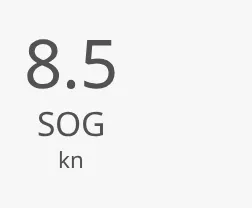
In a vertical readout, stacking set to stacked puts the label and the unit
on lines of their own, and alignment aligns them: vertical to the right,
left or center.
inline (default) |
stacked, vertical |
stacked, left |
stacked, center |
|---|---|---|---|
|
 |
 |
 |
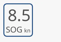
The Readout keeps its natural size and is placed at the top left of the component’s box: a larger box does not make the text larger, and a box that is too small does not shrink it. The blue frame is the component’s box:
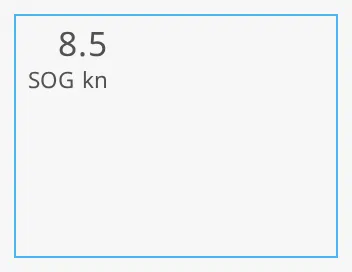
Size the component to the readout, or place it in a flex container that aligns it. A new Readout is 64 × 100 px.
Properties
Section titled “Properties”| Name | Description | Property Type |
|---|---|---|
| size | small, medium or large. Not used when direction is horizontal. Default small. |
value |
| direction | vertical or horizontal. Default vertical. |
value |
| stacking | inline or stacked. Only shown when direction is vertical. Default inline. |
value |
| alignment | vertical (right), left or center, for a stacked readout. Only shown when direction is vertical. Default vertical. |
value |
Setpoint
Section titled “Setpoint”Set hasSetpoint to true and bind setpoint to the ordered value. It is
shown above the value, smaller, with a triangle:
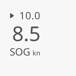
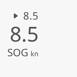
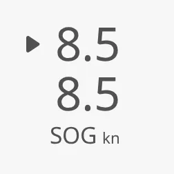
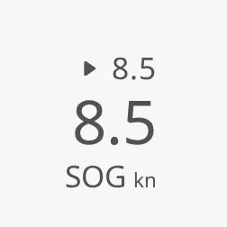
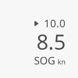
setpointOptions.interaction decides how the setpoint and the value share the
space. The images show a value of 8.5 with a setpoint of 10 (away) and of 8.5
(reached):
| interaction | Setpoint away | Setpoint reached |
|---|---|---|
always-visible (default) |
|
 |
equal-size |
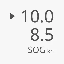 |
 |
flip-flop |
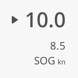 |
 |
pop-up |
 |
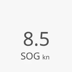 |
always-visible— the setpoint is always shown above the value.equal-size— the setpoint is always shown, in the same size as the value.flip-flop— while the value is away from the setpoint, the setpoint is large and the value small; when it is reached, they swap back.pop-up— the setpoint is shown only while the value has not reached it. Its room is kept, so the readout does not change size.
“Reached” means the value and the setpoint are exactly equal as numbers. Round them in the binding if the value is noisy.
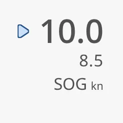
Set setpointOptions.touching to true while the operator is changing the
setpoint (for example while dragging a slider). The setpoint is then drawn
large, with an outlined triangle:
Properties
Section titled “Properties”| Name | Description | Property Type |
|---|---|---|
| hasSetpoint | Show the setpoint. Default false. |
value |
| setpoint | The ordered value. Only shown when hasSetpoint is true. |
value |
| setpointOptions.interaction | always-visible, equal-size, flip-flop or pop-up. Default always-visible. |
value |
| setpointOptions.touching | The operator is changing the setpoint. Default false. |
value |
setpointOptions has more sub-properties; see Block Options.
Advice
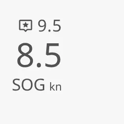
Section titled “Advice”An advice is a recommended value, for example a recommended speed from a
route optimiser. Set hasAdvice to true and bind advice; it is shown above
the value with an advice symbol:
Properties
Section titled “Properties”| Name | Description | Property Type |
|---|---|---|
| hasAdvice | Show the advice. Default false. |
value |
| advice | The recommended value. Only shown when hasAdvice is true. |
value |
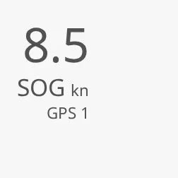
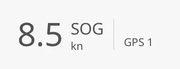
Source
Section titled “Source”src is the name of the sensor or system the value comes from, such as
GPS 1. It is shown under the label when it is not empty:
| Vertical | Horizontal |
|---|---|
 |
 |
The source is a text. The web component can also turn it into a source picker
or a flyout button, but those need a menu of sources the Perspective wrapper
cannot fill, and fire no Perspective event, so they are not offered. A
srcOptions.interaction saved by an older view is ignored.
Properties
Section titled “Properties”| Name | Description | Property Type |
|---|---|---|
| src | Name of the source. Default empty (no source shown). | value |
Priority and Weight
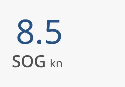
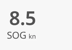
Section titled “Priority and Weight”priority set to enhanced draws the value in the enhanced colour, for the
readouts the operator is steering by. See Priority.
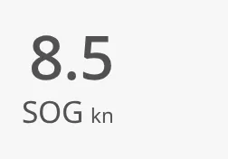
valueOptions.weight makes the value bolder without changing its colour.
priority regular (default) |
priority enhanced |
|---|---|
|
 |
weight regular (default) |
semibold |
bold |
|---|---|---|
|
 |
 |
Properties
Section titled “Properties”| Name | Description | Property Type |
|---|---|---|
| priority | regular or enhanced. Default regular. |
value |
| valueOptions.weight | regular, semibold or bold. Default regular. |
value |
Off, Data Quality and Alerts
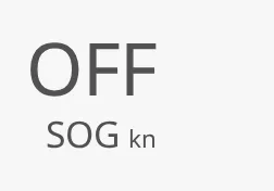
Section titled “Off, Data Quality and Alerts”Set off to true when the equipment is switched off: the value is replaced
by offText (default OFF). The label and unit stay.
off = true |
hasValue = false |
|---|---|
 |
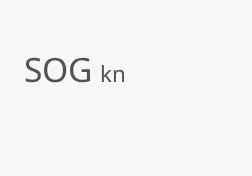 |
hasValue set to false removes the value altogether, for a readout that is
only a label. It is a layout choice, not a way to show a missing value.
Data Quality
Section titled “Data Quality”dataQuality marks a value that should not be trusted:
| dataQuality | ||
|---|---|---|
good (default) |
Normal. | |
low-integrity |
The value may be wrong, for example a sensor out of calibration. | 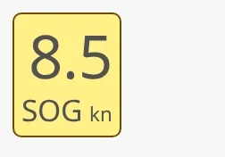 |
invalid |
The value is not valid. | 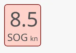 |
Bind it to an expression on the quality of the tag, for example
if(isGood({[default]Navigation/SOG}), 'good', 'invalid').
Alert Frame
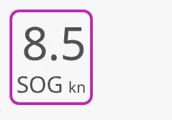
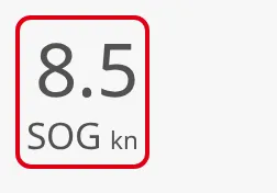
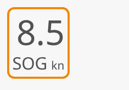
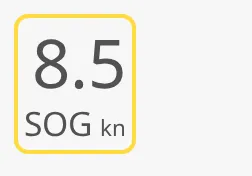
Section titled “Alert Frame”Set hasAlert to true to draw an alert frame around the readout. alert is
an object with status, type, mode, thickness and textSize. The
statuses:
level-critical |
level-high (default) |
level-medium |
level-low |
|---|---|---|---|
 |
 |
 |
 |
level-diagnostic |
alarm (legacy) |
warning (legacy) |
caution (legacy) |
|---|---|---|---|
 |
|
|
|
The Designer offers the level-* values. alarm, warning and caution
are legacy values: they still work when bound or typed in, and look the same
as level-high, level-medium and level-low.
type, mode and thickness work as on the automation buttons; see
Alert Frame (there they are called
alertFrameType, alertFrameMode and alertFrameThickness). The default
type here is regular, a plain frame.
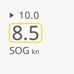
The value, setpoint, advice and source can also each have a frame of their own
— for example only the value, when it is out of range while the setpoint is
fine. Set hasAlert and alert inside valueOptions (or setpointOptions,
…):
Properties
Section titled “Properties”| Name | Description | Property Type |
|---|---|---|
| off | Show offText in place of the value. Default false. |
value |
| offText | Text shown when off is true. Only shown when off is true. Default OFF. |
value |
| dataQuality | good, low-integrity or invalid. Default good. |
value |
| hasAlert | Draw an alert frame around the readout. Default false. |
value |
| alert | The frame. Only shown when hasAlert is true. |
object |
| alert.status | The status: a level-* value (the legacy alarm, warning and caution still work). Default level-high. |
value |
| alert.type | regular, small-side-flip, large-side-flip, bottom-flip or top-flip. Default regular. |
value |
| alert.mode | acked-active, unacked-active or unacked-rectified. Default acked-active. |
value |
| alert.thickness | small or large. Default small. |
value |
| alert.textSize | regular or large. Default regular. |
value |
Block Options
Section titled “Block Options”The value, setpoint, advice, unit and source each have an object of options:
valueOptions, setpointOptions, adviceOptions, unitOptions and
srcOptions. valueOptions is only shown when hasValue is true,
setpointOptions when hasSetpoint is true and adviceOptions when
hasAdvice is true.
| Sub-property | In | Description |
|---|---|---|
| hintedZeros | value, setpoint, advice | Draw the unused places up to maxDigits as faint zeros. Default false. |
| spaceReserver | all | The longest text to keep room for, such as 0000.0 or GPS 12, so readouts next to each other line up. Default empty. |
| dataQuality | value, setpoint, advice, source | Data quality of this part only: good, low-integrity or invalid. Default good. |
| hasAlert | value, setpoint, advice, source | Draw an alert frame around this part only. Default false. |
| alert | value, setpoint, advice, source | That frame, with the sub-properties of alert above. Only shown when hasAlert is true. |
| weight | value | regular, semibold or bold. See Priority and Weight. |
| hasIcon | value | Show an icon before the value, chosen in icon. Default false. |
| icon | value | The icon before the value: path and useCssColor. Only shown when hasIcon is true. |
| hasSignSpacer | value, setpoint, advice | Reserve the room of a minus sign in front of a value that is not negative. Default false. |
| interaction | setpoint | See Setpoint. |
| touching | setpoint | See Setpoint. |
All of these are value properties inside an object.
Common Properties
Section titled “Common Properties”- Priority —
priority, described above. - Style and Events —
style.
Component Events
Section titled “Component Events”The Readout has no component events of its own. The standard Perspective
events, such as onClick, are available in the component’s event
configuration.
Examples
Section titled “Examples”Example 1 — Speed over Ground with Setpoint
Section titled “Example 1 — Speed over Ground with Setpoint”- Drop a Readout into the view and make it 110 × 110 px.
- Set
labeltoSOG,unittokn,sizetolargeandnumberFormatto0.0. - Bind
valueto[default]Navigation/SOG. - Set
hasSetpointtotrueand bindsetpointto[default]Navigation/SpeedOrder. - Set
srctoGPS 1. - Bind
dataQualitytoif(isGood({[default]Navigation/SOG}), 'good', 'invalid').
Example 2 — Heading with Three Digits
Section titled “Example 2 — Heading with Three Digits”- Drop a Readout and set
labeltoHDG,sizetolarge. - Bind
valueto[default]Navigation/Heading; keepnumberFormatat#,##0. - Set
hasDegreetotrue,maxDigitsto3andvalueOptions.hintedZerostotrue. A heading of 40° is shown as040°, with the first zero faint.
Found an error or something unclear?
Tell us what is wrong, confusing or missing on this page.
Built on the OpenBridge Design System