Icon
The Icon shows one icon from the OpenBridge icon library. It is found in the Input - OpenBridge section of the Perspective Component Palette as Icon.

The Icon only shows something: it takes no input from the operator, writes no property back and has no component events. How icons are chosen in general is described in Icons on the page Input Components — Common Features.
An Icon with default properties shows the placeholder icon:
Choosing an Icon
Section titled “Choosing an Icon”The icon is set with icon.path, which is an icon picker: click the icon
button beside the property in the property editor, open the openbridge
library and choose an icon. The property is then set to openbridge/ followed
by the name of the icon, for example openbridge/ship. The path can also be
typed or set from a binding.
To find an icon:
- Browse the icons at openbridge.no. They are grouped by subject, and each icon is shown with its name.
- Write the name in lower case with hyphens, after
openbridge/:openbridge/settings-iec.
Some example icons:
icon.path |
|
|---|---|
openbridge/search |
 |
openbridge/info |
 |
openbridge/home |
 |
openbridge/notification |
 |
openbridge/settings-iec |
 |
openbridge/check-google |
 |
openbridge/star |
 |
openbridge/ship |
 |
openbridge/engine |
 |
openbridge/propulsion |
 |
openbridge/wind |
 |
openbridge/pump-on-horizontal |
 |
Only OpenBridge icons are shown. With an icon from another library (for example
material/home), or a name that does not exist, the component is empty. The
blue frame in the image is the component’s box:

If icon.path is empty, the placeholder icon is shown.
Properties
Section titled “Properties”| Name | Description | Property Type |
|---|---|---|
| icon | The icon to show. | object |
| icon.path | Path of the icon: openbridge/ and the name of the icon. Default openbridge/placeholder. |
value |
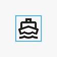
The icon fills the component’s box, so the size of the component is the size of the icon. A new Icon is 48 × 48. The blue frame in the images is the component’s box:
| 24 × 24 | 48 × 48 | 96 × 96 |
|---|---|---|
 |
 |
 |
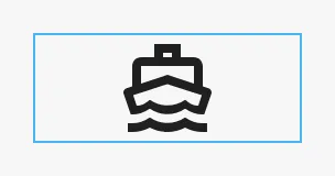
The icon keeps its proportions. In a box that is not square it is as large as the shorter side allows, and centered:
An icon is drawn in a single color: the text color of the component, which by default is the element color of the OpenBridge palette of the session.
Some icons, such as the alert and status icons, have colors of their own. Set
useColor to true to show them:
icon.path |
useColor = false |
useColor = true |
|---|---|---|
openbridge/caution-color-iec |
 |
 |
openbridge/running-color-iec |
 |
 |
As the images show, such an icon is only a filled shape without useColor.
On an icon without colors of its own, useColor makes no visible difference,
but the icon then no longer follows the text color of the component.
To give a single-color icon another color, leave useColor at false and set
the text color (color) in style.
The colors follow the OpenBridge palette of the session. The ship icon in the night palette:

Properties
Section titled “Properties”| Name | Description | Property Type |
|---|---|---|
| useColor | Draw the icon in its own colors instead of the text color of the component. Default false. |
value |
Properties
Section titled “Properties”Properties not covered in the sections above:
| Name | Description | Property Type |
|---|---|---|
| style | Standard Perspective style object. See Appearance. | object |
Component Events
Section titled “Component Events”The Icon has no component events.
Examples
Section titled “Examples”Example 1 — An Icon Beside a Value
Section titled “Example 1 — An Icon Beside a Value”- Drop an Icon into the view and set its size to 24 × 24.
- Click the icon button beside
icon.path, open theopenbridgelibrary and choosewind. The property is nowopenbridge/wind. - Place a label with the wind speed beside it.
Example 2 — An Icon That Follows a Tag
Section titled “Example 2 — An Icon That Follows a Tag”Show a green running symbol while a pump runs, and a neutral one when it is stopped.
-
Drop an Icon into the view and set
useColortotrue. -
Bind
icon.pathto the expressionif({[default]Pump01/Running}, "openbridge/running-color-iec", "openbridge/pump-on-horizontal")
Found an error or something unclear?
Tell us what is wrong, confusing or missing on this page.
Built on the OpenBridge Design System