Stepper Box
The Stepper Box lets the operator raise or lower a number in fixed steps with two buttons. It is found in the Input - OpenBridge section of the Perspective Component Palette as Stepper Box.
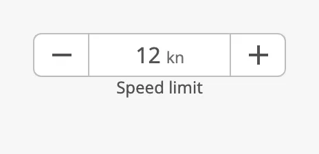
The parts of the stepper:
- Decrease button — to the left. Lowers the value by
stepDown. - Value — the number, with an optional unit. It cannot be typed in. See Value and Steps.
- Increase button — to the right. Raises the value by
stepUp. - Helper text — below the stepper. See Unit and Helper Text.
The Stepper Box is one of the input components. How values are written back, events, disabling and the behavior in the Designer are shared by all of them and are described in Input Components — Common Features. This page covers what is specific to the Stepper Box.
A Stepper Box dropped from the palette goes from 0 to 100 in steps of 1 and is set to 50:
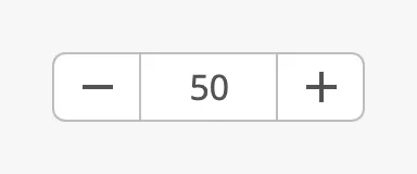
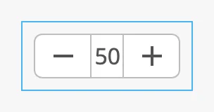
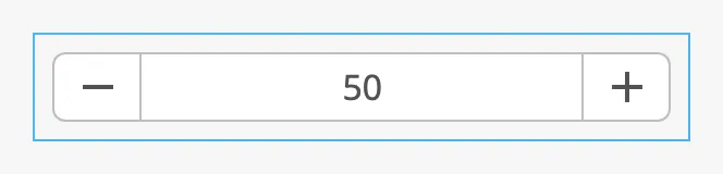
The stepper is as wide as the component; the value takes the space between the buttons. The blue frame is the component’s box:
| 120 px wide | 300 px wide |
|---|---|
 |
 |
Value and Steps
Section titled “Value and Steps”value is the number shown. A click on the increase button adds stepUp to
it, a click on the decrease button subtracts stepDown. The two steps can be
different. Bind value bidirectionally to a tag to connect the stepper to it
(see Values).
The operator changes the value only with the buttons: the number cannot be typed. Use a Number Input Field where the operator must type a number, or a Slider for a coarse setting.
Each click is one step. Holding a button down does not repeat the step.
Limits
Section titled “Limits”The value stays between min and max. A step that would pass a limit stops
at the limit: with max = 100 and stepUp = 5, a click at 98 gives 100. At
a limit the button that leads further is disabled:
At min |
At max |
|---|---|
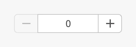 |
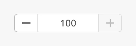 |
A value written by a binding is not limited: it is shown as it is, also outside the range. The first click then brings it to the nearest limit.
Note: The buttons need a value to step from. While
valueis empty, for instance when a bound tag has no value, both buttons are disabled.
Keyboard
Section titled “Keyboard”When the stepper has focus, the Up and Down arrow keys step the value as the buttons do.
Note: After a click on the number itself, the arrow keys still write the new value, but the number shown is not updated. Use the buttons where the operator has a pointer or a touch screen.
Properties
Section titled “Properties”| Name | Description | Property Type |
|---|---|---|
| value | Current value. Written when the operator clicks a button. Default 50. |
value |
| stepUp | How much a click on the increase button adds. Default 1. |
value |
| stepDown | How much a click on the decrease button subtracts. Default 1. |
value |
| min | Lowest value. Default 0. |
value |
| max | Highest value. Default 100. |
value |
type selects the icons on the buttons. The left button always lowers the
value and the right button always raises it.
| type | ||
|---|---|---|
plus-minus (default) |
Minus and plus. For a quantity or a setpoint. | 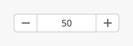 |
left-right |
Arrows left and right. For stepping through a series. | 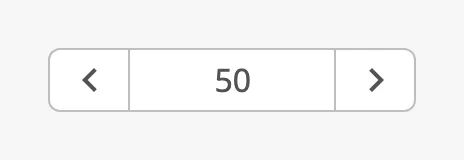 |
up-down |
Arrows down and up. For a level or a height. | 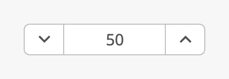 |
Properties
Section titled “Properties”| Name | Description | Property Type |
|---|---|---|
| type | plus-minus, left-right or up-down. Default plus-minus. |
value |
Unit and Helper Text
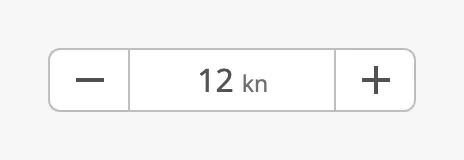
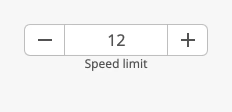
Section titled “Unit and Helper Text”unit is a text shown after the number. helperText is shown centred below the
stepper; make the component about 72 px tall to give it room.
| Unit | Helper text |
|---|---|
 |
 |
The number is shown as it is, without a number format. With a step that is not
a whole number, such as 0.1, choose min, max and the steps so that the
values are the ones you want to show.
Note:
placeholderis meant to be shown whilevalueis empty. No placeholder was shown when tested.
Properties
Section titled “Properties”| Name | Description | Property Type |
|---|---|---|
| unit | Text shown after the number, for example kn. Empty by default. |
value |
| helperText | Text below the stepper. Empty by default. | value |
| placeholder | Hint for an empty stepper. See the note above. | value |
Read-only and Disabled
Section titled “Read-only and Disabled”readonly |
disabled |
|---|---|
 |
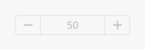 |
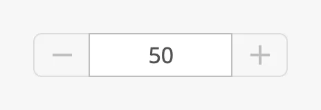
Both stop the operator from changing the value: the buttons are disabled and no
events are fired. With readonly the number keeps its normal colour, so it
reads as a value that is shown but not editable here. With disabled the whole
stepper is dimmed. See Disabled.
Properties
Section titled “Properties”| Name | Description | Property Type |
|---|---|---|
| readonly | Disable the buttons without dimming the number. Default false. |
value |
Common Properties
Section titled “Common Properties”These work in the same way on every input component, and are described in Input Components — Common Features:
- Disabled —
disabled. - Appearance —
style.
Component Events
Section titled “Component Events”Every click on a button writes value and then fires two events:
onActionPerformed, and onUp or onDown.
| Event | Description | Event Object |
|---|---|---|
| onActionPerformed | Fired when the operator changes the value, with either button. | — |
| onUp | Fired when the increase button changed the value. | — |
| onDown | Fired when the decrease button changed the value. | — |
No event is fired for a click on a disabled button, for instance at max.
See Events.
Examples
Section titled “Examples”Example 1 — Speed Limit in Steps of 0.5 kn
Section titled “Example 1 — Speed Limit in Steps of 0.5 kn”- Drop a Stepper Box into the view and make it about 200 × 72 px.
- Set
minto0,maxto20, andstepUpandstepDownto0.5. - Set
unittoknandhelperTexttoSpeed limit. - Bind
valueto the tag[default]Pump01/Setpointand enable Bidirectional.
Example 2 — Step Through Pages
Section titled “Example 2 — Step Through Pages”- Drop a Stepper Box into the view and set
typetoleft-right. - Set
minto1,maxto the number of pages andvalueto1. - Bind
valuebidirectionally to a custom property of the view, for exampleview.custom.page, and use that property to choose what the view shows.
Found an error or something unclear?
Tell us what is wrong, confusing or missing on this page.
Built on the OpenBridge Design System