User Button
The User Button is a round button that represents a user: it shows a user icon or the user’s initials, with a label under it. It is typically used to open a user menu or to pick a user from a list. It is found in the Input - OpenBridge section of the Perspective Component Palette as User Button.
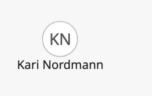
- Circle with an icon or initials — see Icon or Initials.
- Label — see Label.
The User Button is one of the input components. Events, disabling, icons and the behavior in the Designer are shared by all of them and are described in Input Components — Common Features. This page covers what is specific to the User Button.
A User Button with default properties:
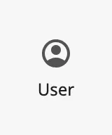
A new User Button already has the label User. With a label the button is
60 px tall, 4 px more than the box of a new component; increase the height of
the component to 60.
Action
Section titled “Action”The User Button has no value. When the operator clicks it, it fires the
onActionPerformed event once. Configure the event with the action to perform,
for example opening a popup (see Example 1).
A disabled User Button does not fire the event.
Icon or Initials
Section titled “Icon or Initials”variant selects what the circle shows:
| variant | Image | |
|---|---|---|
icon (default) |
An icon; a user icon unless you change it. | 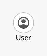 |
initials |
The text of initials. |
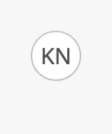 |
Initials. The component removes spaces from initials, turns the text into
capitals and shows the first two characters: kn and k n o are both shown as
KN. When initials is empty the circle is empty:
Icon. icon is an icon picker: choose the icon in the property editor,
which sets icon.path. See Icons. The icon is only shown
when variant is icon.
Properties
Section titled “Properties”| Name | Description | Property Type |
|---|---|---|
| variant | icon or initials. Default icon. |
value |
| initials | The initials; the first two characters are shown. Empty by default. Used when variant is initials. |
value |
| icon | The icon in the circle. An icon picker; see icon.path. Used when variant is icon. |
object |
| icon.path | Path of the icon. Default openbridge/user. |
value |
label is the text under the circle, for example the name of the user. Clear
it to show the circle alone:
| With a label | Without a label |
|---|---|
|
 |
The label can be wider than the circle. Make the component’s box wide enough for it.
Properties
Section titled “Properties”| Name | Description | Property Type |
|---|---|---|
| label | Text under the circle. Default User. Not shown when static is true. |
value |
styleType selects how the button is drawn:
| styleType | Icon | Initials | Disabled | |
|---|---|---|---|---|
flat (default) |
No circle, only the icon or initials. | |
 |
 |
normal |
A circle with a border. | |
|
 |
selected |
A filled circle, for the selected user. |  |
 |
 |
The component never changes styleType itself. To mark the chosen user in a
list of User Buttons, bind styleType on each of them.
Properties
Section titled “Properties”| Name | Description | Property Type |
|---|---|---|
| styleType | flat, normal or selected. Default flat. |
value |
Static
Section titled “Static”Set static to true to show the circle as a plain picture of a user instead
of a button: it does not react to the mouse pointer, and the label is not
shown.
| Initials | Icon |
|---|---|
 |
 |
Note: A click on a static User Button still fires
onActionPerformed. Leave the event unconfigured, or setdisabledtotrueas well, when nothing must happen.
Properties
Section titled “Properties”| Name | Description | Property Type |
|---|---|---|
| static | Show the circle alone, not as a button. Default false. |
value |
Common Properties
Section titled “Common Properties”These work in the same way on every input component, and are described in Input Components — Common Features:
- Disabled —
disabled.
Component Events
Section titled “Component Events”| Event | Description | Event Object |
|---|---|---|
| onActionPerformed | Fired when the operator clicks the button. | — |
See Events.
Examples
Section titled “Examples”Example 1 — Signed-in User
Section titled “Example 1 — Signed-in User”-
Drop a User Button into the view and set its size to 120 × 60.
-
Set
varianttoinitialsandstyleTypetonormal. -
Bind
labelto the name of the signed-in user, for example the session property{session.props.auth.user.firstName}. -
Bind
initialsto an expression that takes the first letter of the first and the last name:substring({session.props.auth.user.firstName}, 0, 1) +substring({session.props.auth.user.lastName}, 0, 1) -
Configure the
onActionPerformedevent with a Popup action that opens a view with the user’s settings.
Found an error or something unclear?
Tell us what is wrong, confusing or missing on this page.
Built on the OpenBridge Design System