Double Slider
The Double Slider lets the operator set a range — a low and a high value — by dragging two thumbs along a track. It is found in the Input - OpenBridge section of the Perspective Component Palette as Double Slider.
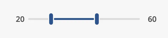
The parts of the slider:
- Low label — the low value, to the left. See Labels.
- Track with the low thumb and the high thumb. The part between the thumbs is highlighted. See Low, High and Range.
- High label — the high value, to the right.
The Double Slider is one of the input components. How values are written back, events, disabling and the behavior in the Designer are shared by all of them and are described in Input Components — Common Features. It is the two-thumb sibling of the Slider. This page covers what is specific to the Double Slider.
A Double Slider dropped from the palette goes from 0 to 100 and is set to the range 25 to 75:

The slider is as wide as the component. Make the component wide enough for the precision the operator needs.
Low, High and Range
Section titled “Low, High and Range”low and high are the positions of the two thumbs, between min and max.
step is the smallest change: with step = 1 the values are whole numbers,
with step = 0.1 they have one decimal.
| low / high | |
|---|---|
45 / 55 |
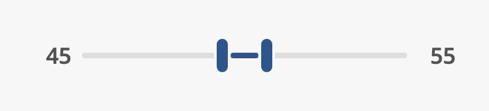 |
0 / 100 |
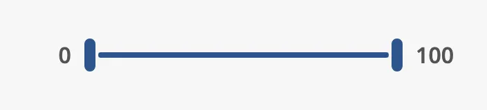 |
50 / 50 |
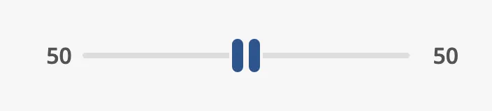 |
A thumb cannot be dragged past the other one: the low thumb stops at high,
where the two values are equal.
The Double Slider writes both low and high, and fires
onActionPerformed, continuously while a thumb moves, not only when the
operator lets go. Bind low and high bidirectionally to two tags to connect
the slider to them (see Values). If every intermediate
value must not be written to the device, bind them to custom properties and
write to the tags from a script.
Keyboard
Section titled “Keyboard”With a thumb in focus, the arrow keys move it by step, and Page Up and Page
Down by stepClick.
Properties
Section titled “Properties”| Name | Description | Property Type |
|---|---|---|
| low | Low end of the range. Written while the operator moves a thumb. Default 25. |
value |
| high | High end of the range. Written while the operator moves a thumb. Default 75. |
value |
| min | Lowest value. Default 0. |
value |
| max | Highest value. Default 100. |
value |
| step | Smallest change of a value. Default 1. |
value |
| stepClick | How much Page Up and Page Down move a thumb. Default 10. |
value |
Variant
Section titled “Variant”| variant | ||
|---|---|---|
normal (default) |
A slim track with two thumbs. | |
enhanced |
A tall, filled track that is easier to hit. Use it where the slider is the main control. | 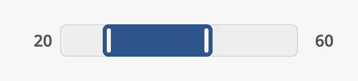 |
no-input |
Shows the range only; the operator cannot change it. Use it as an indicator. | 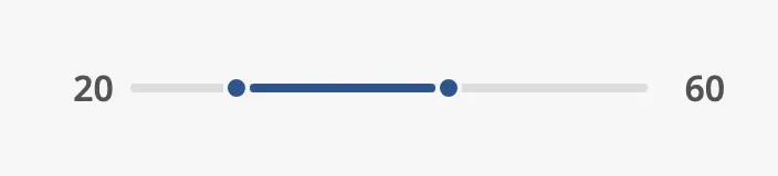 |
Properties
Section titled “Properties”| Name | Description | Property Type |
|---|---|---|
| variant | normal, enhanced or no-input. Default normal. |
value |
Labels
Section titled “Labels”The low value is shown to the left of the track and the high value to the right. The labels are always shown.
| Setting | |
|---|---|
labelUnit = % |
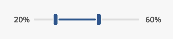 |
labelDecimals = 1, with step = 0.1 |
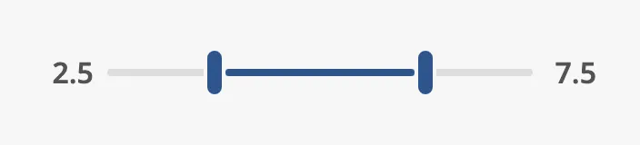 |
labelWidth = 5ch, for values up to 2000 |
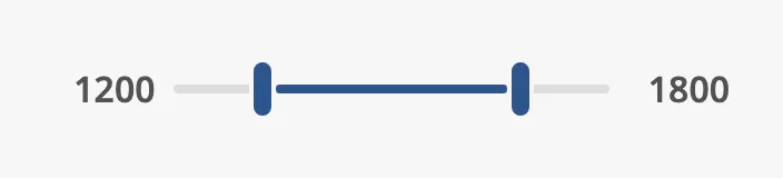 |
labelUnitis a text added after each value.labelDecimalsis the number of decimals shown. Match it tostep.labelWidthis the width reserved for each label, as a CSS length:3chis three characters,60pxis 60 pixels. Reserve room for the longest value so that the track does not change length when the values change.
Properties
Section titled “Properties”| Name | Description | Property Type |
|---|---|---|
| labelUnit | Unit shown after each value, for example %. Empty by default. |
value |
| labelDecimals | Number of decimals in the labels. Default 0. |
value |
| labelWidth | Width reserved for each label, as a CSS length. Default 3ch. |
value |
Pressing on the Track
Section titled “Pressing on the Track”The operator can also press on the track, away from the thumbs. The nearest
thumb then moves: a press below the low thumb or in the lower half of the
range moves the low thumb, a press above moves the high thumb. allowSeeking
decides how:
false(default) — the thumb travels towards the pointer for as long as the track is held, and stops when it is released.seekingSpeedsets how fast: the thumb crosses the whole range in1 / seekingSpeedseconds, 3 seconds with the default0.333. The value is written all the way.true— the thumb jumps to the pressed position at once, and the value is written once.
This is the same as on the Slider, where
the property is spelled allowSeaking.
Note: The track must be pressed and held. A quick click on the track did not change the values when tested, with either setting.
Properties
Section titled “Properties”| Name | Description | Property Type |
|---|---|---|
| allowSeeking | Jump to the pressed position instead of travelling towards it. Default false. |
value |
| seekingSpeed | Speed of the thumb when it travels, in ranges per second. Default 0.333. |
value |
Disabled
Section titled “Disabled”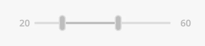
See Disabled. To show a range that the operator must
never change, use the no-input variant instead.
Common Properties
Section titled “Common Properties”These work in the same way on every input component, and are described in Input Components — Common Features:
- Disabled —
disabled. - Appearance —
style.
Component Events
Section titled “Component Events”| Event | Description | Event Object |
|---|---|---|
| onActionPerformed | Fired every time the operator changes low or high, repeatedly while a thumb moves. |
— |
See Events.
Examples
Section titled “Examples”Example 1 — Alarm Limits for a Tank Level
Section titled “Example 1 — Alarm Limits for a Tank Level”- Drop a Double Slider into the view and make it about 320 px wide.
- Set
labelUnitto%andlabelWidthto4ch. - Bind
lowto the tag[default]Tank01/LevelLowLimitandhighto[default]Tank01/LevelHighLimit, and enable Bidirectional on both.
Example 2 — Show a Range Without Input
Section titled “Example 2 — Show a Range Without Input”- Drop a Double Slider into the view and set
varianttono-input. - Bind
lowandhighto the tags that hold the range. The bindings do not need to be bidirectional.
Found an error or something unclear?
Tell us what is wrong, confusing or missing on this page.
Built on the OpenBridge Design System