Heading
The Heading instrument shows the heading and the course over ground of the vessel on a compass ring. It is the reduced form of the Compass: the same arrows, setpoint, orientation and centre, without rate of turn, wind and current. It is found in the Maritime - OpenBridge section of the Perspective Component Palette as Heading.
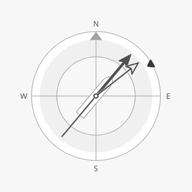
The parts of the instrument:
- Compass ring — with north marked, and the letters N, E, S and W. See Orientation.
- Heading and course arrows — the heading (HDG) and the course over ground (COG). See Heading and Course.
- Setpoint — the ordered heading. See Heading Setpoint.
- Centre — a vessel symbol or readouts. See Centre.
The Heading is one of the maritime instruments. Priority, setpoints, advice
zones and sizing are described in
Maritime Instruments — Common Features. Use the
Compass when the rate of turn, wind or current must be shown as
well. The Heading has no state.
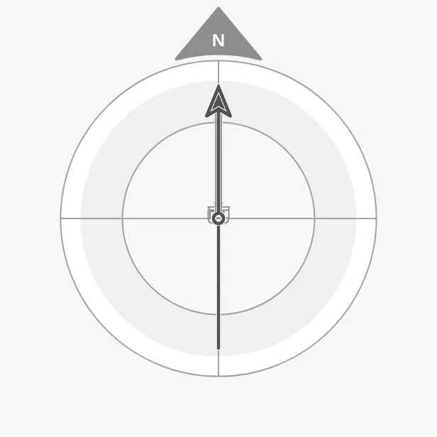
A Heading with default properties shows heading and course 0° as needles, a
small car-ferry-aft vessel, and no labels. A Heading dropped from the palette
starts with the generic-top vessel instead (see Centre):
Heading and Course
Section titled “Heading and Course”Bind heading to the heading of the vessel and courseOverGround to its course
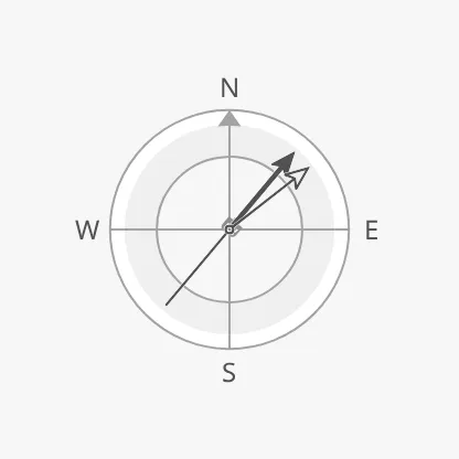
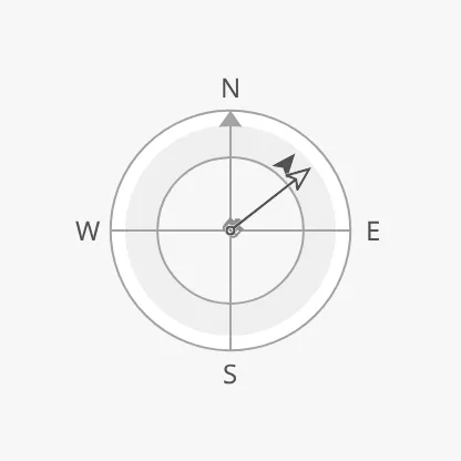
over ground, both in degrees. hdgArrowStyle and cogArrowStyle select how
each is drawn, as on the Compass (see
Compass — Heading and Course), but on the
Heading both are needle by default:
| hdgArrowStyle | |
|---|---|
needle (default) |
 |
arrowHead |
 |
vector |
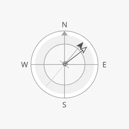 |
beamLine |
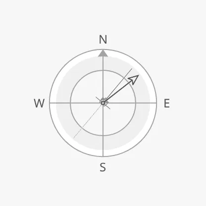 |
| cogArrowStyle | |
|---|---|
needle (default) |
|
arrowHead |
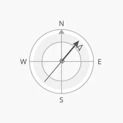 |
vector |
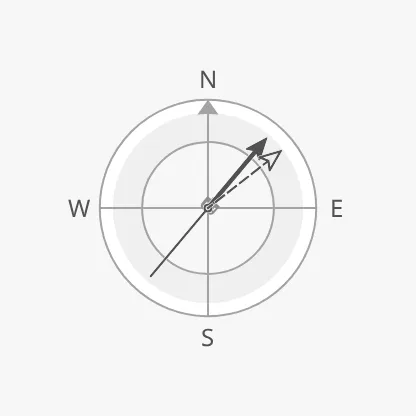 |
velocityVector |
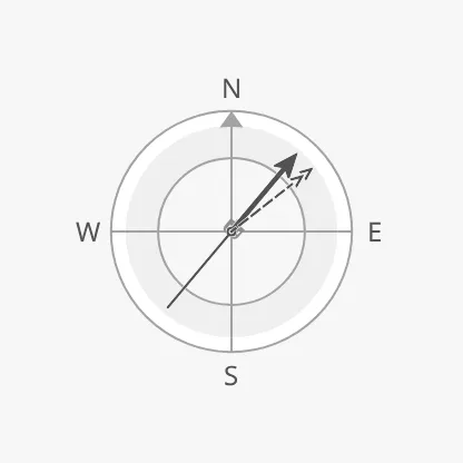 |
Properties
Section titled “Properties”| Name | Description | Property Type |
|---|---|---|
| heading | Heading of the vessel in degrees. Default 0. |
value |
| courseOverGround | Course over ground in degrees. Default 0. |
value |
| hdgArrowStyle | needle, arrowHead, vector or beamLine. Default needle. |
value |
| cogArrowStyle | needle, arrowHead, vector or velocityVector. Default needle. |
value |
Orientation
Section titled “Orientation”direction selects what is up on the instrument, as on the Compass (see
Compass — Orientation):
northUp (default) |
headingUp |
courseUp |
|---|---|---|
|
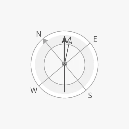 |
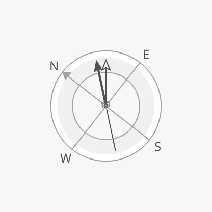 |
showLabels shows the letters N, E, S and W, and tickmarksInside moves them
inside the ring:
showLabels = false |
showLabels = true |
tickmarksInside = true |
|---|---|---|
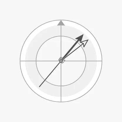 |
|
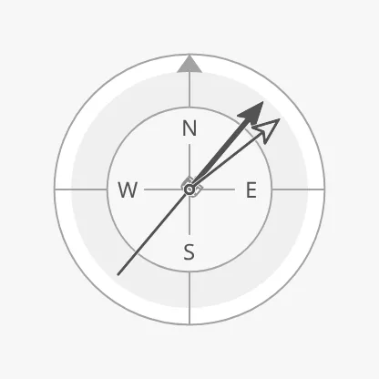 |
Note: The letters are only drawn when the component’s box is at least about 200 px; in a smaller box
showLabelshas no visible effect.
Properties
Section titled “Properties”| Name | Description | Property Type |
|---|---|---|
| direction | northUp, headingUp or courseUp. Default northUp. |
value |
| showLabels | Show the letters N, E, S and W. Default false. |
value |
| tickmarksInside | Place the letters and the north arrow inside the ring. Default false. |
value |
Heading Setpoint
Section titled “Heading Setpoint”The heading setpoint works as on the Compass; see
Compass — Heading Setpoint and
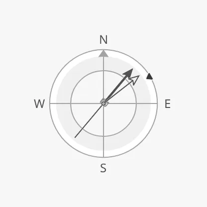
Setpoint. Set headingSetpoint to the ordered heading
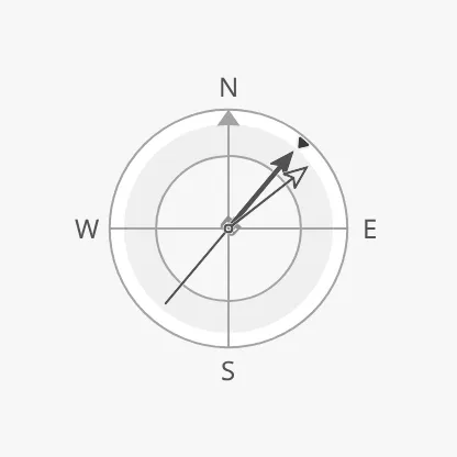
and leave it empty for no setpoint. The Heading decides by itself when the
setpoint is reached (autoAtHeadingSetpoint is true, with a deadband of 2°).
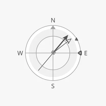
| Setpoint at 60° | Reached | A new setpoint being chosen |
|---|---|---|
 |
 |
 |
advices is a list of advice zones on the ring,
with min and max as headings in degrees:
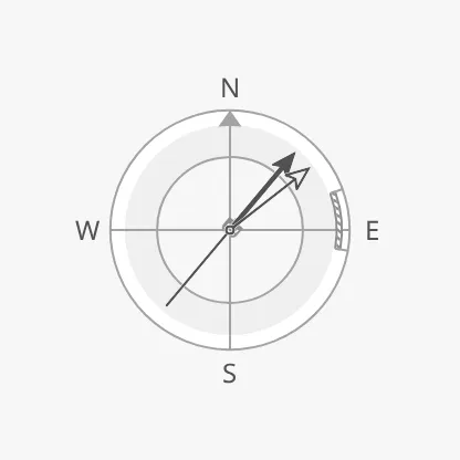
A zone is triggered when the heading or the heading setpoint is inside it;
adviceTrigger narrows that to the heading (value) or the setpoint alone.
headingAdvices is the older name of the list. It still works, and when it is
not empty it replaces advices, but use advices.
Properties
Section titled “Properties”| Name | Description | Property Type |
|---|---|---|
| headingSetpoint | Ordered heading in degrees. Empty by default: no setpoint. | value |
| autoAtHeadingSetpoint | Let the instrument decide when the setpoint is reached. Default true. |
value |
| autoAtHeadingSetpointDeadband | Degrees the heading may differ from the setpoint and still count as reached. Default 2. Only shown when autoAtHeadingSetpoint is true. |
value |
| atHeadingSetpoint | Whether the setpoint is reached. Only shown when autoAtHeadingSetpoint is false. |
value |
| touching | The operator is operating the heading control. Default false. |
value |
| hasNewHeadingSetpoint | Show a second marker for a setpoint that is being chosen. Default false. |
value |
| newHeadingSetpoint | The setpoint being chosen. Only shown when hasNewHeadingSetpoint is true. |
value |
| animateSetpoint | Animate the marker when a new setpoint is confirmed. Default false. |
value |
| headingSetpointAtZeroDeadband | How close to zero the setpoint must be to be drawn in its “zero” form. Default 0.5. |
value |
| advices | Advice zones on the ring, with min and max in degrees. Empty by default. |
array |
| adviceTrigger | Which reading triggers a zone: both (the heading or the setpoint), value (the heading) or setpoint. Default both. |
value |
| adviceEmphasis | Apply the design’s emphasis rules between go-to and no-go zones. Default false. |
value |
| headingAdvices | Deprecated, use advices. Still works: when not empty, it replaces advices. |
array |
Centre
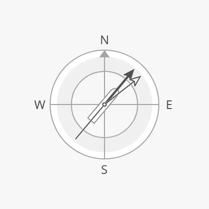
Section titled “Centre”vesselImage selects the vessel symbol in the centre, which turns with the
heading. Use a symbol seen from the top; the list of top views is on the
Compass page.
car-ferry-aft (default) |
generic-top |
cargo-top |
|---|---|---|
|
 |
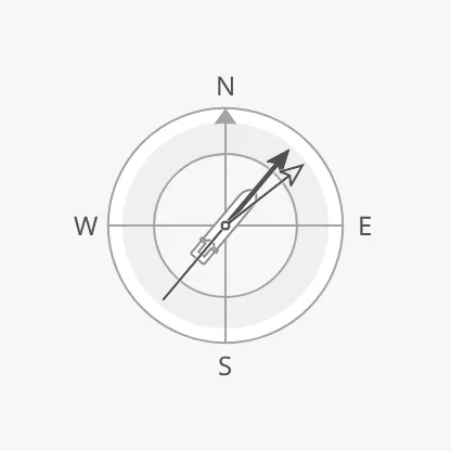 |
Note: A Heading dropped from the palette starts with
generic-top. The default for a view that never setvesselImage,car-ferry-aft, is a view from astern, which shows as a tiny symbol in the centre. SetvesselImageto a top view such asgeneric-top. A Heading without any vessel symbol is not possible.
Readouts
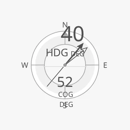
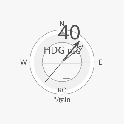
Section titled “Readouts”Instead of the vessel, the centre can show numbers. centerReadouts is a list
of readouts, each an object with a source: hdg for the heading or cog for
the course over ground. The first is drawn large at the top and the rest below
it. Each entry can also have a label, a unit and fractionDigits. The
source rot is accepted but has no value on the Heading and shows a dash.
[{source: hdg}, {source: cog}] |
[{source: hdg}, {source: rot}] |
|---|---|
 |
 |
Properties
Section titled “Properties”| Name | Description | Property Type |
|---|---|---|
| vesselImage | Vessel symbol in the centre. Default car-ferry-aft; auto draws none. Not drawn when centerReadouts has entries. |
value |
| vesselImageSrc | Your own vessel image instead of vesselImage. See Custom Vessel Image. |
object |
| centerReadouts | Readouts shown instead of the vessel, each with a source of hdg or cog. Empty by default. |
array |
Priority
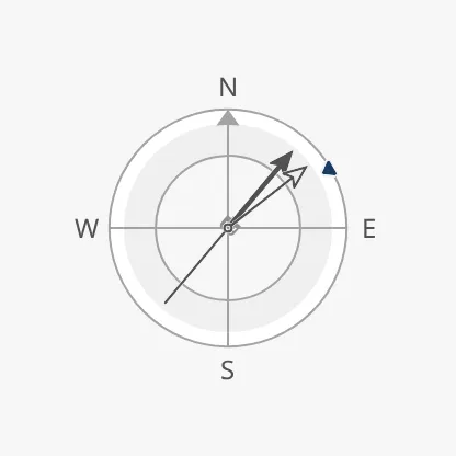
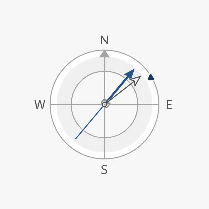
Section titled “Priority”priority works as described in Priority. With
priority enhanced, priorityElements selects which arrows get the enhanced
colour: a list of hdg and cog. A new Heading lists hdg. The setpoint is
drawn in the enhanced colour whatever the list holds. The property is only shown
when priority is enhanced.
regular (default) |
enhanced, priorityElements empty |
enhanced, priorityElements = ["hdg"] (the default) |
|---|---|---|
|
 |
 |
Properties
Section titled “Properties”| Name | Description | Property Type |
|---|---|---|
| priorityElements | Arrows drawn in the enhanced colour: hdg, cog. Default ["hdg"]. Only shown when priority is enhanced. |
array |
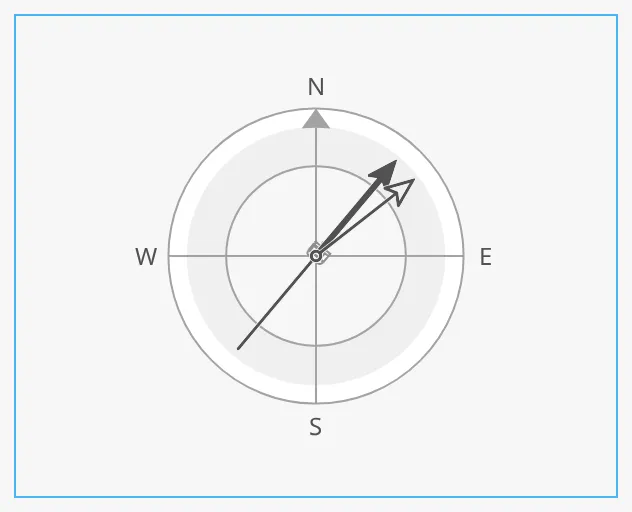
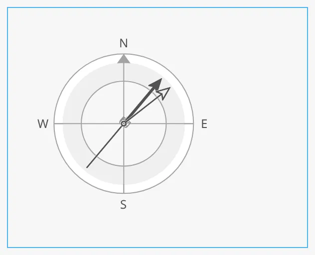
The Heading fills the component’s box and is centred in it. With
hasFaceDiameter the ring has a fixed size whatever the box; see
Size. The blue frame is the component’s box:
| Filling the box | faceDiameter = 140 |
|---|---|
 |
 |
Common Properties
Section titled “Common Properties”These work in the same way on every maritime instrument, and are described in Maritime Instruments — Common Features:
- Priority —
priority. - Size —
hasFaceDiameter,faceDiameter. - Style and Events —
style.
Component Events
Section titled “Component Events”The Heading has no component events of its own.
Examples
Section titled “Examples”Example 1 — Heading Display with a Heading Order
Section titled “Example 1 — Heading Display with a Heading Order”- Drop a Heading into the view and make it square, about 300 px.
- Set
showLabelstotrueandvesselImagetogeneric-top. - Bind
headingto[default]Nav/HeadingandcourseOverGroundto[default]Nav/COG. - Bind
headingSetpointto[default]Autopilot/HeadingOrder.
Found an error or something unclear?
Tell us what is wrong, confusing or missing on this page.
Built on the OpenBridge Design System