Navigation Bar
The Navigation Bar is the navigation menu of an application: a vertical list of the pages the operator can go to. It is found in the App - OpenBridge section of the Perspective Component Palette as Navigation Bar.
It is designed to be placed in a left dock that is opened with the navigation button of the Top Bar. See App Components — Overview for how the pieces fit together.
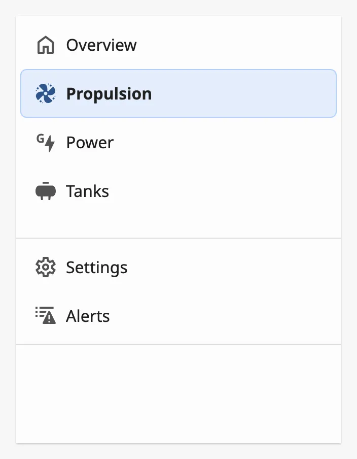
From top to bottom:
- Items — one row per page. The page the operator is on is highlighted. See Items.
- Footer — items that are kept at the bottom, below a divider. See Footer.
- Logo — an optional company logo at the very bottom. See Logo.
A Navigation Bar dropped from the palette has no items:
The Navigation Bar fills the view it is placed in. Use it as the only component of the docked view, and set the width of the dock in Page Configuration.
items is the list of pages. Each item is an object:
| Name | Description | Property Type |
|---|---|---|
| label | Text of the row. | value |
| path | URL of the page to go to, as in Page Configuration, for example /propulsion. |
value |
| icon | Icon of the row, chosen with the icon picker. Remove the property for a row without an icon. | object |
| children | Items shown under this one. Makes the item a group. | array |
| alerts | Alert counts shown as badges on the row. See Alert Badges. | object |
A click on an item navigates to its path. The item whose path is exactly the
URL of the current page is shown as selected:
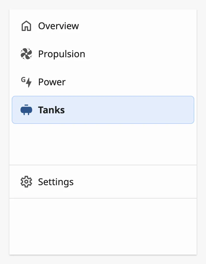
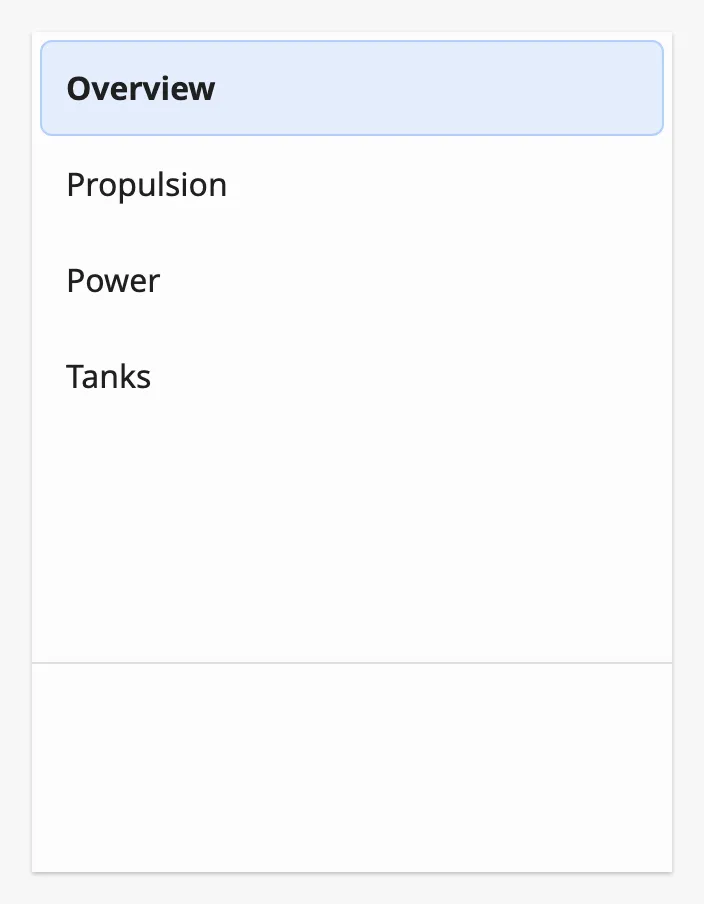
Icons are optional, but use them on either all items or none:
Groups
Section titled “Groups”An item with children is a group. A click on it does not navigate: it shows
its children, which are items of the same kind. The group is shown as selected
when one of its children is the current page.
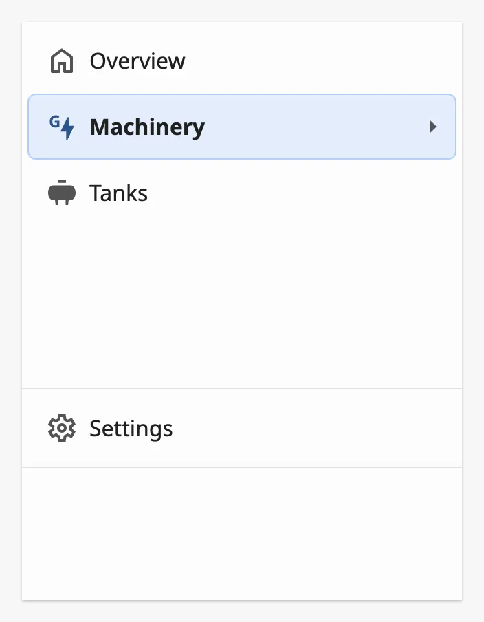
In most variants the children open in a flyout beside the menu:
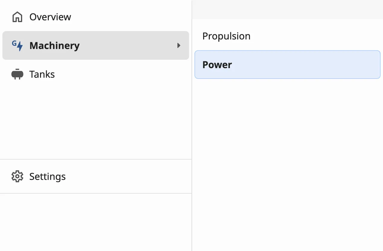
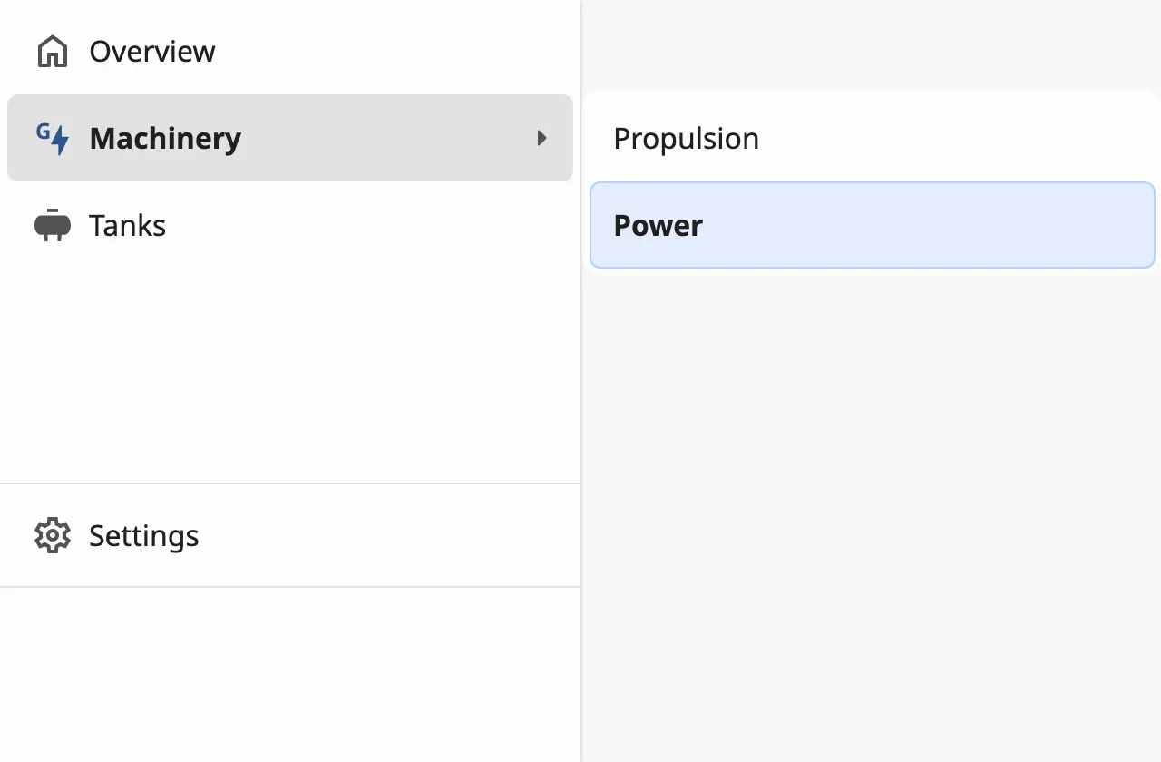
flyoutVariant sets the size of the flyout: full (above) takes the whole
height of the menu, compact is only as tall as its items:
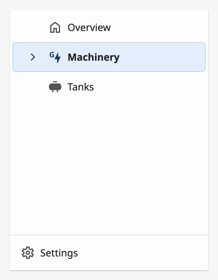
In the tree variant the children are shown inline instead,
indented under the group.
Footer
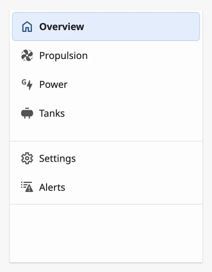
Section titled “Footer”footerItems is a second list of items, of the same form as items, shown at
the bottom of the menu below a divider. Use it for pages that are not part of
the main navigation, such as settings.
Set showAlertList to true to add an Alerts item to the footer. It
navigates to alertListPath, typically a page with the Alert List Page
component.
Properties
Section titled “Properties”| Name | Description | Property Type |
|---|---|---|
| footerItems | Items shown at the bottom of the menu. Empty by default. | array |
| showAlertList | Add an Alerts item to the footer. Default false. |
value |
| alertListPath | Page the Alerts item navigates to. Default /alarms. Only shown when showAlertList is true. |
value |
Variant
Section titled “Variant”variant selects the layout of the menu:
| variant | ||
|---|---|---|
full (default) |
Icons and labels. | 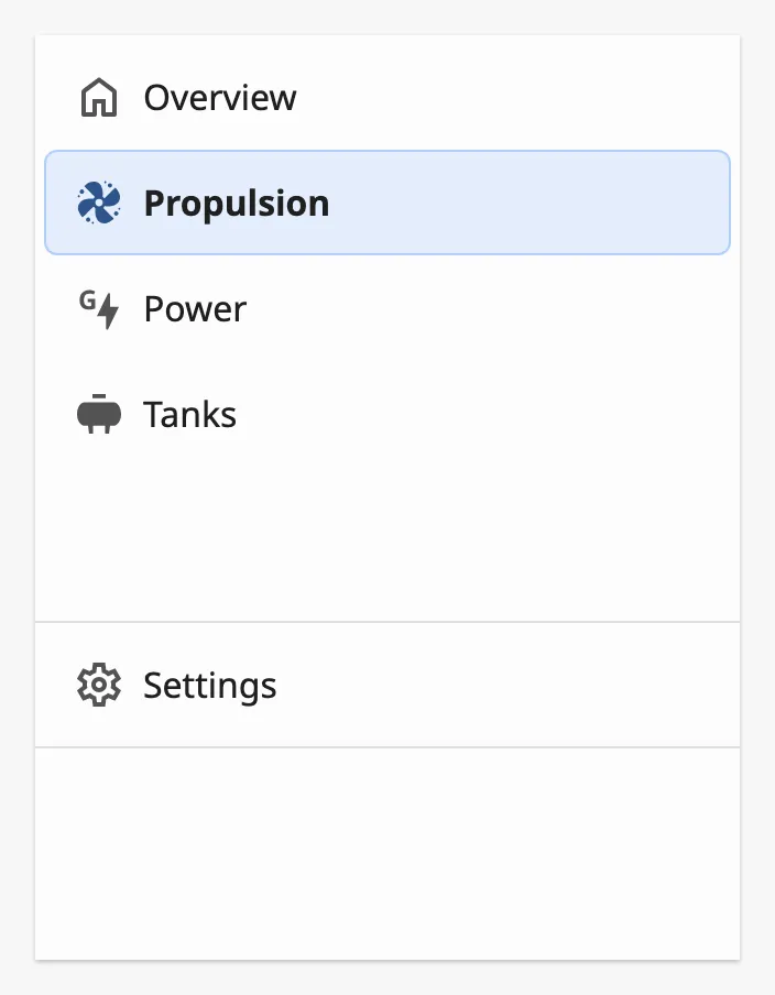 |
compact |
A narrow menu with the label under each icon. | 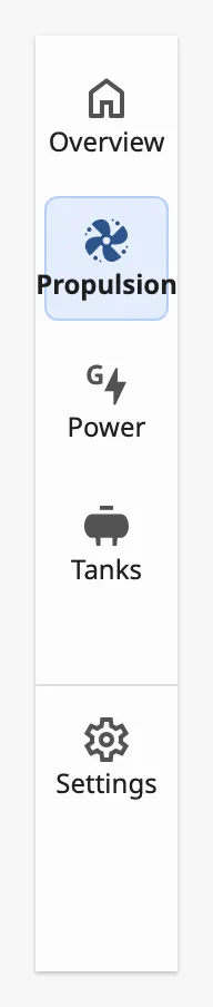 |
icon-only |
Icons only. Use it only when no item is a group. |  |
icon-only-large |
Icons only, for a menu that has groups. |  |
tree |
A tree: groups open inline and their children are indented. The only variant that shows alert badges. | 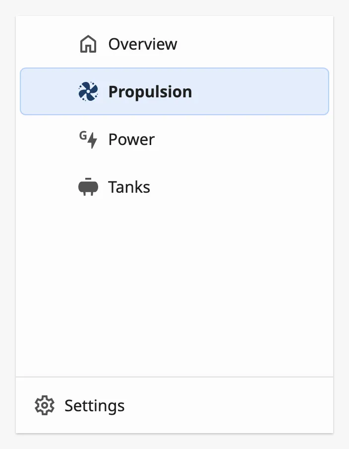 |
With the icon-only variants every item needs an icon.
A group in the tree variant:
Properties
Section titled “Properties”| Name | Description | Property Type |
|---|---|---|
| variant | full, icon-only, icon-only-large, compact or tree. Default full. |
value |
| flyoutVariant | Size of the flyout of a group: full or compact. Default full. |
value |
Alert Badges
Section titled “Alert Badges”In the tree variant an item can show how many alerts belong to its page. Set
the counts in the alerts object of the item; a badge is shown for each count
that is not zero, the most severe first.
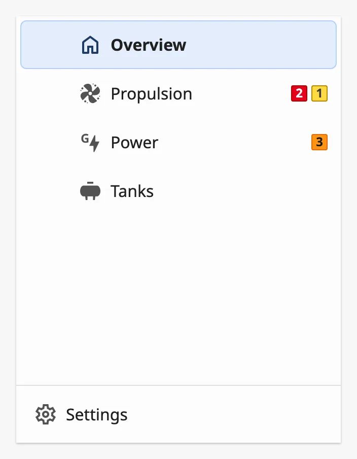
| Name | Description | Property Type |
|---|---|---|
| countLevelCritical | Number of level-critical alerts. | value |
| countLevelHigh | Number of level-high alerts. | value |
| countLevelMedium | Number of level-medium alerts. | value |
| countLevelLow | Number of level-low alerts. | value |
| countLevelDiagnostic | Number of level-diagnostic alerts. | value |
| countAlarm | Number of alarms. | value |
| countWarning | Number of warnings. | value |
| countCaution | Number of cautions. | value |
The Navigation Bar does not count alarms itself. Bind each count to an expression or a tag that holds the number.
Note: The badges are not drawn in the other variants. The
aggregateoption, meant to combine the counts into one badge, currently has no effect.
Set companyImageUrl to the URL of an image to show a company logo at the
bottom of the menu. companyImageAlt is the text read by screen readers.
Properties
Section titled “Properties”| Name | Description | Property Type |
|---|---|---|
| companyImageUrl | URL of the logo. Empty, and no logo, by default. | value |
| companyImageAlt | Alternative text of the logo. Default Company Logo. |
value |
Properties
Section titled “Properties”Properties not covered in the sections above:
| Name | Description | Property Type |
|---|---|---|
| items | The pages of the menu. See Items. Empty by default. | array |
| style | Standard Perspective style object. It currently has no effect on the Navigation Bar. | object |
Component Events
Section titled “Component Events”The Navigation Bar has no component events. It navigates by itself when the operator clicks an item.
Examples
Section titled “Examples”Example 1 — Navigation Menu in a Dock
Section titled “Example 1 — Navigation Menu in a Dock”-
Create a view
Framework/Navigationand add a Navigation Bar as its only component. -
Set
items:[{"label": "Overview", "path": "/", "icon": {"path": "openbridge/home"}},{"label": "Machinery","path": "","icon": {"path": "openbridge/generator"},"children": [{"label": "Propulsion", "path": "/propulsion"},{"label": "Power", "path": "/power"}]},{"label": "Tanks", "path": "/tanks", "icon": {"path": "openbridge/tank"}}] -
Set
showAlertListtotrue. -
In Page Configuration → Shared Settings, add a left dock with this view, Dock ID
nav, DisplayonDemand, Handlehideand Contentcover. -
On the Top Bar, set
bindNavMenuToDocktotrueandnavDocktonav.
The navigation button of the Top Bar now opens the menu, and the menu closes when the operator chooses a page.
Found an error or something unclear?
Tell us what is wrong, confusing or missing on this page.
Built on the OpenBridge Design System