Textarea Field
The Textarea Field lets the operator type several lines of text, such as a note or a log entry. It is found in the Input - OpenBridge section of the Perspective Component Palette as Textarea Field.
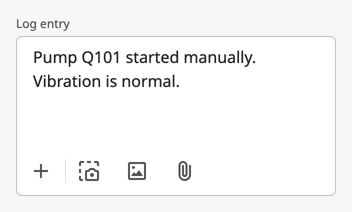
The parts of the field:
- Label — above the field. See Label.
- Text — the text itself, with an optional leading icon. See Value and Leading Icon.
- Toolbar — buttons below the text. See Toolbar.
The Textarea Field is one of the input components. How values are written back, events, disabling, icons and the behavior in the Designer are shared by all of them and are described in Input Components — Common Features. It is the multi-line sibling of the Text Input Field. This page covers what is specific to the Textarea Field.
A Textarea Field dropped from the palette is empty and has no label:
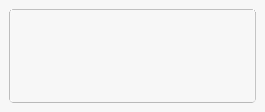
The field fills the component, in width and in height. The text scrolls when it does not fit.
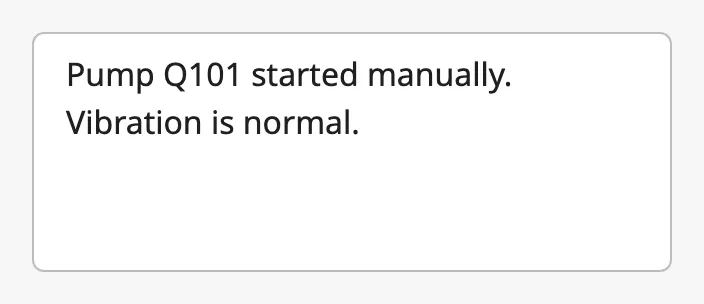
value is the text in the field. Bind it bidirectionally to a tag or property
to connect the field to it (see Values).
| Value |
|---|
 |
| Placeholder |
|---|
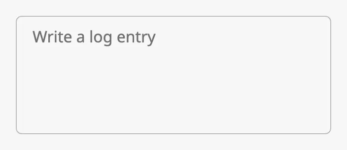 |
placeholder is a hint shown while the field is empty.
The Enter key starts a new line.
When the Value Is Written
Section titled “When the Value Is Written”deferUpdates decides when the field writes value and fires
onActionPerformed:
false(default) — for every keystroke, including each new line.true— once, when the operator leaves the field. Use it when the text goes to a tag or a database, so that a half-written text is not stored.
Updates While the Operator Types
Section titled “Updates While the Operator Types”When value is bound, the binding can write a new value while the operator is
typing, and replace what has been typed. Set rejectUpdatesWhileFocused to
true to ignore incoming values for as long as the field has focus. A value
that was ignored is not shown when the operator leaves the field either; the
field keeps the operator’s text.
Numbers and Booleans
Section titled “Numbers and Booleans”With convertToPrimitives set to true (default), text that looks like a
number, a boolean or null is converted before it is written, as on the
Text Input Field: typing 123
writes the number 123 and true writes the boolean true.
Note: For free text, set
convertToPrimitivestofalse. With the default, a text that is only a number is rewritten as that number:007becomes7in the field, and a new line typed after123is removed.
Properties
Section titled “Properties”| Name | Description | Property Type |
|---|---|---|
| value | Text in the field. Written when the operator types. Empty by default. | value |
| placeholder | Hint shown while the field is empty. | value |
| deferUpdates | Write value when the field is left, instead of for every keystroke. Default false. |
value |
| rejectUpdatesWhileFocused | Ignore values written from a binding while the field has focus. Default false. |
value |
| convertToPrimitives | Convert text that looks like a number, boolean or null before writing it. Default true. |
value |
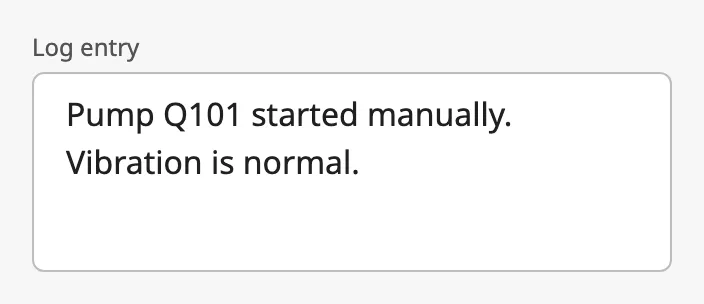
Set showLabel to true and type a label to show a text above the field.
Both are needed: the label is not shown while label is empty.
Note:
requiredcurrently has no effect: no mark is shown after the label.
Properties
Section titled “Properties”| Name | Description | Property Type |
|---|---|---|
| showLabel | Show the label. Default false. |
value |
| label | Text above the field. Only shown when showLabel is true. |
value |
| required | Meant to mark the field as required. Has no effect. Default false. |
value |
Leading Icon
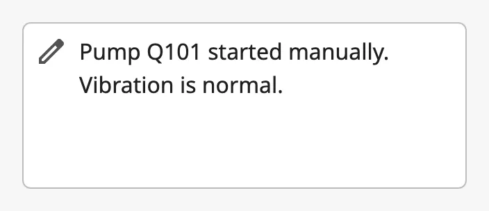
Section titled “Leading Icon”Set hasLeadingIcon to true to show an icon before the first line of text.
leadingIcon is chosen with the icon picker. See Icons.
Properties
Section titled “Properties”| Name | Description | Property Type |
|---|---|---|
| hasLeadingIcon | Show an icon at the start of the text. Default false. |
value |
| leadingIcon | The icon, chosen with the icon picker. Only shown when hasLeadingIcon is true. |
object |
Toolbar
Section titled “Toolbar”Set showToolbar to true to show a row of buttons below the text. The toolbar
takes about 48 px of the component’s height.
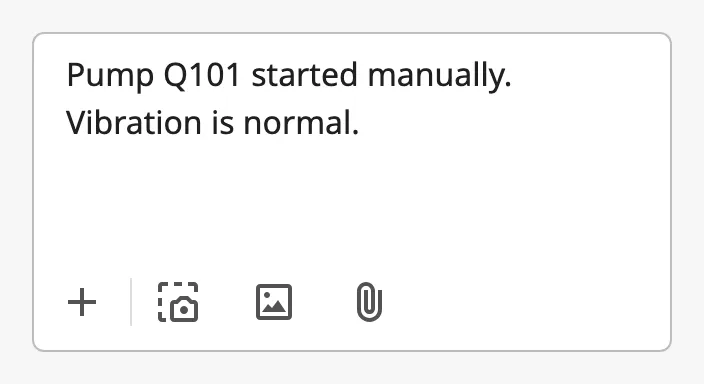
The buttons do nothing by themselves. Three of them fire a component event, and a script on that event decides what happens:
| Button | Event |
|---|---|
| + (add) | None. A click on this button cannot be handled. |
| Screenshot | onScreenshotClick |
| Image | onImageClick |
| Attachment | onAttachmentClick |
The component cannot show attached files. Show them elsewhere in the view, for instance in a list below the field.
Properties
Section titled “Properties”| Name | Description | Property Type |
|---|---|---|
| showToolbar | Show the toolbar below the text. Default false. |
value |
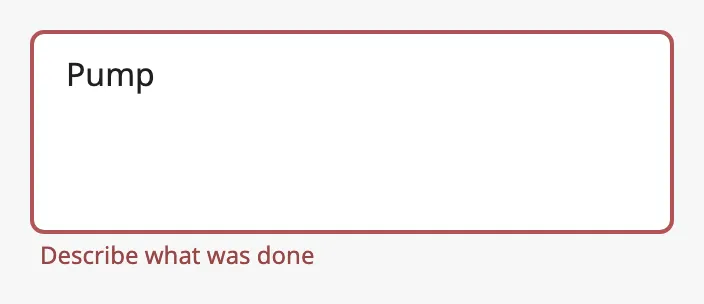
Set error to true to show the field as invalid, with a red border.
errorText is shown below the field.
With errorText |
|---|
 |
| Without |
|---|
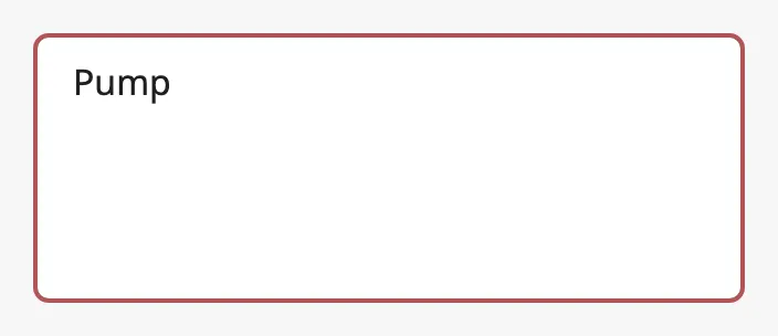 |
The field does not validate the text itself. Bind error to an expression that
checks it (see Example 2).
Properties
Section titled “Properties”| Name | Description | Property Type |
|---|---|---|
| error | Show the field as invalid. Default false. |
value |
| errorText | Text shown below the field. Only shown when error is true. |
value |
Disabled
Section titled “Disabled”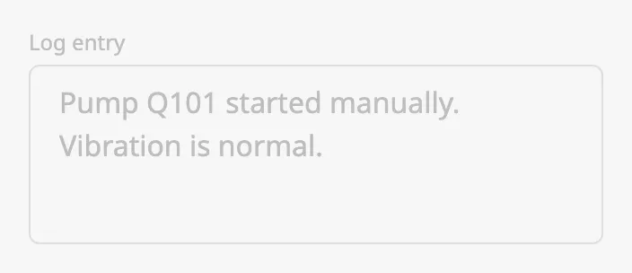
A disabled field cannot be typed in, and its toolbar buttons fire no events. See Disabled.
Common Properties
Section titled “Common Properties”These work in the same way on every input component, and are described in Input Components — Common Features:
- Disabled —
disabled. - Icons — how to choose
leadingIcon. - Appearance —
style.
Component Events
Section titled “Component Events”| Event | Description | Event Object |
|---|---|---|
| onActionPerformed | Fired when value is written: for every keystroke, or when the field is left when deferUpdates is true. |
— |
| onScreenshotClick | Fired when the screenshot button in the toolbar is clicked. | — |
| onImageClick | Fired when the image button in the toolbar is clicked. | — |
| onAttachmentClick | Fired when the attachment button in the toolbar is clicked. | — |
| onSendClick | Not fired: the field has no send button. | — |
See Events.
Examples
Section titled “Examples”Example 1 — Log Entry
Section titled “Example 1 — Log Entry”- Drop a Textarea Field into the view and make it about 320 × 120 px.
- Set
showLabeltotrueandlabeltoLog entry. - Set
convertToPrimitivestofalse, so the text is stored as typed. - Set
deferUpdatestotrue, so the text is written when the operator leaves the field. - Bind
valueto a custom property of the view, for exampleview.custom.logEntry, and enable Bidirectional. - Add a Button labelled
Savebelow the field, and storeself.view.custom.logEntryfrom a script on itsonActionPerformedevent. The click on the button takes the focus from the field, so the text has been written when the script runs.
Example 2 — Require a Text
Section titled “Example 2 — Require a Text”With the field from Example 1:
- Bind
errorto the expressionlen(trim({view.custom.logEntry})) = 0. - Set
errorTexttoDescribe what was done.
Found an error or something unclear?
Tell us what is wrong, confusing or missing on this page.
Built on the OpenBridge Design System