Gauge Radial
The Gauge Radial shows a value on an arc-shaped scale, as a filled arc, a bar or a needle. It is a general-purpose gauge for any quantity: load, pressure, level, temperature. It is found in the Maritime - OpenBridge section of the Perspective Component Palette as Gauge Radial.
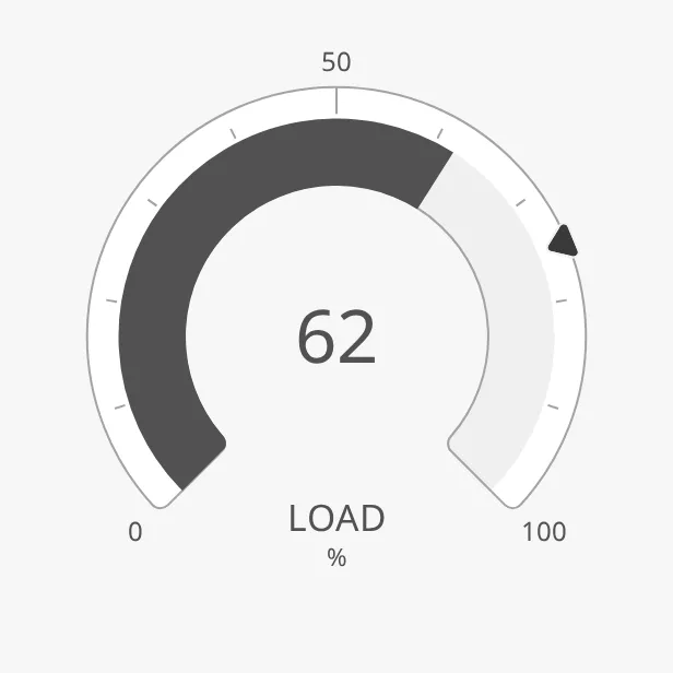
The parts of the gauge:
- Scale — the arc from
minValuetomaxValue, with tickmarks and labels. See Range and Scale. - Value — the filled arc, bar or needle. See Type.
- Readout — the value as a number, with a label and a unit. See Readout.
- Setpoint — a marker on the scale. See Setpoint.
The Gauge Radial is one of the maritime instruments. State, priority, the setpoint, advice zones, the scale and sizing are shared by all of them and are described in Maritime Instruments — Common Features. This page covers what is specific to the Gauge Radial. For a small symbol of the same kind, see the Gauge Radial Indicator.
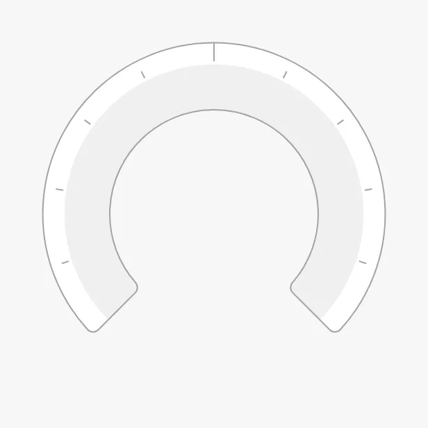
A Gauge Radial dropped from the palette shows 0 on a scale from 0 to 100, without labels:
Range and Scale
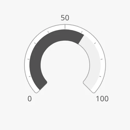
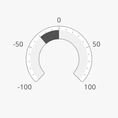
Section titled “Range and Scale”Bind value to the quantity to show. minValue and maxValue are the ends of
the scale; the range always spans the whole arc. With a range that is symmetric
around zero, zero is at the top and the value grows to either side:
0 to 100, value = 62 |
−100 to 100, value = -30 |
Tickmarks every 25, 5 and 1 |
|---|---|---|
 |
 |
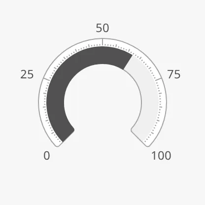 |
The tickmarks are on from the start: primaryTickmarkInterval (default 50)
sets the long, labelled ones and secondaryTickmarkInterval (default 10) the
medium ones. Turn on the short ones with hasTertiaryTickmarkInterval. The
labels need showLabels to be true. See also Scale.
Properties
Section titled “Properties”| Name | Description | Property Type |
|---|---|---|
| value | The value. Default 0. |
value |
| minValue | Lowest value of the scale. Default 0. |
value |
| maxValue | Highest value of the scale. Default 100. |
value |
| primaryTickmarkInterval | Distance between the long, labelled tickmarks. Default 50. |
value |
| secondaryTickmarkInterval | Distance between the medium tickmarks. Default 10. |
value |
| hasTertiaryTickmarkInterval | Show short tickmarks. Default false. |
value |
| tertiaryTickmarkInterval | Distance between the short tickmarks. Only shown when hasTertiaryTickmarkInterval is true. |
value |
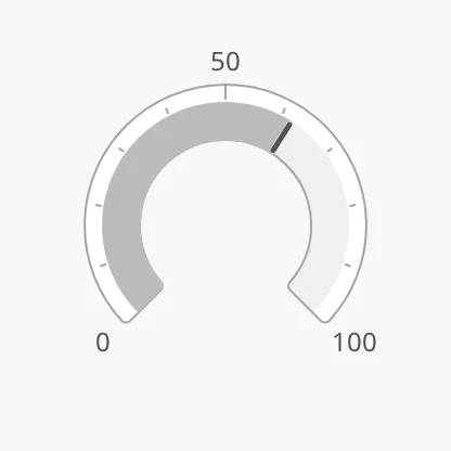
type selects how the value is drawn:
filled (default) |
bar |
needle |
|---|---|---|
|
 |
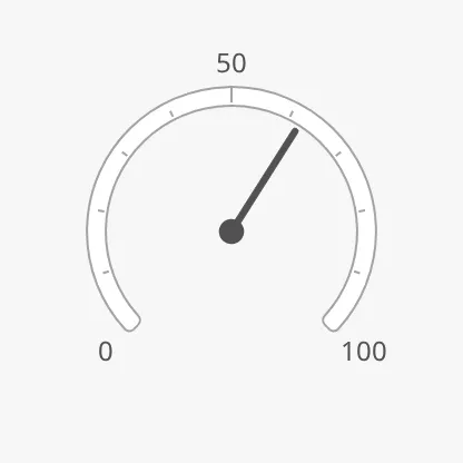 |
filled— a solid arc from the start of the scale (or from zero) to the value.bar— a lighter arc with a marker line at the value.needle— a pointer from the centre.
Properties
Section titled “Properties”| Name | Description | Property Type |
|---|---|---|
| type | filled, bar or needle. Default filled. |
value |
Sector
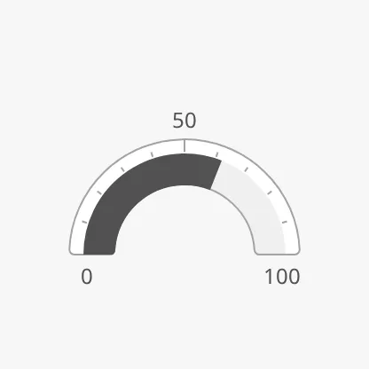
Section titled “Sector”sector selects how much of a circle the scale covers:
270 (default) |
180 |
|---|---|
|
 |
90-left |
90-right |
|---|---|
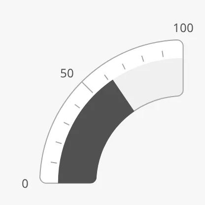 |
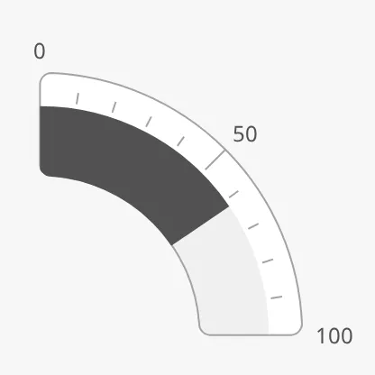 |
The quarter circles are for placing gauges in the corners of a layout, or two of them side by side. Advice zones are not drawn on them.
Properties
Section titled “Properties”| Name | Description | Property Type |
|---|---|---|
| sector | 270, 180, 90-left or 90-right. Default 270. |
value |
Readout
Section titled “Readout”Set hasReadout to true to show the value as a number, with label and
unit below it. fractionDigits is the number of decimals. Where the readout
goes depends on sector and type:
| 270°, filled | 180°, filled | 270°, needle |
|---|---|---|
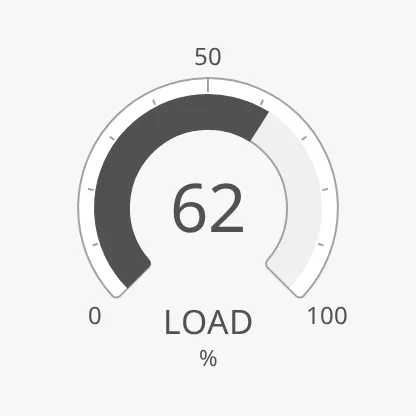 |
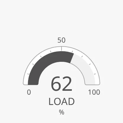 |
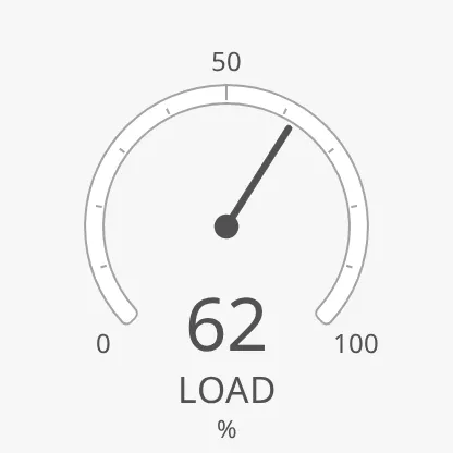 |
In a quarter circle the readout sits in the free corner:
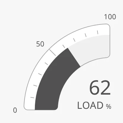
A needle gauge with sector 180, 90-left or 90-right has no readout.
Properties
Section titled “Properties”| Name | Description | Property Type |
|---|---|---|
| hasReadout | Show the value as a number. Default false. |
value |
| label | Text under the number, for example LOAD. Empty by default. |
value |
| unit | Unit after the label, for example %. Empty by default. |
value |
| fractionDigits | Number of decimals in the readout. Default 0. |
value |
Setpoint and Advice Zones
Section titled “Setpoint and Advice Zones”The setpoint works as described in Setpoint:
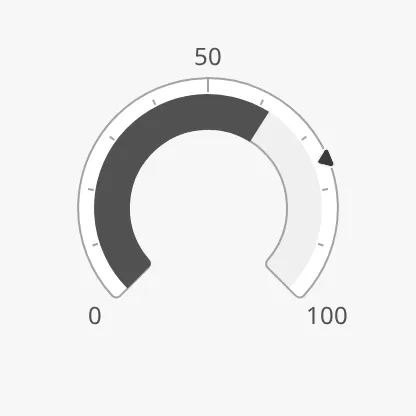
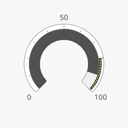
advices is a list of advice zones, with the ends
of a zone in the unit of the scale:
[{"category": "caution", "min": 80, "max": 100}]A zone you add in the Property Editor starts with category, min, max and
state filled in. Views made with earlier versions use minValue and
maxValue for the ends; they still work.
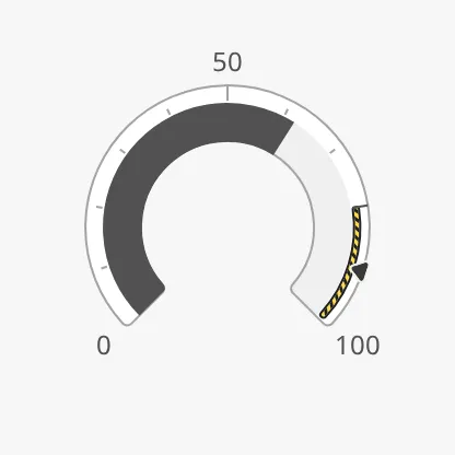
A zone is triggered when the value or the setpoint is inside it. Earlier
versions triggered it by the value only; set adviceTrigger to value to keep
that:
| Zone from 80 to 100 | Value (90) inside the zone | Setpoint (90) inside the zone |
|---|---|---|
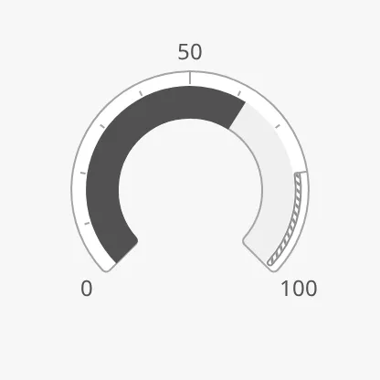 |
 |
 |
State and Priority
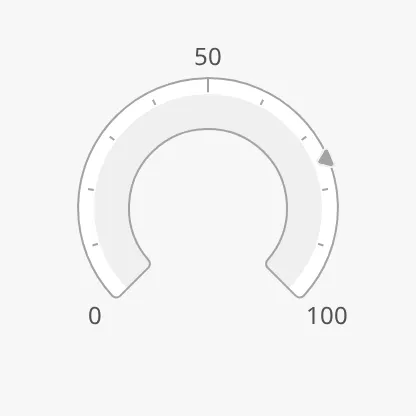
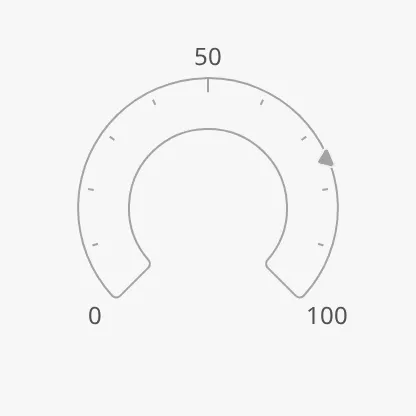
Section titled “State and Priority”active |
loading |
off |
|---|---|---|
|
 |
 |
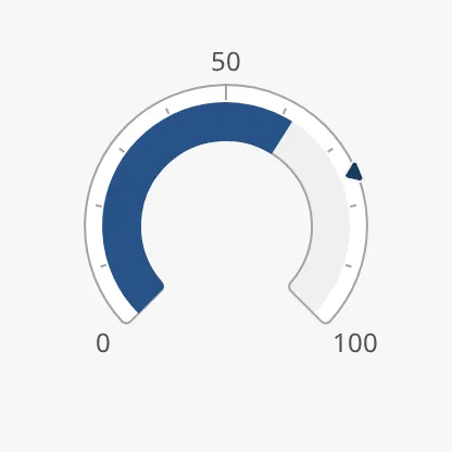
priority = regular |
priority = enhanced |
|---|---|
|
 |
Size and Alignment
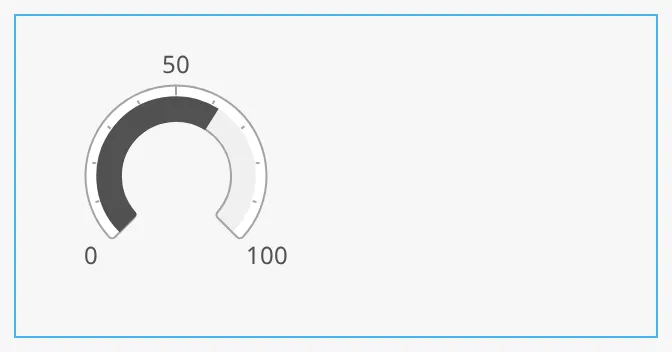
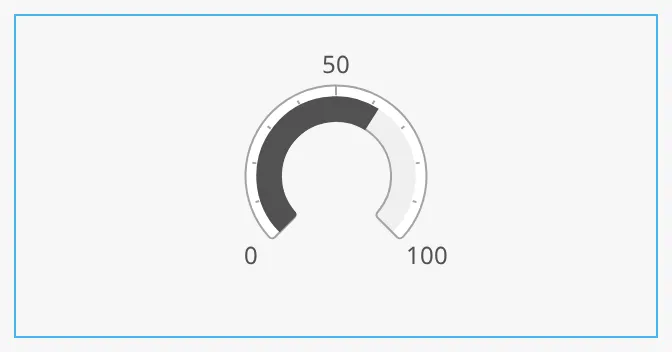
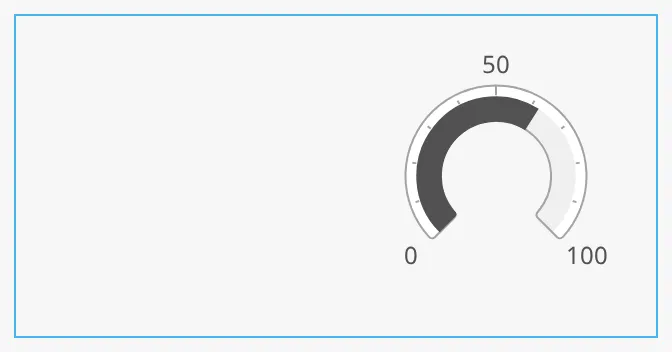
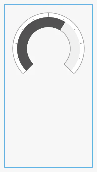
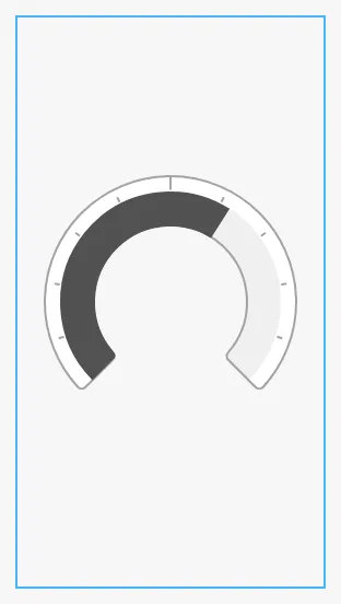
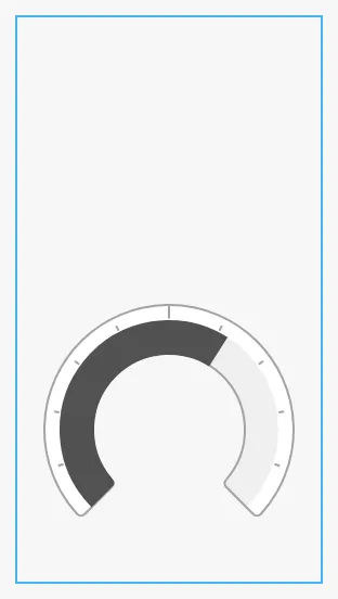
Section titled “Size and Alignment”The gauge fills the component’s box, as described in Size:
it grows until it touches the shorter side of the box. In a box that is wider
than tall, horizontalAlignment places it to the left, centre or right; in a
box that is taller than wide, verticalAlignment places it at the top, centre
or bottom. The blue frame is the component’s box:
left |
center (default) |
|---|---|
 |
 |
right |
|---|
 |
top |
center (default) |
bottom |
|---|---|---|
 |
 |
 |
Properties
Section titled “Properties”| Name | Description | Property Type |
|---|---|---|
| horizontalAlignment | Place the gauge in a wide box: left, center or right. Default center. |
value |
| verticalAlignment | Place the gauge in a tall box: top, center or bottom. Default center. |
value |
Common Properties
Section titled “Common Properties”These work in the same way on every maritime instrument, and are described in Maritime Instruments — Common Features:
- State —
state. - Priority —
priority. - Setpoint —
hasSetpoint,setpoint,autoAtSetpoint,autoAtSetpointDeadband,atSetpoint,touching,hasNewSetpoint,newSetpoint,animateSetpoint,setpointAtZeroDeadband,setpointOverride. - Advice Zones —
advices,adviceTrigger,adviceEmphasis(see above). - Scale —
showLabels,tickmarksInside,tickmarkStyle. - Size —
hasFaceDiameter,faceDiameter. - Style and Events —
style.
Component Events
Section titled “Component Events”The Gauge Radial has no component events of its own.
Examples
Section titled “Examples”Example 1 — Main Engine Load
Section titled “Example 1 — Main Engine Load”- Drop a Gauge Radial into the view and make it 200 × 200 px.
- Bind
valueto[default]Engine/ME1/Load. - Set
showLabelstotrue,primaryTickmarkIntervalto25andsecondaryTickmarkIntervalto5. - Set
hasReadouttotrue,labeltoLOADandunitto%. - Set
advicesto[{"category": "caution", "min": 85, "max": 100}], so the zone lights up when the load goes above 85 %.
Found an error or something unclear?
Tell us what is wrong, confusing or missing on this page.
Built on the OpenBridge Design System