Alert Subsystem Button
The Alert Subsystem Button shows the alarms of one part of the plant — an engine, the HVAC, a switchboard — as a split button: the left half shows the subsystem’s name and one badge per alarm priority, the right half is a shortcut to its alert list page. It is found in the App - OpenBridge section of the Perspective Component Palette as Alert Subsystem Button (Experimental).
Note: This component is experimental: its properties may change in a later version.
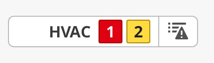
From left to right:
- Icon — optional,
hasIconandicon. - Label — the subsystem’s name,
label. - Badges — one per alarm priority with alarms, with the count inside. Clicking this half opens the Alert Menu.
- List button — fires
onAlertListClickand navigates toalertListPath. See The List Half.
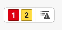
A fresh button has no label and no icon:
Which Alarms Are Counted
Section titled “Which Alarms Are Counted”The button reads alarms from the gateway alarm system directly; no binding is
needed. Use the filter property to select the subsystem’s alarms, in the same
way as the Top Bar and the Alarm Status
Table: filter.conditions.source or filter.conditions.displayPath with the
subsystem’s tag folder, for example *Engine1*. filter.states and
filter.priorities work as on the Top Bar; every priority the filter lets
through gets a badge, diagnostic included.
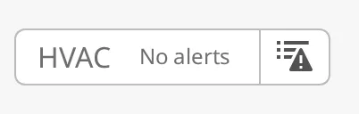
While nothing is counted, the button shows emptyText instead of the badges:
maxAlerts (default 50) limits how many alarms are sent to the menu; the
badges still count every alarm that matches the filter.
Properties
Section titled “Properties”| Name | Description | Property Type |
|---|---|---|
| label | The subsystem’s name, before the badges. Default empty. | value |
| emptyText | Text shown instead of the badges while the subsystem has no alarms. Default No alerts. |
value |
| hasIcon | Show an icon before the label. Default false. |
value |
| icon | The icon, an icon picker object. Only shown when hasIcon is true. |
object |
| maxAlerts | Most alarms sent to the menu. Default 50, at most 1000. Large values slow down the client. |
value |
| filter | Gateway-side alarm filter, as on the Top Bar. | object |
icon sub-properties:
| Name | Description | Property Type |
|---|---|---|
| path | Path of the icon, for example openbridge/placeholder. |
value |
| useCssColor | Draw the icon in its own OpenBridge palette colours instead of the text colour. Default false. |
value |
Alert Menu
Section titled “Alert Menu”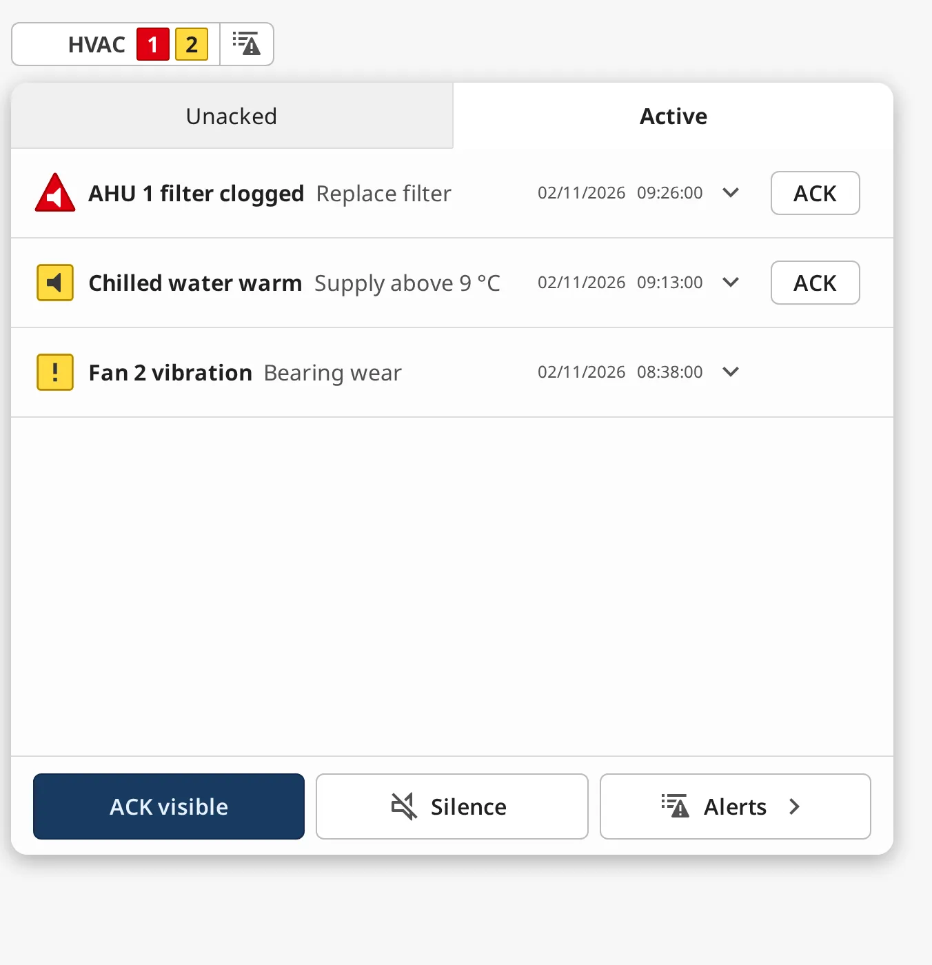
Clicking the counts half opens the same Alert Menu the Top Bar has, listing
the subsystem’s alarms with the most recent first, in the Unacked and
Active tabs, with ACK visible, Silence and Alerts › at the
bottom. It closes on Escape, on a click outside it, or on a second click on
the counts. Everything in it works as described for the
Top Bar’s Alert Menu: acknowledging follows
canAcknowledge, allowAlertAcknowledge and alertConvention; Silence
fires onAlertSilenceClick; Alerts › does what the list half does.
Note: In the Designer, the menu only opens in Preview Mode.
Properties
Section titled “Properties”| Name | Description | Property Type |
|---|---|---|
| allowAlertAcknowledge | Show the ACK and ACK visible buttons. Default true. |
value |
| canAcknowledge | Whether the operator may acknowledge alarms from this component. When false, acknowledge is hidden and the gateway rejects acknowledge requests. Default true. |
value |
| alertConvention | Which alarms can be acknowledged: levels or bam. Default levels. |
value |
| titleSource | Alarm field used as the title: label, name, notes or displayPath. Default label. |
value |
| descriptionSource | Alarm field used as the description. Default notes. |
value |
| dateFormat | Format of alarm times, for example DD/MM/YYYY HH:mm:ss. |
value |
| showTimeInUtc | Show alarm times in UTC instead of the local time zone. Default false. |
value |
| showAlertListButton | Show the Alerts › button in the menu. Default true. |
value |
| showAlertSilenceButton | Show the Silence button in the menu, which fires onAlertSilenceClick. Default true. |
value |
The List Half
Section titled “The List Half”The right half, with the alert list icon, is for jumping to the subsystem’s
own alert list page, typically a page with an Alert List Page component
filtered to the same alarms. A click fires the onAlertListClick event and
then navigates to alertListPath; leave the path empty to only fire the event
and navigate from a script.
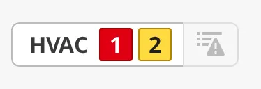
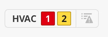
Either half can be disabled on its own, or both with disabled:
listDisabled |
disabled |
|---|---|
 |
 |
Properties
Section titled “Properties”| Name | Description | Property Type |
|---|---|---|
| alertListPath | Page the list half and the Alerts › button navigate to. Default /alarms. Empty: event only. |
value |
| disabled | Disable both halves. Default false. |
value |
| counterDisabled | Disable the counts half alone. Default false. Only shown when disabled is false. |
value |
| listDisabled | Disable the list half alone. Default false. Only shown when disabled is false. |
value |
Properties
Section titled “Properties”| Name | Description | Property Type |
|---|---|---|
| style | Standard Perspective style object. | object |
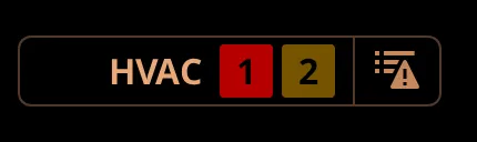
The colours follow the OpenBridge palette of the session:
Component Events
Section titled “Component Events”| Event | Description | Event Object |
|---|---|---|
| onAlertListClick | Fired when the list half or Alerts › in the menu is clicked, before navigating to alertListPath. |
— |
| onAlertSilenceClick | Fired when the operator clicks Silence in the menu. Silencing the audible alarm is done by your script. | — |
Examples
Section titled “Examples”Example 1 — One Button per Engine
Section titled “Example 1 — One Button per Engine”- Drop an Alert Subsystem Button into a Flex Container and set
labeltoEngine 1. - Set
filter.conditions.sourceto*Engine1*, the folder of the engine’s alarm tags. - Set
alertListPathto/alarms/engine1, a page with an Alert List Page whose filter uses the same source path. - Repeat for
Engine 2with*Engine2*. Each button counts its own alarms, opens its own menu, and jumps to its own list.
Found an error or something unclear?
Tell us what is wrong, confusing or missing on this page.
Built on the OpenBridge Design System