Indicator Graph
The Indicator Graph is a plain trend line of recent values, without axes or a frame, with a dot at the latest value. It fills the component’s box, so it can be a small symbol or a wide strip under a readout. It is found in the Chart - OpenBridge section of the Perspective Component Palette as Indicator Graph (Beta).
Note: This component is in beta: its properties may change in a later version.
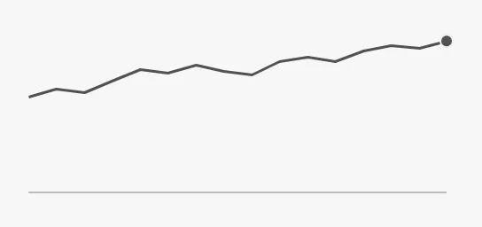
- Line — the values in
data. See Data. - Dot — the latest value, at the right edge. See Data.
- Zero line — a thin line at the value
0. See Zero Line.
A new Indicator Graph has a box of 128 × 128 px and shows example data, so it is visible in the Designer before it is bound. The blue frame is the component’s box:
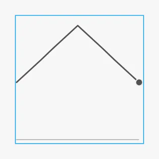
For a fixed-size trend symbol with a frame, see the Graph Mini.
data holds the points of the graph. It can be:
-
an object with two lists of the same length,
xValues(the time or position of each point) andyValues(the values). A new component has{"xValues": [0, 1, 2, 3, 4, 5, 6, 7, 8, 9, 10],"yValues": [5, 6, 7, 8, 9, 10, 9, 8, 7, 6, 5]} -
a dataset, for example from a Tag History binding. The first date column (or else the first column) is the time, and the first other column that is not a date is the value. A dataset with a single value column is drawn against the row number;
-
a list of objects with
xandy; -
a list of numbers, which are the values in order.
The points are placed from left to right by their xValues, so uneven gaps in
time show as uneven gaps in the line. The latest value is marked with the dot.
Note: The images on this page were made with the object form of
data. The dataset form was not tried for this page.
Properties
Section titled “Properties”| Name | Description | Property Type |
|---|---|---|
| data | The points: an object with xValues and yValues, a dataset, or a list of points or numbers. Example data by default. |
object |
Size and Priority
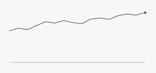
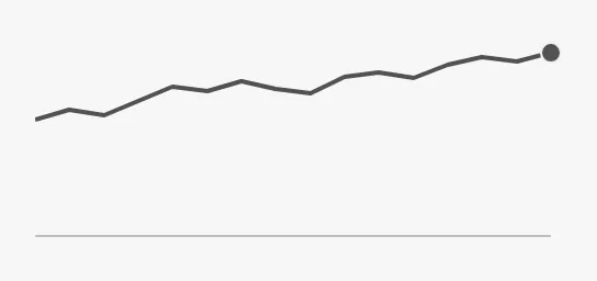
Section titled “Size and Priority”layout.size sets the width of the line and the size of the dot. It does not
change the size of the graph, which always fills the box:
| layout.size | |
|---|---|
small |
 |
medium (default) |
|
large |
 |
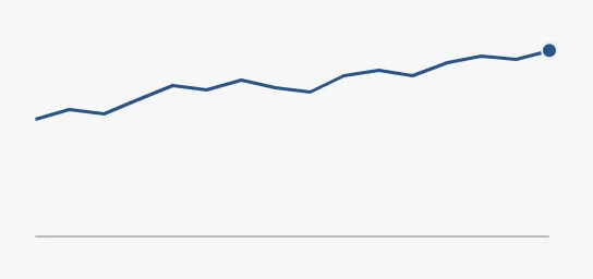
layout.priority sets the colour of the line and the dot:
| layout.priority | |
|---|---|
regular (default) |
|
enhanced |
 |
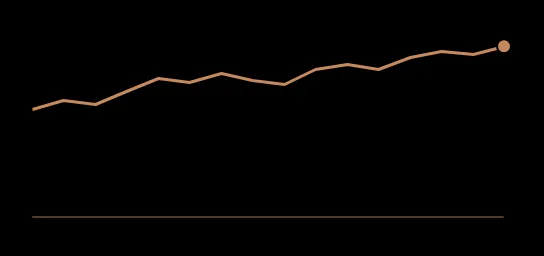
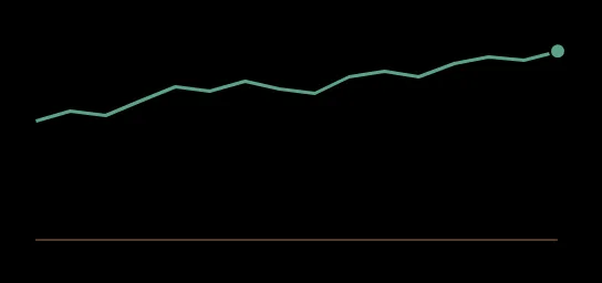
The colours follow the OpenBridge palette of the session. In the night palette,
regular and enhanced:
Night, regular |
Night, enhanced |
|---|---|
 |
 |
Properties
Section titled “Properties”| Name | Description | Property Type |
|---|---|---|
| layout | Look of the graph; the sub-properties below. | object |
| layout.size | Width of the line and size of the dot: small, medium or large. Default medium. |
value |
| layout.priority | Colour of the line: regular or enhanced. Default regular. |
value |
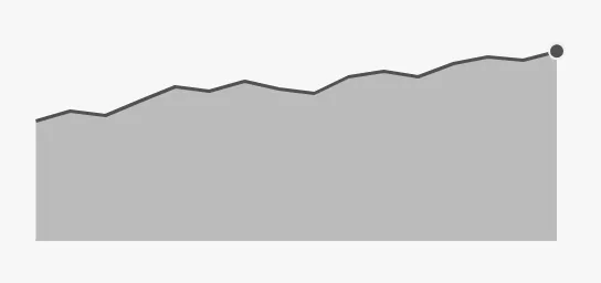
layout.fill shades the area between the line and the bottom of the graph. The
shading is always the regular grey tint, also with layout.priority
enhanced:
| layout.fill | |
|---|---|
false (default) |
|
true |
 |
Properties
Section titled “Properties”| Name | Description | Property Type |
|---|---|---|
| layout.fill | Shade the area under the line. Default false. |
value |
Zero Line
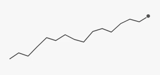
Section titled “Zero Line”layout.y.showZeroLine draws a thin line at the value 0. While it is on and
no minimum is set, the range always includes 0, so values far from zero
make a flat line near the top. Turn it off to let the range follow the data,
so that small changes fill the graph. The values 12 to 19:
| layout.y.showZeroLine | |
|---|---|
true (default) |
|
false |
 |
With values above and below zero, the zero line is drawn inside the graph, at
the height of 0:
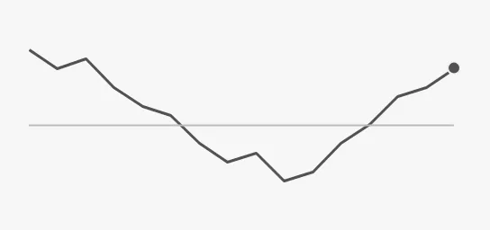
The zero line is only drawn when 0 is inside the range.
Properties
Section titled “Properties”| Name | Description | Property Type |
|---|---|---|
| layout.y | Vertical range; the sub-properties below and in Range. | object |
| layout.y.showZeroLine | Draw a line at 0, and keep 0 in the range. Default true. |
value |
By default the range runs from a little below the lowest value (or from 0,
see Zero Line) to a little above the highest. Set
layout.y.hasMin and layout.y.min, and layout.y.hasMax and
layout.y.max, to fix the bottom and top of the range, for example to the
measuring range of a sensor. min is only shown when hasMin is true, and
max only when hasMax is true.
| Range | |
|---|---|
min = 0, max = 40 |
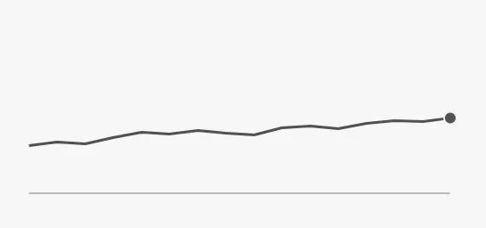 |
min = 0, max = 18, the latest value is 19 |
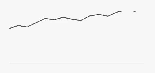 |
Values outside the range are cut off at the edge of the graph. When the latest value is outside the range, the dot is not drawn.
Properties
Section titled “Properties”| Name | Description | Property Type |
|---|---|---|
| layout.y.hasMin | Fix the bottom of the range at layout.y.min. Default false. |
value |
| layout.y.min | Value at the bottom of the graph. Default 0. Only shown when hasMin is true. |
value |
| layout.y.hasMax | Fix the top of the range at layout.y.max. Default false. |
value |
| layout.y.max | Value at the top of the graph. Default 100. Only shown when hasMax is true. |
value |
The graph fills the component’s box, whatever its shape. The blue frame is the component’s box:
| Box | |
|---|---|
| 128 × 128 | 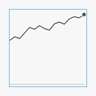 |
| 320 × 64 | 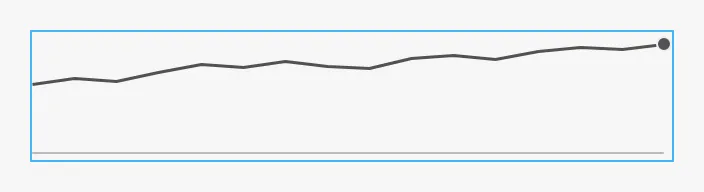 |
Properties
Section titled “Properties”| Name | Description | Property Type |
|---|---|---|
| style | Standard Perspective style object. | object |
Component Events
Section titled “Component Events”The Indicator Graph has no component events of its own.
Examples
Section titled “Examples”Example 1 — Trend under a Readout
Section titled “Example 1 — Trend under a Readout”- Drop an Indicator Graph under the readout of the value and make its box 240 × 64.
- Add a Tag History binding to
data, for the tag[default]Pump01/Pressure, a Realtime range of 60 minutes and a polling rate of, for example, 10 seconds. - Set
layout.y.showZeroLinetofalseso that the line uses the full height.
The binding returns a dataset with a date column (t_stamp) and a value
column, which the Indicator Graph reads as time and value.
Example 2 — Heel Angle around Zero
Section titled “Example 2 — Heel Angle around Zero”- Drop an Indicator Graph and make its box 240 × 96.
- Add a Tag History binding to
datafor[default]Ship/Heel, with a Realtime range of 10 minutes. - Keep
layout.y.showZeroLineattrue, and setlayout.y.hasMintotrue,layout.y.minto-10,layout.y.hasMaxtotrueandlayout.y.maxto10, so that the zero line is in the middle.
Note: These examples were written from the component’s code and were not tried in a gateway.
Found an error or something unclear?
Tell us what is wrong, confusing or missing on this page.
Built on the OpenBridge Design System