Slide Button
The Slide Button is a slide-to-confirm button: the operator must drag its handle to the end of the track to perform the action. Use it for actions that must not be started by an accidental click, such as stopping a machine. It is found in the Input - OpenBridge section of the Perspective Component Palette as Slide Button (Experimental).
Note: This component is experimental: its properties may change in a later version.
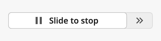
- Handle with an icon and a label — see Label and Icon.
- Track with arrows that show the direction to slide — see Sliding.
The Slide Button is one of the input components. Events, disabling, icons and the behavior in the Designer are shared by all of them and are described in Input Components — Common Features. This page covers what is specific to the Slide Button.
A Slide Button with default properties. The blue frame is the component’s box:
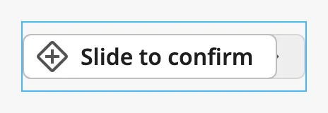
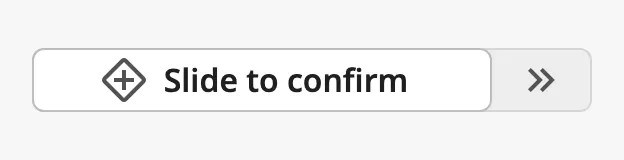
A new Slide Button is 200 px wide, which is too narrow for its default label and icon: the arrows at the end of the track are cut off. Make the component wider; at 280 px it looks like this:
Sliding
Section titled “Sliding”The Slide Button has no value. The operator presses the handle, drags it to the right and releases it:
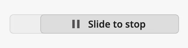
- When the handle is released at 80 % of the way or more, the component
fires the
onActionPerformedevent once. The handle then returns to the start. - When the handle is released earlier, it returns to the start and nothing happens.
- A click on the button without dragging does nothing.
With the keyboard, the operator moves focus to the handle with Tab and presses Enter or Space. This fires the event in the same way as a completed slide.
A disabled Slide Button cannot be slid and does not fire the event.
Disable After Use
Section titled “Disable After Use”Set autoDisable to true to make the button disable itself after a completed
slide, so that the action cannot be repeated by sliding again. The button is
then drawn as disabled and ignores further slides.
Note: The component does not change the
disabledproperty when it disables itself; the property staysfalse. To control from a tag or a script when the button can be used, leaveautoDisableatfalseand binddisabledinstead (see Example 1).
Properties
Section titled “Properties”| Name | Description | Property Type |
|---|---|---|
| autoDisable | Disable the button after a completed slide. Default false. |
value |
Label and Icon
Section titled “Label and Icon”label is the text on the handle. Keep it short and say what sliding does, for
example Slide to stop.
The handle shows an icon before the label when hasLeadingIcon is true.
icon is an icon picker: choose the icon in the property editor, which sets
icon.path. See Icons.
| hasLeadingIcon | Image |
|---|---|
true (default) |
|
false |
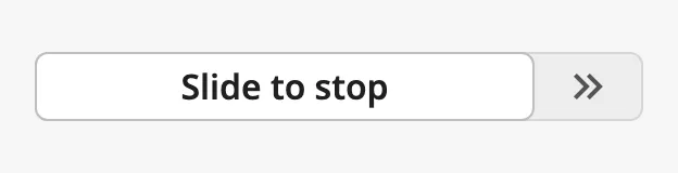 |
Properties
Section titled “Properties”| Name | Description | Property Type |
|---|---|---|
| label | Text on the handle. Default Slide to confirm. |
value |
| hasLeadingIcon | Show an icon before the label. Default true. |
value |
| icon | The icon on the handle. An icon picker; see icon.path. Only shown when hasLeadingIcon is true. |
object |
| icon.path | Path of the icon. Default openbridge/placeholder. |
value |
The button fills the width of the component. Set hugContent to true to make
it only as wide as its label and icon need. The blue frame in the images is the
component’s box:
| hugContent | Image |
|---|---|
false (default) |
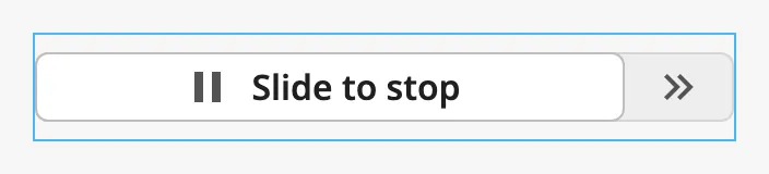 |
true |
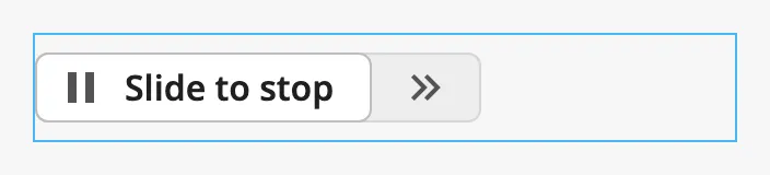 |
With hugContent set to true the button can become wider than the component’s
box when the box is narrower than the label needs.
Properties
Section titled “Properties”| Name | Description | Property Type |
|---|---|---|
| hugContent | Make the button only as wide as its content needs. Default false. |
value |
Disabled
Section titled “Disabled”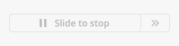
See Disabled for the disabled property, which works in
the same way on every input component.
Component Events
Section titled “Component Events”| Event | Description | Event Object |
|---|---|---|
| onActionPerformed | Fired when the operator completes a slide, or presses Enter or Space on the handle. | — |
See Events.
Examples
Section titled “Examples”Example 1 — Stop a Pump
Section titled “Example 1 — Stop a Pump”-
Drop a Slide Button into the view and set its width to 280.
-
Set
labeltoSlide to stopand choose the iconopenbridge/standbyforicon. -
Configure the
onActionPerformedevent with a script action:def runAction(self, event):system.tag.writeBlocking(['[default]Pump01/StopCommand'], [True]) -
Bind
disabledto an expression that istruewhen the pump is not running, for example!{[default]Pump01/Running}. The button is then disabled as soon as the pump has stopped, and enabled again when it runs.
Found an error or something unclear?
Tell us what is wrong, confusing or missing on this page.
Built on the OpenBridge Design System