Top Bar
The Top Bar is the application header of an OpenBridge project. It shows the application and page name, the most important active alert, and the buttons that open the project-wide menus: navigation, alerts, brilliance (palette and dimming), user, and apps. It is found in the OpenBridge section of the Perspective Component Palette as Top Bar.
The Top Bar is designed to be placed once, in a top dock that is shared by all pages, so the menus and the palette are the same wherever the operator navigates.

From left to right:
- Navigation menu button — opens the navigation menu. See Navigation Menu.
- App icon, app name and page name —
hasAppIcon,appIcon,appName,pageName. - Command button — shows whether this workstation is in command. See Command Button.
- Alert message — the highest-priority active alert, with an ACK button. See Alert Menu.
- Alert button — the number of alerts, coloured by the highest priority. Opens the Alert Menu.
- Dimming button — opens the Brilliance Menu.
- User button — opens the User Menu.
- Apps button — see Apps Button.
- Clock — see Clock.
A Top Bar dropped from the palette with default properties shows only the navigation button, the app and page names, the alert button, the dimming button and the clock:

Menu Behavior
Section titled “Menu Behavior”All menus opened from the Top Bar behave the same way:
- Clicking a button opens its menu; clicking the same button again closes it.
- A menu also closes when the operator presses Escape or clicks anywhere outside it.
- Only one of the alert, brilliance and user menus is open at a time. Opening one closes the others.
- The button of the open menu is shown highlighted.
Note: In the Designer, the Top Bar is only interactive in Preview Mode. Buttons that change the palette, the brightness or the pressed state of a button write to the component’s properties, so a click in Preview Mode is saved with the view. Reset those properties before saving if needed.
Navigation Menu
Section titled “Navigation Menu”
The navigation menu button (☰) sits at the far left of the Top Bar. The Top Bar does not draw the navigation menu itself: the contents are an ordinary Perspective view that you design, shown in a docked view. This lets you use any components for navigation, for instance buttons with Navigate actions or an OpenBridge navigation menu.
There are two ways to connect the button to a menu.
Bind to a Dock (recommended)
Section titled “Bind to a Dock (recommended)”- Create a view for the navigation menu, for example
Navigation/Menu. - Open Page Configuration and add a docked view on the left (or right)
side of the page (or under Shared Settings for every page):
- View: the navigation view.
- Dock ID: an id, for example
nav. - Display:
onDemand. - Handle:
hide. - Content:
cover(the menu floats over the page) orpush.
- On the Top Bar, set
bindNavMenuToDocktotrueandnavDockto the Dock ID (nav).
The button now opens and closes the dock, and it is highlighted while the dock is open — also when the dock is opened or closed from a script. Like the other menus, the dock closes on Escape and on a click outside the dock and the Top Bar.
Use the Property Only
Section titled “Use the Property Only”When bindNavMenuToDock is false, clicking the button only toggles the
navMenuButtonPressed property. Bind something to that property, for example a
property change script that calls system.perspective.openDock /
system.perspective.closeDock, or the visibility of an embedded view.
Closing on Navigation
Section titled “Closing on Navigation”With autocloseNavMenu set to true (default), the menu closes automatically
when the page changes, so the operator returns to the page after choosing a
destination.
Properties
Section titled “Properties”| Name | Description | Property Type |
|---|---|---|
| navMenuButtonPressed | Whether the navigation menu is open. Written by the Top Bar when the button is clicked. When bindNavMenuToDock is true it follows the dock and is not read as input. |
value |
| bindNavMenuToDock | Open and close a docked view with the button, and highlight the button while the dock is open. | value |
| navDock | Dock ID, from the Page Configuration, of the dock to open. Only shown when bindNavMenuToDock is true. |
value |
| autocloseNavMenu | Close the navigation menu when the page changes. Default true. |
value |
Alert Menu
Section titled “Alert Menu”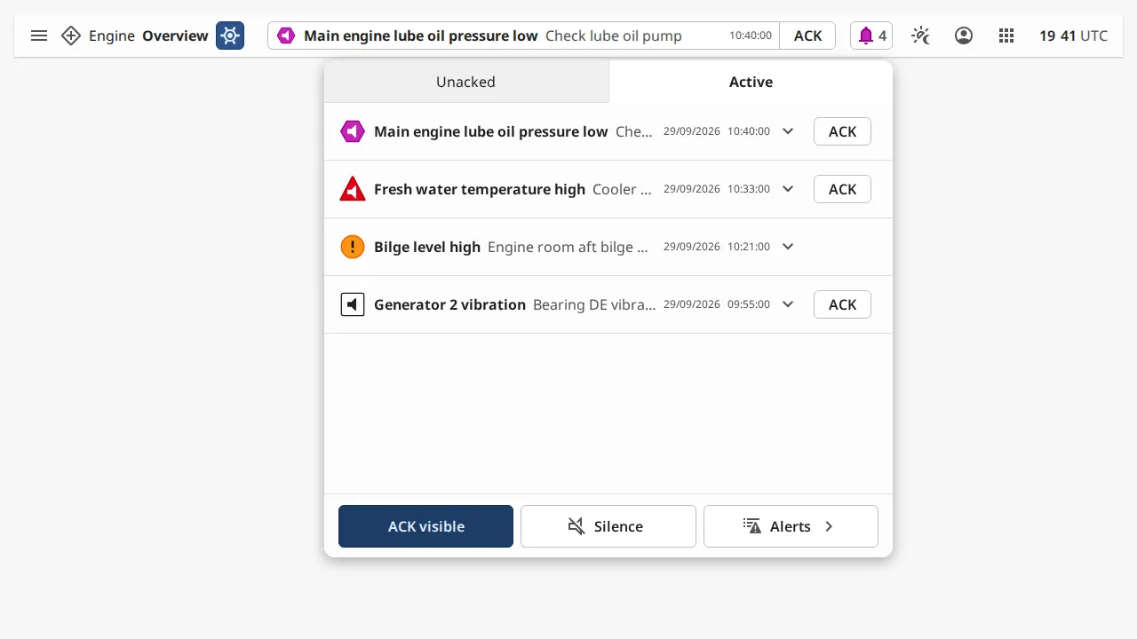
The Top Bar reads alarms from the gateway alarm system directly; no binding is needed. Alarms are shown in two places:
- The alert message in the middle of the bar shows the most important active alarm: its icon, title, description and activation time. If the operator may acknowledge it, an ACK button is shown next to it.
- The alert button shows the number of alarms. It is coloured by the highest priority, and it blinks while there are unacknowledged alarms.
Clicking the alert button or the alert message opens the Alert Menu. It lists alarms with the highest priority and most recent first, in two tabs: Unacked and Active. Expand a row (˅) to see more of the alarm. At the bottom of the menu:
| Button | What it does |
|---|---|
| ACK visible | Acknowledges every alarm listed in the menu that can be acknowledged. Hidden when allowAlertAcknowledge is false or no listed alarm can be acknowledged. |
| Silence | Fires the onAlertSilenceClick event. Silencing the audible alarm is done by your script. Hidden when showAlertSilenceButton is false. |
| Alerts › | Navigates to the page in alertPath (default /alarms), typically a page with the Alert List Page component, and closes the menu. Hidden when showAlertListButton is false. |
Which Alarms Are Shown
Section titled “Which Alarms Are Shown”Use the filter property to select alarms on the gateway, in the same way as
the Alarm Status Table:
filter.states— which alarm states to include. By default active and cleared unacknowledged alarms and active acknowledged alarms are included; cleared and acknowledged alarms are not.filter.priorities— which priorities to include. Diagnostic is excluded by default.filter.conditions—source,displayPathandproviderfilters. Separate several values with commas;*is a wildcard.
maxAlerts (default 50) limits how many alarms are sent to the menu. The
alert button still counts every alarm that matches the filter.
Acknowledging
Section titled “Acknowledging”Acknowledge is allowed when both canAcknowledge and allowAlertAcknowledge are
true. canAcknowledge is also checked on the gateway, so it is the property to
bind to a role or security check. alertConvention decides which alarms can be
acknowledged:
levels— every unacknowledged alarm can be acknowledged.bam— follows BAM (Bridge Alert Management): only alarms, cautions and level alerts can be acknowledged.
Text and Time
Section titled “Text and Time”titleSource and descriptionSource select which alarm field (label, name,
notes or displayPath) is used as the title and description, both in the
alert message and in the menu. dateFormat sets how times are formatted, and
showTimeInUtc shows them in UTC instead of the workstation time zone.
Properties
Section titled “Properties”| Name | Description | Property Type |
|---|---|---|
| showAlerts | Show the alert message in the middle of the Top Bar. Default true. |
value |
| showAlertsButton | Show the alert button. Default true. |
value |
| showAlertListButton | Show the Alerts › button in the menu. Default true. |
value |
| showAlertSilenceButton | Show the Silence button in the menu, which fires onAlertSilenceClick. Default true. |
value |
| allowAlertAcknowledge | Show the ACK and ACK visible buttons. Default true. |
value |
| canAcknowledge | Whether the operator may acknowledge alarms from this component. When false, acknowledge is hidden and the gateway rejects acknowledge requests. Default true. |
value |
| alertConvention | Which alarms can be acknowledged: levels or bam. Default levels. |
value |
| alertPath | Page the Alerts › button navigates to. Default /alarms. |
value |
| titleSource | Alarm field used as the title: label, name, notes or displayPath. Default label. |
value |
| descriptionSource | Alarm field used as the description. Default notes. |
value |
| dateFormat | Format of alarm times, for example DD/MM/YYYY HH:mm:ss. Use HH for 24-hour time and hh with a for 12-hour time. |
value |
| showTimeInUtc | Show alarm times in UTC instead of the local time zone. Default false. |
value |
| maxAlerts | Most alarms sent to the menu. Default 50. Large values slow down the client. |
value |
| filter | Gateway-side alarm filter. See below. | object |
filter sub-properties:
| Name | Description | Property Type |
|---|---|---|
| states.activeUnacked | Include active, unacknowledged alarms. Default true. |
value |
| states.activeAcked | Include active, acknowledged alarms. Default true. |
value |
| states.clearUnacked | Include cleared, unacknowledged alarms. Default true. |
value |
| states.clearAcked | Include cleared, acknowledged alarms. Default false. |
value |
| priorities.diagnostic | Include diagnostic alarms. Default false. |
value |
| priorities.low | Include low alarms. Default true. |
value |
| priorities.medium | Include medium alarms. Default true. |
value |
| priorities.high | Include high alarms. Default true. |
value |
| priorities.critical | Include critical alarms. Default true. |
value |
| conditions.source | Alarm source path filter. Comma-separated, * wildcard. Default *. |
value |
| conditions.displayPath | Display path filter (falls back to source path). Comma-separated, * wildcard. Default *. |
value |
| conditions.provider | Alarm provider filter. Comma-separated. Empty means all providers. | value |
Brilliance Menu
Section titled “Brilliance Menu”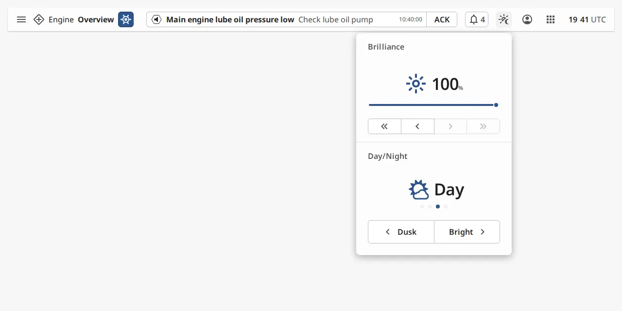
The dimming button opens the Brilliance Menu, where the operator chooses the OpenBridge palette for the whole session:
- Day/Night — steps between the
bright,day,duskandnightpalettes. The choice is written to thepaletteproperty and applied to every OpenBridge component in the session immediately. - Brilliance — a brightness slider, shown when
showBrightnessistrue. The value (0–100) is written to thebrightnessproperty. The Top Bar does not dim the screen itself; bindbrightnessto whatever controls the display.

Palette and the Ignition Theme
Section titled “Palette and the Ignition Theme”To keep the Ignition theme (session.props.theme) in step with the palette:
- Set
useIgnitionThemetotrue. - Bind
themebidirectionally tosession.props.theme. - Adjust
palletteToThemeif your project uses other theme names.
When the operator selects a palette, the Top Bar writes the matching theme. When the theme changes from elsewhere, the Top Bar picks a matching palette (day before dusk before bright before night, when several palettes map to the same theme).
Properties
Section titled “Properties”| Name | Description | Property Type |
|---|---|---|
| showBrillianceMenu | Show the dimming button and apply palette to the session. Default true. |
value |
| palette | Current palette: bright, day, dusk or night. Default day. |
value |
| showBrightness | Show the brightness slider in the menu. Default false. |
value |
| brightness | Brightness selected in the menu, 0–100. Default 100. |
value |
| useIgnitionTheme | Keep theme in step with palette. Default false. |
value |
| theme | Ignition theme. Bind to session.props.theme. Only shown when useIgnitionTheme is true. |
value |
| palletteToTheme | Which Ignition theme each palette maps to. Default bright/day → light, dusk/night → dark. |
object |
User Menu
Section titled “User Menu”| Signed out | Signed in |
|---|---|
 |
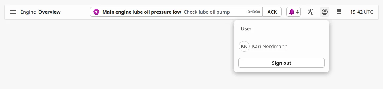 |
Set showUserButton to true to show the user button. It opens the User
Menu, which shows a Sign in button when isLoggedIn is false, and the
user’s name, initials and a Sign out button when isLoggedIn is true.
Bind the properties to the session:
isLoggedIn→session.props.auth.authenticateduserFullName→session.props.auth.user.userName(or a full-name field from your identity provider). The initials are made from the first and last word of the name.
What happens on Sign in / Sign out is decided by bindUserButtonToAuth:
true— the Top Bar signs in and out directly, with the same authentication as the Login and Logout actions. The events below still fire.false— only theonSignInClickandonSignOutClickevents fire, and you handle them in a script, for instance withsystem.perspective.login()andsystem.perspective.logout().
Sign-in redirects to the identity provider and has no effect in the Designer.
Properties
Section titled “Properties”| Name | Description | Property Type |
|---|---|---|
| showUserButton | Show the user button and its menu. Default false. |
value |
| bindUserButtonToAuth | Sign in and out directly from the menu. Default false. |
value |
| isLoggedIn | Whether a user is signed in. Selects which view of the menu is shown. Default false. |
value |
| userFullName | Name of the signed-in user. Only shown when isLoggedIn is true. |
value |
Apps Button
Section titled “Apps Button”
Set showAppsButton to true to show the apps button (the 3×3 grid). The Top
Bar does not include an apps menu: clicking the button toggles
appsButtonPressed, and the button is highlighted while it is true. Bind the
property to open your own launcher, for example the visibility of an embedded
view, a popup, or a dock. Set appsButtonPressed back to false from your
script when the launcher closes.
Properties
Section titled “Properties”| Name | Description | Property Type |
|---|---|---|
| showAppsButton | Show the apps button. Default false. |
value |
| appsButtonPressed | Whether the apps button is pressed. Toggled on each click. Only shown when showAppsButton is true. |
value |
Command Button
Section titled “Command Button”Set showInCommand to true to show the command button next to the page name.
inCommand selects whether it shows this workstation as in command. The button
is an indicator only; clicking it does nothing.
| Name | Description | Property Type |
|---|---|---|
| showInCommand | Show the command button. Default false. |
value |
| inCommand | Whether the workstation is in command. Only shown when showInCommand is true. |
value |
The clock at the far right shows the current time, updated by the client.
| Name | Description | Property Type |
|---|---|---|
| showClock | Show the clock. Default true. |
value |
| showTimezone | Show the time zone after the time. Default true. |
value |
| utcHourOffset | Time zone of the clock, in hours from UTC. Default 0. |
value |
Narrow Screens
Section titled “Narrow Screens”Each element has a breakpoint: when the browser window (not the component)
is narrower than the value in pixels, the element is hidden. Set a breakpoint to
0 to always show the element.
| 1280 px | 480 px |
|---|---|
 |
 |
When buttons are hidden, a ⋮ button appears at the right. The Top Bar does not currently open a menu from this button, so do not rely on it to reach the hidden buttons — lower the breakpoint of a button the operator needs on small screens.
| Name | Description | Property Type |
|---|---|---|
| appIconBreakpointPx | Hide the app icon below this width. Default 500. |
value |
| appTitleBreakpointPx | Hide the app name below this width. Default 500. |
value |
| dimmingButtonBreakpointPx | Hide the dimming button below this width. Default 500. |
value |
| userButtonBreakpointPx | Hide the user button below this width. Default 500. |
value |
| appsButtonBreakpointPx | Hide the apps button below this width. Default 500. |
value |
Properties
Section titled “Properties”Properties not covered in the sections above:
| Name | Description | Property Type |
|---|---|---|
| appName | Name of the application. Default App. |
value |
| pageName | Name of the current page, shown in bold. Default Page. Bind it to the page, for example with an expression on page.props.path. |
value |
| hasAppIcon | Show the app icon. Default false. |
value |
| appIcon | Icon shown before the app name, chosen with the icon picker. Only shown when hasAppIcon is true. |
value |
| style | Standard Perspective style object. | object |
Component Events
Section titled “Component Events”| Event | Description | Event Object |
|---|---|---|
| onSignInClick | Fired when the operator clicks Sign in in the User Menu. | event.username, event.password — empty with the current menu, which has no username and password fields. |
| onSignOutClick | Fired when the operator clicks Sign out in the User Menu. | — |
| onAlertSilenceClick | Fired when the operator clicks Silence in the Alert Menu. | — |
Examples
Section titled “Examples”Example 1 — Top Bar in a Shared Dock
Section titled “Example 1 — Top Bar in a Shared Dock”-
Create a view
Framework/TopBarwith a flex container root, and add a Top Bar withposition.grow=1. -
In Page Configuration → Shared Settings, add a top dock: View
Framework/TopBar, Displayvisible, Size48, Contentpush, Handlehide. -
Add a left dock with Dock ID
nav, your navigation view, DisplayonDemand, Handlehide, Contentcover. -
On the Top Bar set:
Property Value appName EnginebindNavMenuToDock truenavDock navalertPath /alarmsshowUserButton truebindUserButtonToAuth true -
Bind
pageNameto the current page andisLoggedIn/userFullNametosession.props.auth.
Example 2 — Silence the Alarm Horn
Section titled “Example 2 — Silence the Alarm Horn”On the Top Bar, configure the onAlertSilenceClick event with a script action:
def runAction(self, event): system.tag.writeBlocking(['[default]Bridge/Horn/Silence'], [True])Example 3 — Follow the Ignition Theme
Section titled “Example 3 — Follow the Ignition Theme”Set useIgnitionTheme to true, then bind theme bidirectionally to
session.props.theme. Selecting Night in the Brilliance Menu now also
switches the Ignition theme to dark, and switching the theme to light from a
script selects the Day palette.
Found an error or something unclear?
Tell us what is wrong, confusing or missing on this page.
Built on the OpenBridge Design System