Gauge Vertical
The Gauge Vertical shows a value as a bar that fills a vertical track, next to a scale. It is found in the Maritime - OpenBridge section of the Perspective Component Palette as Gauge Vertical.
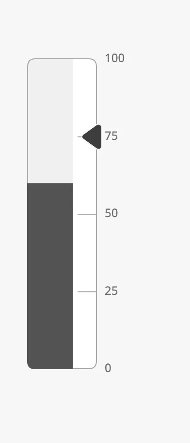
The parts of the gauge:
- Bar — filled up to the value. See Value and Range and Fill.
- Scale — the band beside the bar, with tickmarks and labels. See Scale.
- Setpoint — a marker on the scale. See Setpoint.
The Gauge Vertical is one of the maritime instruments. State, priority, the setpoint and advice zones are shared by all of them and are described in Maritime Instruments — Common Features. This page covers what is specific to the Gauge Vertical.
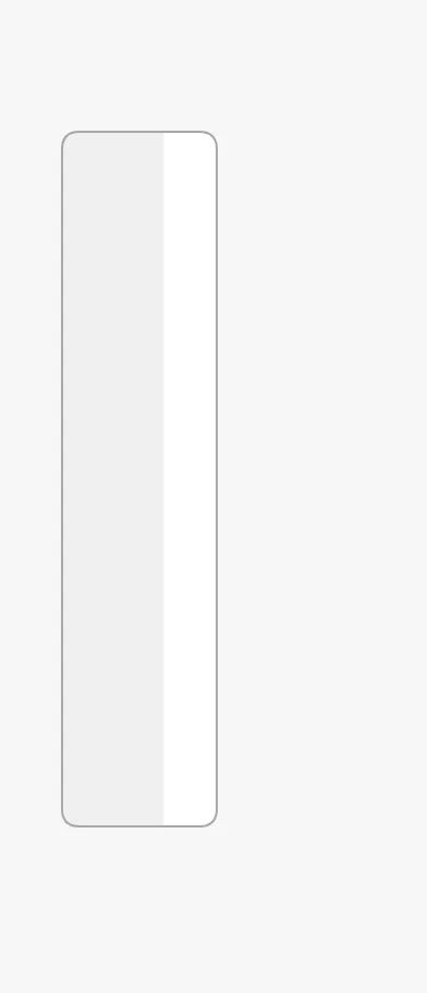
A Gauge Vertical dropped from the palette has no value and an empty track:
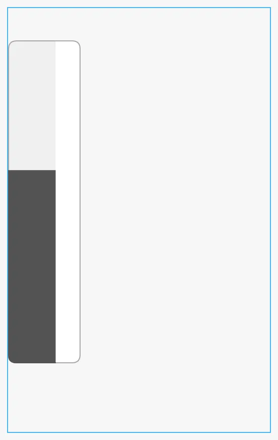
The gauge has a fixed size, about 320 px tall with its labels, and sits at the top left of the component’s box; it does not grow or shrink with the box. Make the box at least that tall, or the bottom of the gauge is cut off. The blue frame is the component’s box:
Value and Range
Section titled “Value and Range”Set hasValue to true and bind value to the quantity to show. minValue
and maxValue are the ends of the scale.
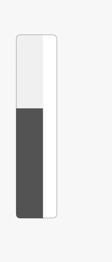
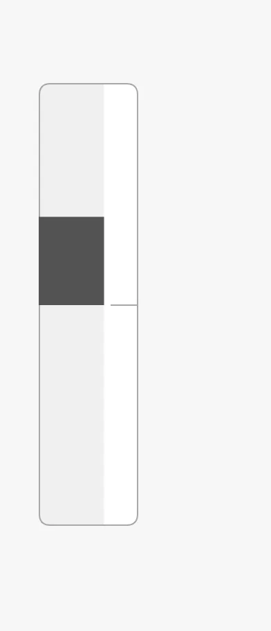
value = 60, 0 to 100 |
value = 20, −50 to 50 |
reverse = true |
|---|---|---|
 |
 |
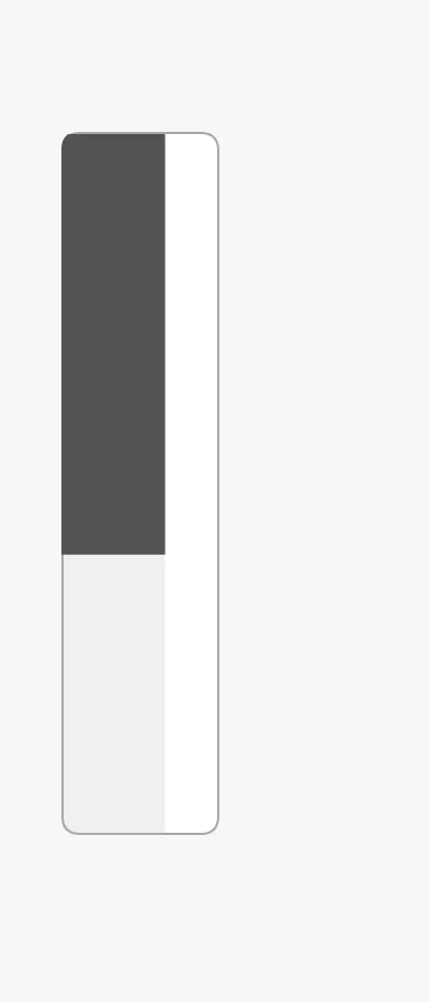 |
The bar is drawn from zero, so with a range that spans zero it grows up or down
from the zero line. With reverse the scale is turned upside down: minValue
is at the top and the values grow downwards, as on a depth scale.
Properties
Section titled “Properties”| Name | Description | Property Type |
|---|---|---|
| hasValue | Show a value. Default false. |
value |
| value | The value. Only shown when hasValue is true. |
value |
| minValue | Lowest value of the scale. Default 0. |
value |
| maxValue | Highest value of the scale. Default 100. |
value |
| reverse | Put minValue at the top. Default false. |
value |
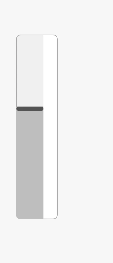
fillMode selects how the value is drawn:
fill (default) |
tint |
highlightCurrentValue |
|---|---|---|
|
 |
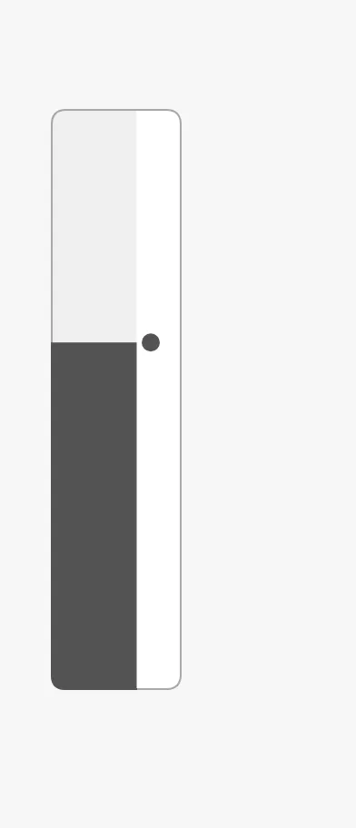 |
fill— a solid bar up to the value.tint— a lighter bar with a marker line at the value, which makes the value itself stand out.highlightCurrentValue— adds a dot at the value, in the scale band.
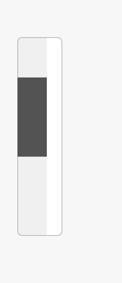
The bar normally runs from zero to the value. fillMin and fillMax give it
other ends, for showing a range instead of a level:
Properties
Section titled “Properties”| Name | Description | Property Type |
|---|---|---|
| fillMode | fill or tint. Default fill. |
value |
| highlightCurrentValue | Mark the value with a dot in the scale band. Default false. |
value |
| hasFillMin | Give the bar another start than zero. Default false. |
value |
| fillMin | Start of the bar. Only shown when hasFillMin is true. |
value |
| hasFillMax | Give the bar another end than the value. Default false. |
value |
| fillMax | End of the bar. Only shown when hasFillMax is true. |
value |
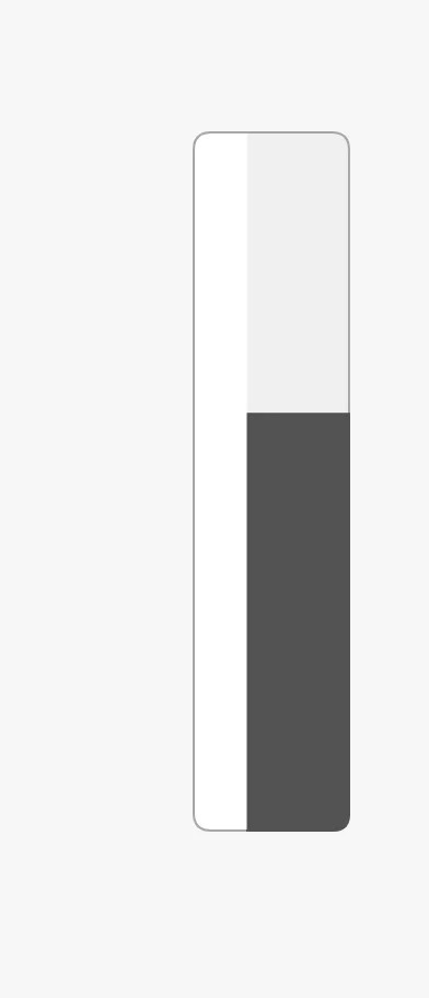
side places the scale to the right (default) or the left of the bar:
right (default) |
left |
|---|---|
|
 |
The values top and bottom belong to the horizontal gauge.
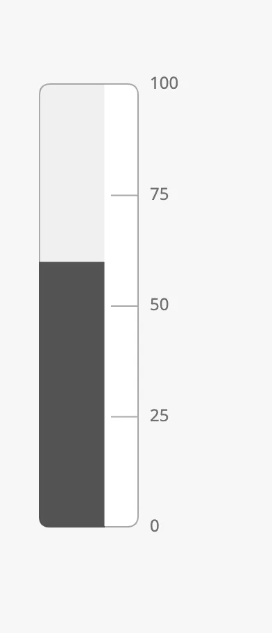
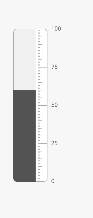
The scale is empty until tickmarks are turned on. There are three levels, each
with a has… property that turns it on and an interval:
| Primary, every 25 | Primary 25, secondary 5, tertiary 1 | mainTickmarks = [0, 50, 100] |
|---|---|---|
 |
 |
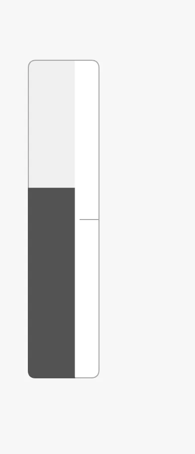 |
- Primary tickmarks are the longest and carry the labels.
showLabelsturns the labels off. - Secondary and tertiary tickmarks are shorter and have no labels.
mainTickmarksis a list of single values to mark, independent of the intervals.
The labels are drawn outside the box, beside the scale: leave room for them.
Joining Gauges
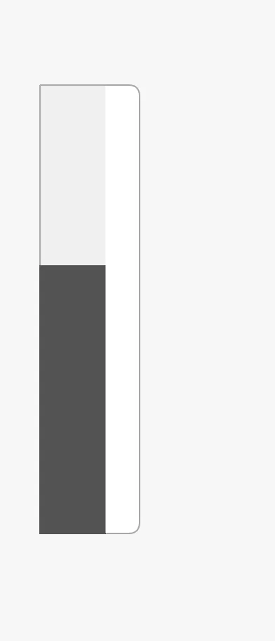
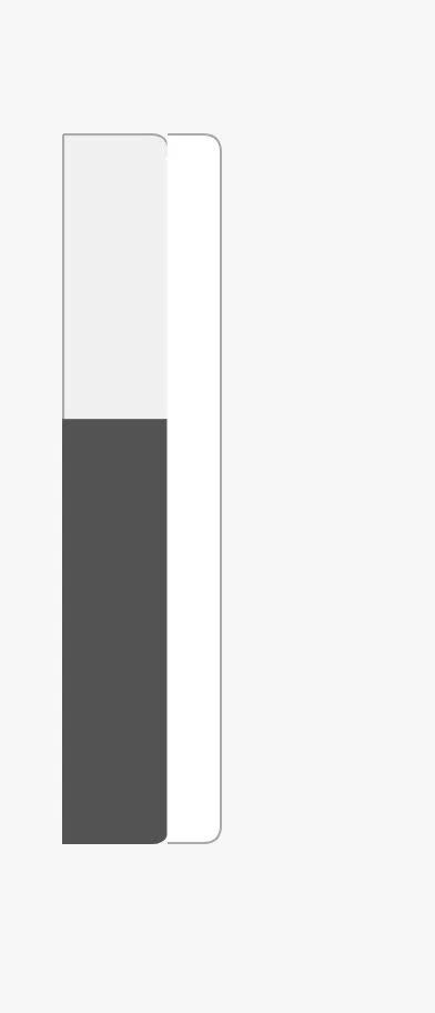
Section titled “Joining Gauges”borderRadiusPosition selects which corners of the gauge are rounded, for
placing several gauges side by side as one instrument:
innerFirstChild (default) |
middleChild |
|---|---|
|
 |
middleRoundedChild |
outerLastChild |
|---|---|
|
 |
Properties
Section titled “Properties”| Name | Description | Property Type |
|---|---|---|
| side | Side of the bar the scale is on: left or right. Default right. |
value |
| showLabels | Show the numbers at the primary tickmarks. Default true. |
value |
| hasPrimaryTickmarkInterval | Show primary tickmarks. Default false. |
value |
| primaryTickmarkInterval | Distance between primary tickmarks. Only shown when hasPrimaryTickmarkInterval is true. |
value |
| hasSecondaryTickmarkInterval | Show secondary tickmarks. Default false. |
value |
| secondaryTickmarkInterval | Distance between secondary tickmarks. Only shown when hasSecondaryTickmarkInterval is true. |
value |
| hasTertiaryTickmarkInterval | Show tertiary tickmarks. Default false. |
value |
| tertiaryTickmarkInterval | Distance between tertiary tickmarks. Only shown when hasTertiaryTickmarkInterval is true. |
value |
| mainTickmarks | Single values to mark on the scale. Empty by default. | array |
| borderRadiusPosition | Which corners are rounded: innerFirstChild, middleChild, middleRoundedChild or outerLastChild. Default innerFirstChild. |
value |
Setpoint and Advice Zones
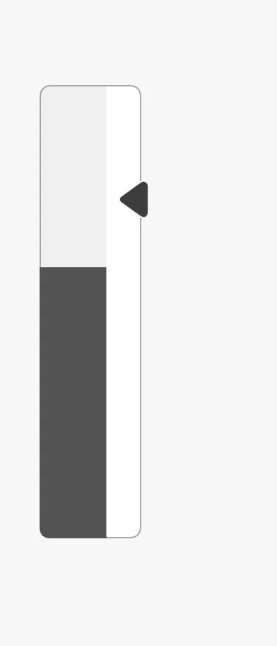
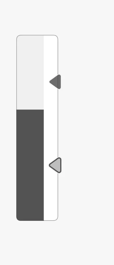
Section titled “Setpoint and Advice Zones”The setpoint works as described in Setpoint. The marker sits on the scale and points at the bar:
| Setpoint at 75 | A new setpoint being chosen |
|---|---|
 |
 |
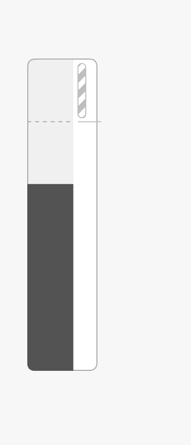
advices is a list of advice zones. On this gauge
the ends of a zone are called min and max:
State and Priority
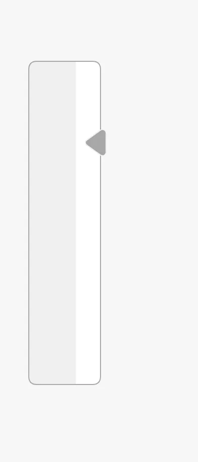
Section titled “State and Priority”active |
loading |
|---|---|
|
 |
off |
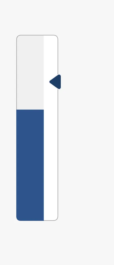
priority = enhanced |
|---|---|
|
 |
Common Properties
Section titled “Common Properties”These work in the same way on every maritime instrument, and are described in Maritime Instruments — Common Features:
- State —
state. - Priority —
priority. - Setpoint —
hasSetpoint,setpoint,autoAtSetpoint,autoAtSetpointDeadband,atSetpoint,touching,hasNewSetpoint,newSetpoint,animateSetpoint,setpointAtZeroDeadband,setpointOverride. - Advice Zones —
advices, withminandmax. - Style and Events —
style.
focused is deprecated; use touching.
Component Events
Section titled “Component Events”The Gauge Vertical has no component events of its own.
Examples
Section titled “Examples”Example 1 — Tank Level with a High Limit
Section titled “Example 1 — Tank Level with a High Limit”- Drop a Gauge Vertical into the view and make it about 340 px tall.
- Set
hasValuetotrueand bindvalueto[default]Tanks/FW1/Level. - Set
hasPrimaryTickmarkIntervaltotrueandprimaryTickmarkIntervalto25. - Set
advicesto[{"min": 90, "max": 100, "type": "caution", "hinted": false}].
Found an error or something unclear?
Tell us what is wrong, confusing or missing on this page.
Built on the OpenBridge Design System