Valve
The Valve is an automation symbol for a valve in a mimic or diagram. It comes in two types:
- Analog — a valve that can be set to any opening between closed and fully open, such as a control or regulating valve. It shows the opening in percent.
- Digital — a valve that is either open or closed, such as a shut-off valve.
It is found in the Automation - OpenBridge section of the Perspective Component Palette as Valve (2). Expand it and drag Analog or Digital into the view; dragging Valve itself gives an analog valve.
The Valve is for valves with two ports. For a valve that connects three pipes, use the Analog Threeway Valve or the Digital Threeway Valve, listed right after the Valve in the palette as Valve - Threeway Analog and Valve - Threeway Digital.
| Analog | Digital |
|---|---|
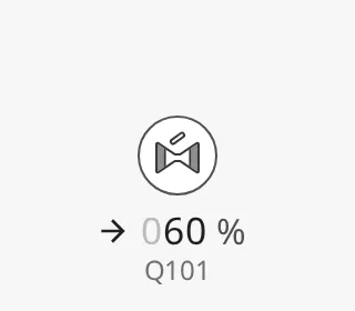 |
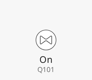 |
The Valve shows the state it is given; it does not change it, and clicking it does nothing unless you configure an event.
valveType selects the type: analog (default) or digital. The palette
entry sets it for you, and you can change it later in the Property Editor
without replacing the component; bindings on the properties both types share,
such as open, keep working.
The properties that only one type has are shown in the Property Editor only for that type:
| Type | Its own properties | Described in |
|---|---|---|
analog |
value, labelDirection |
Analog Valve |
digital |
— | Digital Valve |
Everything else — open, variant, vertical and the
common properties — is the same for both types.
Properties
Section titled “Properties”| Name | Description | Property Type |
|---|---|---|
| valveType | analog or digital. Default analog. |
value |
| open | Whether the valve is open. Default false. See State. |
value |
| value | Analog only. Opening in percent, 0–100. See Opening. Default 0. |
value |
| labelDirection | Analog only. Arrow in front of the value: up, down, left, right or none. See Label Direction. Default right. |
value |
| variant | regular draws the icon on a button, flat draws only the icon. Default regular. |
value |
| vertical | Draw the valve for a vertical pipe. Default false. |
value |
| handle | Digital only. The handle or actuator drawn on the valve. Default none. See Handles. |
value |
| flowDirection | Digital only. Direction the medium flows: auto, up, down, left or right. Default auto. |
value |
| invertHandlePosition | Digital only. Put the handle on the other side of the valve. Default false. |
value |
| handleSize | Digital only. regular, or small for a handle drawn from the symbol’s centre. Default regular. |
value |
Common Properties
Section titled “Common Properties”The Valve is an automation button. The properties below work in the same way on every automation button, and are described in Automation Buttons — Common Features:
- Readout — The readout next to the symbol: the status row and the tag name. Properties:
showReadoutStack,readoutPosition,readoutSize,showStatus,showStatusIcon,hasTag,tag. - Positioning — Which part of the button is aligned to the component’s box. Properties:
positioning. - Size — Size of the whole component. Properties:
componentSize. - Activated — Highlighted background that marks the symbol as selected. Properties:
activated. - Static — Grey symbol for a device whose state is unknown. Properties:
static. - Alert Frame — Alert frame around the symbol. Properties:
alert,alertFrameType,alertFrameStatus,alertFrameMode,alertFrameThickness,showAlertCategoryIcon,showAlertIcon. - Progress — Progress ring while a command is carried out. Properties:
progress,progressMode,progressValue. - Badges — Badges in the corners of the symbol. Properties:
badgeControl,badgeAlert,badgeInterlock,badgeCommandLocked. - Style — Standard Perspective style object.
In a Connector Diagram
Section titled “In a Connector Diagram”In a Connector Diagram, a Valve of either type lets
the medium through while open is true.
Views Made Before the Valve
Section titled “Views Made Before the Valve”Before the Valve existed, the palette had separate Analog Valve and Digital Valve components. Views that use them keep working unchanged; the two components are just no longer offered in the palette. Use the Valve for new views.
Component Events
Section titled “Component Events”The Valve has no component events of its own. The standard Perspective events,
such as onClick, are available in the component’s event configuration. See
Operating a Device.
Found an error or something unclear?
Tell us what is wrong, confusing or missing on this page.
Built on the OpenBridge Design System