Gauge Radial Indicator
The Gauge Radial Indicator is a small symbol that shows a value with a needle on a short arc. It is found in the Maritime - OpenBridge section of the Perspective Component Palette as Gauge Radial Indicator.

It is the indicator form of the Gauge Radial: it has no scale, labels, setpoint or advice zones, and is meant for overviews and dense grids of indicators where the exact value is shown elsewhere. See Instruments and Indicators.
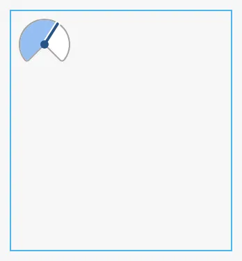
A Gauge Radial Indicator dropped from the palette shows 33 on a scale from 0 to 100:

The indicator has a fixed size of 48 × 48 px and sits at the top left of the component’s box; it does not grow with the box. A new component has a box of 158 × 172 px, much larger than the symbol. Make the box 48 × 48 px. The blue frame is the component’s box:
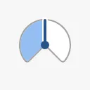
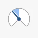
Bind value to the quantity to show. minValue and maxValue are the ends of
the arc; the area between the start of the arc and the needle is filled. With a
range that spans zero, zero is at the top.
0 |
50 |
100 |
-30, −100 to 100 |
|---|---|---|---|
 |
 |
 |
 |
Properties
Section titled “Properties”| Name | Description | Property Type |
|---|---|---|
| value | The value. Default 33. |
value |
| minValue | Lowest value of the arc. Default 0. |
value |
| maxValue | Highest value of the arc. Default 100. |
value |
Sector and Style
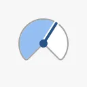
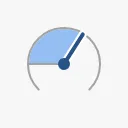
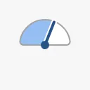
Section titled “Sector and Style”sector is the sweep of the arc in degrees, and styleType whether the arc
has a frame:
| sector | styleType = regular (default) |
styleType = flat |
|---|---|---|
270 (default) |
 |
 |
180 |
 |
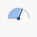 |
Only 270 and 180 are supported; any other number is drawn as 270. Use
flat where the surrounding layout already separates the indicators.
Properties
Section titled “Properties”| Name | Description | Property Type |
|---|---|---|
| sector | Sweep of the arc: 270 or 180. Default 270. |
value |
| styleType | regular (framed) or flat. Default regular. |
value |
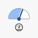
Set hasIcon to true and icon to the name of an OpenBridge icon, without
the icon- prefix (for example pressure or diesel-engine), to show what the
indicator measures. The icon is drawn below the pivot of the needle:
| 270° | 180° |
|---|---|
|
 |
A name that is not an OpenBridge icon draws nothing.
Properties
Section titled “Properties”| Name | Description | Property Type |
|---|---|---|
| hasIcon | Show the icon. Default false. |
value |
| icon | Name of an OpenBridge icon, such as pressure. Empty by default. |
value |
Properties
Section titled “Properties”Properties not covered in the sections above:
| Name | Description | Property Type |
|---|---|---|
| style | Standard Perspective style object. | object |
The indicator has no state or priority.
Component Events
Section titled “Component Events”The Gauge Radial Indicator has no component events of its own.
Examples
Section titled “Examples”Example 1 — Pressure in an Overview Grid
Section titled “Example 1 — Pressure in an Overview Grid”- Drop a Gauge Radial Indicator into the view and make it 48 × 48 px.
- Bind
valueto[default]Pump01/DischargePressure, and setmaxValueto10. - Set
hasIcontotrueandicontopressure. - Set
styleTypetoflatif the indicators sit in cards.
Found an error or something unclear?
Tell us what is wrong, confusing or missing on this page.
Built on the OpenBridge Design System