Message Menu Item
The Message Menu Item is one row of a list of messages or notifications. It shows a short version of the message, and the operator clicks it to expand it and read the whole text. It is found in the Input - OpenBridge section of the Perspective Component Palette as Message Menu Item (Beta).
Note: This component is in beta: its properties may change in a later version.
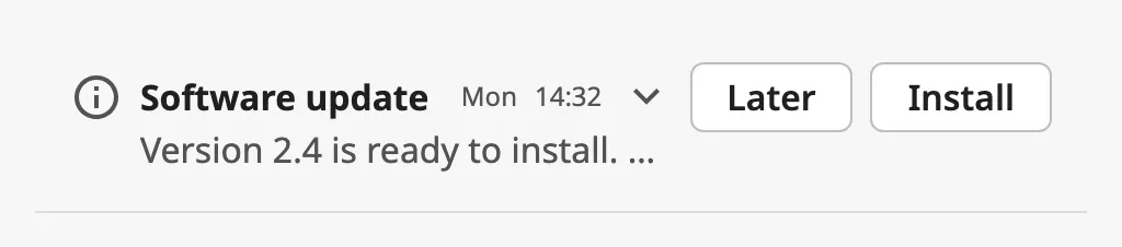
From left to right:
- Icons — what kind of message it is. See Icons.
- Title and description. See Text.
- Day and time, and the chevron that shows whether the item is expanded. See Time and Expanding.
- Action buttons — up to two. See Actions.
A Message Menu Item dropped from the palette has a placeholder title and description:

The item fills the width of the component and is as tall as its content needs. Its height changes when the operator expands it, so place it where it can grow: in a flex container, typically a column of items in a Flex Repeater.
title is shown in bold and description after it. Each can be turned off:
| Shown | |
|---|---|
| Title and description |  |
| Title only |  |
| Description only |  |
size selects how much of the text a collapsed item shows:
| size | |
|---|---|
single-line (default) |
Title and description on one line. The day, the time and the chevron are not shown. |
double-line |
The title on the first line, with the day, the time and the chevron, and the description on the second. |

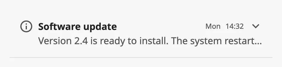
Text that does not fit is cut off with an ellipsis until the item is expanded.
Note: A
single-lineitem that is narrower than about 433 px does not show its title, only the description. Make the component wider, or usedouble-line, where the title is always shown.

Properties
Section titled “Properties”| Name | Description | Property Type |
|---|---|---|
| hasTitle | Show the title. Default true. |
value |
| title | Title of the message. Default Title. Only shown when hasTitle is true. |
value |
| hasDescription | Show the description. Default true. |
value |
| description | Text of the message. Default Some description text goes here.. Only shown when hasDescription is true. |
value |
| size | single-line or double-line. Default single-line. |
value |
Expanding
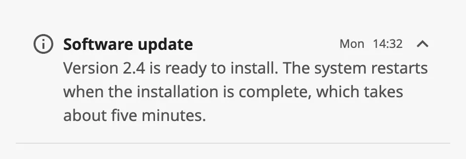
Section titled “Expanding”A click anywhere on the item except its action buttons expands it, and a second click collapses it again. Enter does the same when the item has keyboard focus. An expanded item shows the whole description, and the day and time:
| open | |
|---|---|
false (default) |
|
true |
 |
When the operator expands or collapses the item, it writes the new state to
open and then fires onActionPerformed and onMessageClick. open can also
be set from a binding or a script, for example to collapse the other items of a
list when one is expanded.
Note: In the Designer the item reacts only in Preview Mode, and the state written to
openthere is saved with the view. See In the Designer.
Properties
Section titled “Properties”| Name | Description | Property Type |
|---|---|---|
| open | The item is expanded. Written when the operator clicks the item. Default false. |
value |
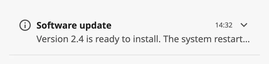
time and day are shown to the right of the title, in a double-line item
and in any expanded item. They are texts, shown as they are: bind them to an
expression such as dateFormat({view.params.timestamp}, 'HH:mm').
| hasDay | |
|---|---|
false |
 |
true |
|
Both are turned on in a new component, but empty, so nothing is shown until you set them.
Properties
Section titled “Properties”| Name | Description | Property Type |
|---|---|---|
| hasTimestamp | Show the time. Default true. |
value |
| time | Text of the time, for example 14:32. Empty by default. Only shown when hasTimestamp is true. |
value |
| hasDay | Show the day. Default true. |
value |
| day | Text of the day, for example Mon. Empty by default. Only shown when hasDay is true. |
value |
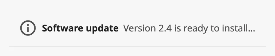
The item can show up to three icons of your choice, and a shelf mark:
hasPrimaryIcon— the icon of the message, before the text.hasSecondaryIcon— a second icon after the primary one, for instance who or what sent the message.hasTrailingIcon— an icon at the right end of the item.enhancedIcon— draws the primary icon larger, to make an important message stand out.isShelved— adds the shelf mark before the icons, for a message that has been set aside.
| Property | |
|---|---|
hasPrimaryIcon |
|
hasSecondaryIcon |
 |
hasTrailingIcon |
 |
enhancedIcon |
 |
isShelved |
 |
primaryIcon, secondaryIcon and trailingIcon are icon pickers: choose
an icon from the openbridge library. See Icons.
The trailing icon is not a button of its own: a click on it expands the item
like a click anywhere else. It is not shown when stackVertical is true.
Properties
Section titled “Properties”| Name | Description | Property Type |
|---|---|---|
| hasPrimaryIcon | Show the primary icon. Default false. |
value |
| primaryIcon | The primary icon. Default openbridge/placeholder. Only shown when hasPrimaryIcon is true. |
object |
| hasSecondaryIcon | Show the secondary icon. Default false. |
value |
| secondaryIcon | The secondary icon. Default openbridge/placeholder. Only shown when hasSecondaryIcon is true. |
object |
| hasTrailingIcon | Show the trailing icon. Default false. |
value |
| trailingIcon | The trailing icon. Default openbridge/placeholder. Only shown when hasTrailingIcon is true. |
object |
| enhancedIcon | Draw the primary icon larger. Default false. |
value |
| isShelved | Show the shelf mark. Default false. |
value |
Actions
Section titled “Actions”Set hasActionLabel to true to give the item action buttons. A button is
shown for each label that is not empty: primaryActionLabel is the button at
the right, secondaryActionLabel the one to the left of it.
| Buttons | |
|---|---|
| Primary only |  |
| Primary and secondary |  |
A click on a button fires onPrimaryActionClick or onSecondaryActionClick.
It does not expand or collapse the item.
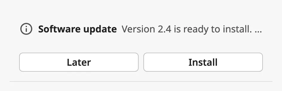
stackVertical moves the buttons below the text, where they share the width of
the item:
| stackVertical | |
|---|---|
false (default) |
|
true |
 |
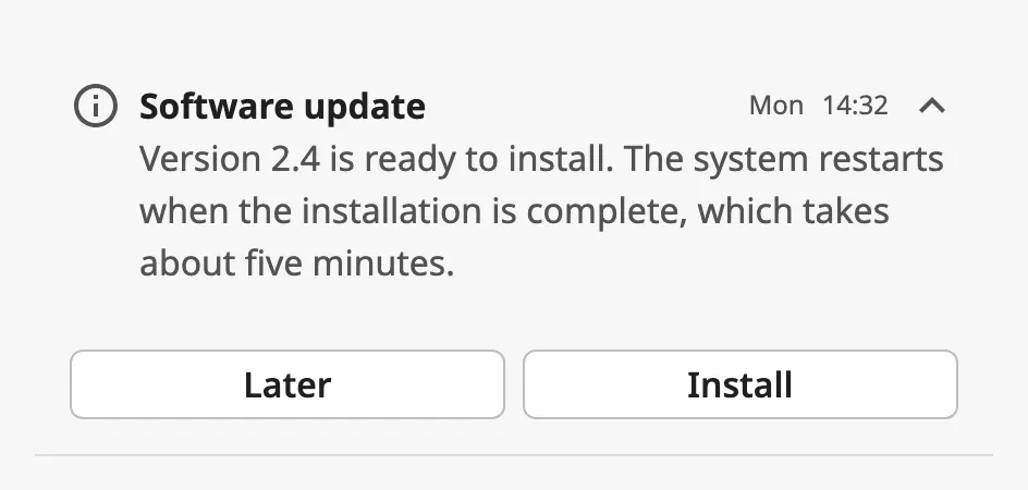
Expanded, with the buttons below the text:
Properties
Section titled “Properties”| Name | Description | Property Type |
|---|---|---|
| hasActionLabel | Show the action buttons. Default false. |
value |
| primaryActionLabel | Label of the primary button. Empty by default. Only shown when hasActionLabel is true. |
value |
| secondaryActionLabel | Label of the secondary button. Empty by default. Only shown when hasActionLabel is true. |
value |
| stackVertical | Place the buttons below the text. Default false. |
value |
Common Properties
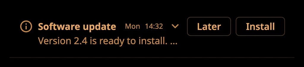
Section titled “Common Properties”Described in Input Components — Common Features:
- Appearance —
style, and the palette:
The Message Menu Item has no disabled property.
Component Events
Section titled “Component Events”| Event | Description | Event Object |
|---|---|---|
| onMessageClick | Fired when the operator expands or collapses the item, after open is written. |
— |
| onPrimaryActionClick | Fired when the operator clicks the primary action button. | — |
| onSecondaryActionClick | Fired when the operator clicks the secondary action button. | — |
| onActionPerformed | Fired for any of the three above, just before it. | — |
The event objects are empty. In onMessageClick, read the new state from
self.props.open.
Examples
Section titled “Examples”Example 1 — A List of Messages
Section titled “Example 1 — A List of Messages”A view custom property messages holds a list of objects with title, text,
day and time.
- Create a view
Messages/Itemwith the parameterstitle,text,dayandtime, and add a Message Menu Item as its only component. Let the root container be a flex container so that the view grows with the item. - Bind
title,description,dayandtimeof the item to the parameters, and setsizetodouble-line. - In the main view, add a Flex Repeater with direction
column, set itspathtoMessages/Itemand bindinstancestoview.custom.messages.
Example 2 — Acknowledge Button
Section titled “Example 2 — Acknowledge Button”-
On the item of Example 1, set
hasActionLabeltotrueandprimaryActionLabeltoAcknowledge. -
Configure the
onPrimaryActionClickevent with a script action that handles the message, for example:def runAction(self, event):system.perspective.sendMessage('message-acknowledged', {'title': self.props.title})
Found an error or something unclear?
Tell us what is wrong, confusing or missing on this page.
Built on the OpenBridge Design System