Gauge Bar Indicator
The Gauge Bar Indicator is a small symbol that shows a level as a filled bar, without a scale or labels. It is found in the Maritime - OpenBridge section of the Perspective Component Palette as Gauge Bar Indicator.
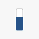
It is the indicator form of the Gauge Vertical and Gauge Horizontal, for overviews where the exact value is shown elsewhere. See Instruments and Indicators.
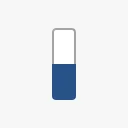
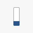
A Gauge Bar Indicator dropped from the palette shows a vertical bar at 50:
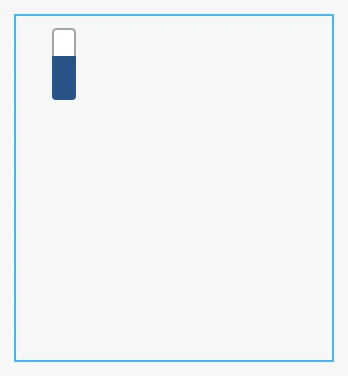
The indicator has a fixed size of 48 × 48 px and sits at the top left of the component’s box; it does not grow with the box. A new component has a box of 158 × 172 px, much larger than the symbol. Make the box 48 × 48 px. The blue frame is the component’s box:
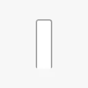
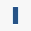
value is a percentage: the bar is empty at 0 and full at 100. Values
outside 0 to 100 are clamped. There is no minValue or maxValue; bind
value to an expression that scales your quantity to 0–100, for example
{[default]Tanks/FW1/Level} / 250 * 100 for a tank of 250 m³.
0 |
25 |
100 |
|---|---|---|
 |
 |
 |
Properties
Section titled “Properties”| Name | Description | Property Type |
|---|---|---|
| value | Fill level, from 0 to 100. Default 50. |
value |
Direction and Type
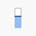
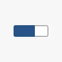
Section titled “Direction and Type”| direction | type = fill |
type = tinted |
|---|---|---|
vertical |
|
 |
horizontal |
 |
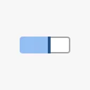 |
fill— a solid bar.tinted— a lighter bar with a marker line at its end.
Both properties are empty on a new component, which draws as vertical and
fill. The Designer offers no list of values: type vertical, horizontal,
fill or tinted.
Properties
Section titled “Properties”| Name | Description | Property Type |
|---|---|---|
| direction | vertical or horizontal. Default vertical. |
value |
| type | fill or tinted. Default fill. |
value |
Properties
Section titled “Properties”Properties not covered in the sections above:
| Name | Description | Property Type |
|---|---|---|
| style | Standard Perspective style object. | object |
The indicator has no state or priority.
Component Events
Section titled “Component Events”The Gauge Bar Indicator has no component events of its own.
Examples
Section titled “Examples”Example 1 — Tank Level on a Tank Overview
Section titled “Example 1 — Tank Level on a Tank Overview”- Drop a Gauge Bar Indicator next to the tank symbol and make it 48 × 48 px.
- Bind
valueto the expression{[default]Tanks/FW1/Level} / 250 * 100. - Set
typetotinted.
Found an error or something unclear?
Tell us what is wrong, confusing or missing on this page.
Built on the OpenBridge Design System