Azimuth Thruster
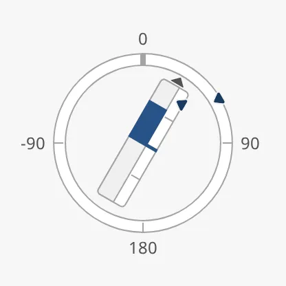
The Azimuth Thruster shows a thruster that can turn all the way round: the direction it points on a full-circle scale, and the thrust it gives on a bar along it. Both the angle and the thrust can have a setpoint. It is found in the Maritime - OpenBridge section of the Perspective Component Palette as Azimuth Thruster.
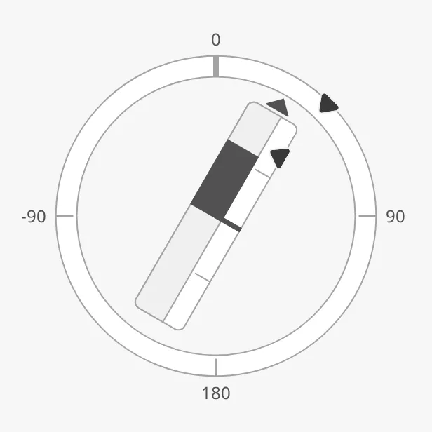
The parts of the instrument:
- Scale — the ring, with 0° (ahead) at the top. See Scale.
- Thruster — the bar that turns with the angle and fills with the thrust. The arrow at its end shows the direction of positive thrust. See Angle and Thrust.
- Angle setpoint — the ordered angle, on the ring. See Angle Setpoint.
- Thrust setpoint — the ordered thrust, beside the bar. See Thrust Setpoint.
The Azimuth Thruster is one of the maritime instruments. State, priority, how a setpoint works, advice zones and sizing are shared by all of them and are described in Maritime Instruments — Common Features. This page covers what is specific to the Azimuth Thruster. For a small symbol of the same thruster, see the Propulsion Azimuth Indicator.
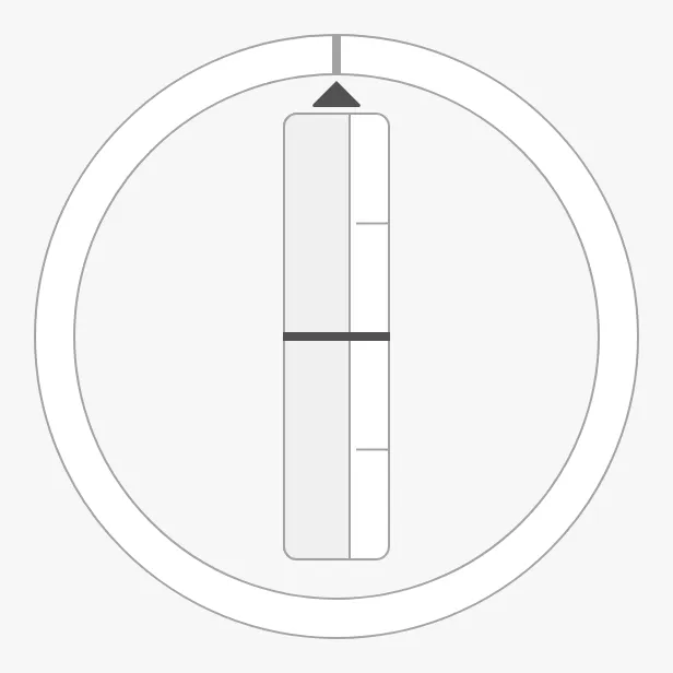
An Azimuth Thruster dropped from the palette points ahead with no thrust, and has no labels and only the tickmark at 0°:
Angle and Thrust
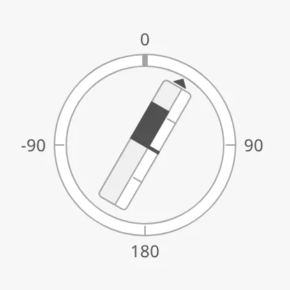
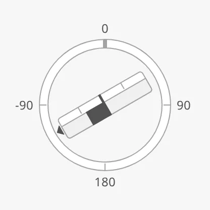
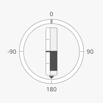
Section titled “Angle and Thrust”Bind angle to the direction of the thruster in degrees: 0 is ahead,
positive angles turn it clockwise (to starboard). Bind thrust to the thrust in
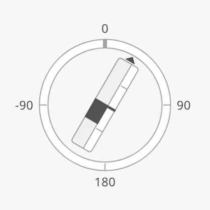
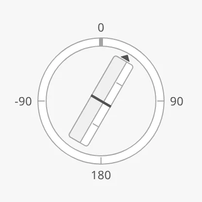
percent, from -100 to 100. Positive thrust fills the bar from the centre
towards the arrow, negative thrust towards the other end.
angle = 30, thrust = 60 |
angle = -120, thrust = 40 |
angle = 180, thrust = 80 |
|---|---|---|
 |
 |
 |
thrust = -40 |
thrust = 0 |
|---|---|
 |
 |
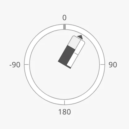
For a thruster that only pushes one way, set singleDirection to true: the
bar then has only its half towards the arrow.
singleDirection = false (default) |
singleDirection = true |
|---|---|
|
 |
Properties
Section titled “Properties”| Name | Description | Property Type |
|---|---|---|
| angle | Direction of the thruster in degrees; 0 is ahead. Default 0. |
value |
| thrust | Thrust in percent, -100 to 100. Default 0. |
value |
| singleDirection | Draw only the half of the bar for positive thrust. Default false. |
value |
Angle Setpoint
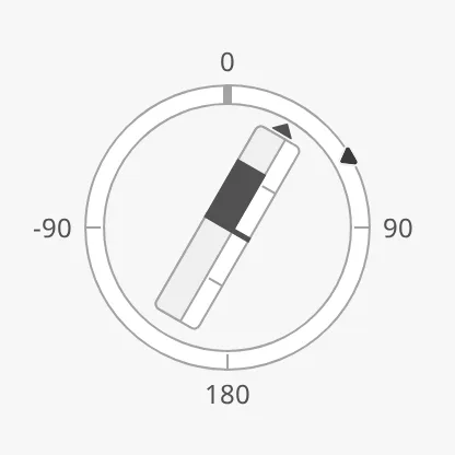
Section titled “Angle Setpoint”Set hasAngleSetpoint to true and bind angleSetpoint to the ordered angle.
A marker is drawn on the ring. The setpoint works as described in
Setpoint, with Angle in the property names.
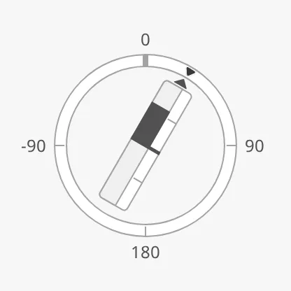
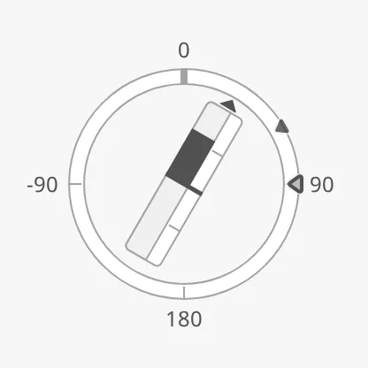
| Setpoint at 60° | Reached | A new setpoint being chosen |
|---|---|---|
 |
 |
 |
The Azimuth Thruster decides by itself when the angle setpoint is reached:
autoAtAngleSetpoint is true by default, with a deadband of 2°.
angleAdvices is a list of advice zones on the
ring, with min and max in degrees — for example the sectors where the
thruster must not point because it would wash against the hull:
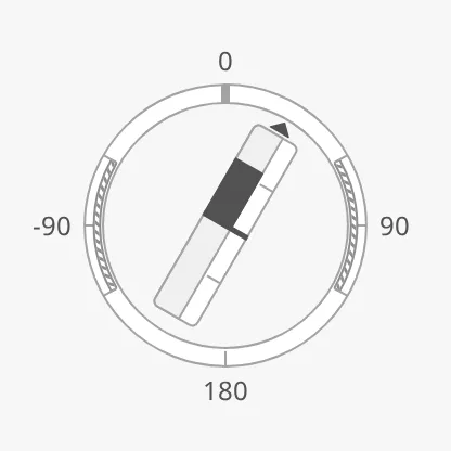
A zone on the ring is triggered when the angle or the angle setpoint is inside
it. adviceTrigger and adviceEmphasis apply to the zones on the ring and
along the bar alike.
Properties
Section titled “Properties”| Name | Description | Property Type |
|---|---|---|
| hasAngleSetpoint | Show the angle setpoint. Default false. |
value |
| angleSetpoint | Ordered angle in degrees. Only shown when hasAngleSetpoint is true. |
value |
| autoAtAngleSetpoint | Let the instrument decide when the setpoint is reached. Default true. Only shown when hasAngleSetpoint is true. |
value |
| autoAtAngleSetpointDeadband | Degrees the angle may differ from the setpoint and still count as reached. Default 2. |
value |
| atAngleSetpoint | Whether the setpoint is reached. Used when autoAtAngleSetpoint is false. Default false. |
value |
| hasNewAngleSetpoint | Show a second marker for a setpoint that is being chosen. Default false. Only shown when hasAngleSetpoint is true. |
value |
| newAngleSetpoint | The angle setpoint being chosen. Only shown when hasNewAngleSetpoint is true. |
value |
| angleSetpointAtZeroDeadband | How close to zero the setpoint must be to be drawn in its “zero” form. Default 0.5. |
value |
| angleSetpointOverride | Keep the setpoint in its normal colour in the loading and off states. Default false. |
value |
| angleAdvices | Advice zones on the ring, with min and max in degrees. Empty by default. |
array |
| adviceTrigger | Which reading triggers a zone: both (the value or the setpoint), value or setpoint. Default both. |
value |
| adviceEmphasis | Apply the design’s emphasis rules between go-to and no-go zones. Default false. |
value |
Thrust Setpoint
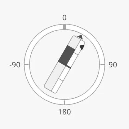
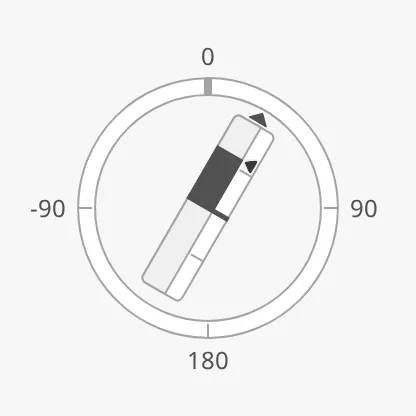
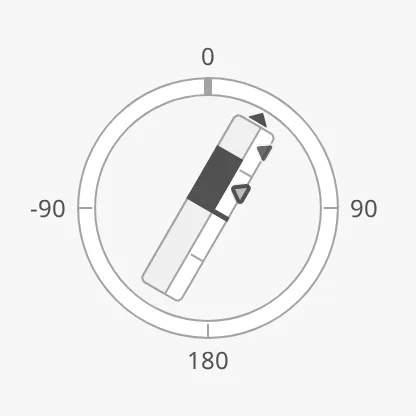
Section titled “Thrust Setpoint”Set hasThrustSetpoint to true and bind thrustSetpoint to the ordered
thrust in percent. A marker is drawn beside the bar and turns with it. It works
in the same way as the angle setpoint, with Thrust in the property names;
autoAtThrustSetpoint is true by default, with a deadband of 1 %.
| Setpoint at 80 % | Reached | A new setpoint being chosen |
|---|---|---|
 |
 |
 |
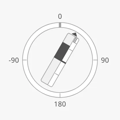
thrustAdvices is a list of advice zones along
the bar, with min and max in percent of thrust. A zone along the bar is
triggered when the thrust or the thrust setpoint is inside it:
Touching
Section titled “Touching”touching is shared by the two setpoints: set it to true while the operator
has a hand on the thruster lever, and both markers are drawn in their focus
form.
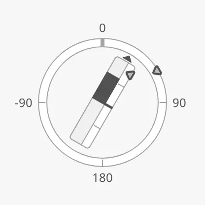
animateSetpoint is also shared: with it, both markers slide to a newly
confirmed setpoint.
Properties
Section titled “Properties”| Name | Description | Property Type |
|---|---|---|
| hasThrustSetpoint | Show the thrust setpoint. Default false. |
value |
| thrustSetpoint | Ordered thrust in percent. Only shown when hasThrustSetpoint is true. |
value |
| autoAtThrustSetpoint | Let the instrument decide when the setpoint is reached. Default true. Only shown when hasThrustSetpoint is true. |
value |
| autoAtThrustSetpointDeadband | Percent the thrust may differ from the setpoint and still count as reached. Default 1. |
value |
| atThrustSetpoint | Whether the setpoint is reached. Used when autoAtThrustSetpoint is false. Default false. |
value |
| hasNewThrustSetpoint | Show a second marker for a setpoint that is being chosen. Default false. Only shown when hasThrustSetpoint is true. |
value |
| newThrustSetpoint | The thrust setpoint being chosen. Only shown when hasNewThrustSetpoint is true. |
value |
| thrustSetpointAtZeroDeadband | How close to zero the setpoint must be to be drawn in its “zero” form. Default 0.1. |
value |
| thrustSetpointOverride | Keep the setpoint in its normal colour in the loading and off states. Default false. |
value |
| thrustAdvices | Advice zones along the bar, with min and max in percent. Empty by default. |
array |
| touching | The operator is operating the thruster lever; affects both setpoints. Default false. |
value |
| animateSetpoint | Animate the markers when a new setpoint is confirmed. Default false. |
value |
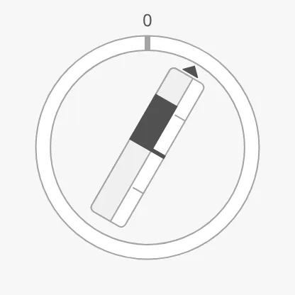
The ring always has a tickmark at 0°. More tickmarks are turned on with their
has… property and spaced with the interval in degrees:
| No intervals (default) | primaryTickmarkInterval = 90 |
Primary 45, secondary 15, tertiary 5 |
|---|---|---|
 |
|
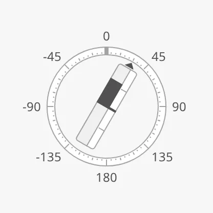 |
With showLabels set to true, the primary tickmarks are labelled in degrees,
negative to port, as in the images above. A new Azimuth Thruster has no primary
tickmarks, so turning on showLabels alone shows only the 0: set
hasPrimaryTickmarkInterval to true as well.
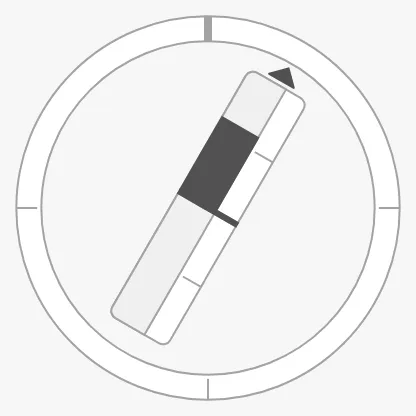
hasLabelSpacer reserves room around the ring for the labels. With it set to
false, the ring grows to fill the box and the labels are not drawn, even
with showLabels set to true:
hasLabelSpacer = true (default) |
hasLabelSpacer = false |
|---|---|
|
 |
Set starboardPortIndicator to true to colour the ring by side: green on the
starboard half and red on the port half.
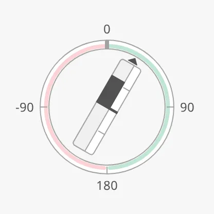
tickmarksInside and tickmarkStyle work as described in
Scale.
Properties
Section titled “Properties”| Name | Description | Property Type |
|---|---|---|
| hasPrimaryTickmarkInterval | Draw the long, labelled tickmarks. Default false. |
value |
| primaryTickmarkInterval | Degrees between the primary tickmarks. Default 90. Only shown when hasPrimaryTickmarkInterval is true. |
value |
| hasSecondaryTickmarkInterval | Draw the medium tickmarks. Default false. |
value |
| secondaryTickmarkInterval | Degrees between the secondary tickmarks. Only shown when hasSecondaryTickmarkInterval is true. |
value |
| hasTertiaryTickmarkInterval | Draw the short tickmarks. Default false. |
value |
| tertiaryTickmarkInterval | Degrees between the tertiary tickmarks. Only shown when hasTertiaryTickmarkInterval is true. |
value |
| hasLabelSpacer | Reserve room around the ring for the labels. Default true. |
value |
| starboardPortIndicator | Colour the ring green on the starboard half and red on the port half. Default false. |
value |
Propellers
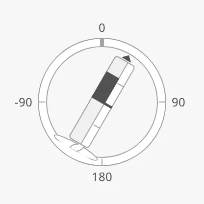
Section titled “Propellers”topPropeller and bottomPropeller draw a symbol of the propeller housing at
the ends of the bar. With none at the top, the end of the bar is an arrow.
| Value | topPropeller |
bottomPropeller |
|---|---|---|
none (default) |
|
|
cap |
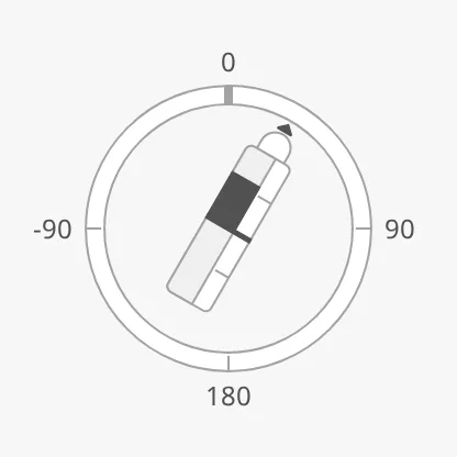 |
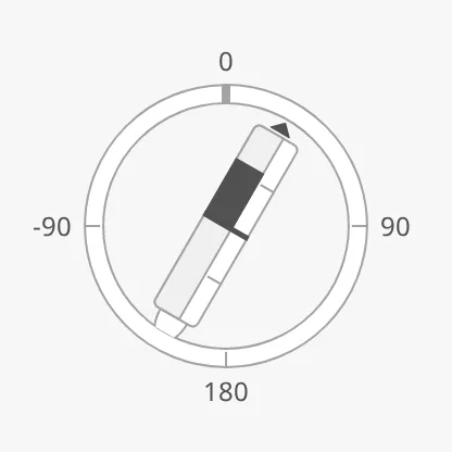 |
single |
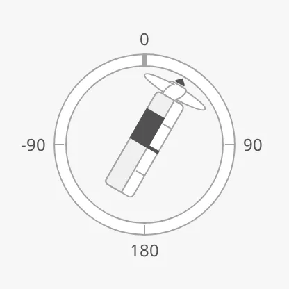 |
 |
Properties
Section titled “Properties”| Name | Description | Property Type |
|---|---|---|
| topPropeller | none, cap or single. Default none. |
value |
| bottomPropeller | none, cap or single. Default none. |
value |
State and Priority
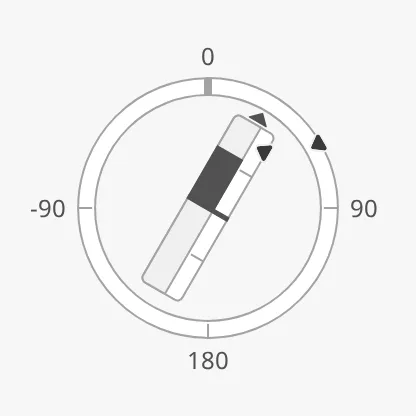
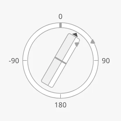
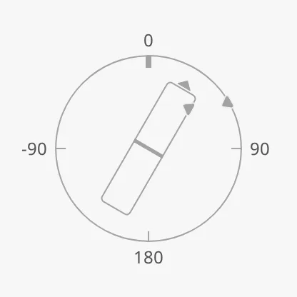
Section titled “State and Priority”state and priority work as described in State and
Priority, and apply to the thruster and both
setpoints:
active |
loading |
off |
|---|---|---|
 |
 |
 |
priority = regular (default) |
priority = enhanced |
|---|---|
|
 |
Common Properties
Section titled “Common Properties”These work in the same way on every maritime instrument, and are described in Maritime Instruments — Common Features:
- State —
state. - Priority —
priority. - Advice Zones —
angleAdvices,thrustAdvices,adviceTrigger,adviceEmphasis. - Scale —
showLabels,tickmarksInside,tickmarkStyle. - Size —
hasFaceDiameter,faceDiameter. - Style and Events —
style.
Component Events
Section titled “Component Events”The Azimuth Thruster has no component events of its own.
Examples
Section titled “Examples”Example 1 — Azimuth Thruster with Orders
Section titled “Example 1 — Azimuth Thruster with Orders”-
Drop an Azimuth Thruster into the view and make it square, about 300 px.
-
Set
showLabelsandhasPrimaryTickmarkIntervaltotrue, andprimaryTickmarkIntervalto90. -
Bind
angleto[default]Propulsion/Azi1/Angleandthrustto[default]Propulsion/Azi1/Thrust. -
Set
hasAngleSetpointtotrueand bindangleSetpointto[default]Propulsion/Azi1/AngleOrder. -
Set
hasThrustSetpointtotrueand bindthrustSetpointto[default]Propulsion/Azi1/ThrustOrder. -
To mark the sectors where the thruster washes against the hull, set
angleAdvicesto:[{"category": "caution", "min": 60, "max": 120},{"category": "caution", "min": -120, "max": -60}]
Found an error or something unclear?
Tell us what is wrong, confusing or missing on this page.
Built on the OpenBridge Design System