Transmitter Stack
The Transmitter Stack shows several readings side by side in one chip, attached to a line in a diagram by one leader line. Use it where one place in the process has several measurements, such as pressure and temperature. It is found in the Automation - OpenBridge section of the Perspective Component Palette as Transmitter Stack (Experimental).
Note: This component is experimental: its properties may change in a later version.
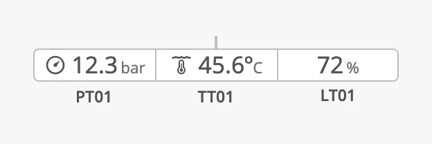
- Leader line — the short line from the chip to the line in the diagram. See Orientation.
- Segments — one per reading, each with an optional icon, a value and a unit. See Values.
- Id tags — the name of each measurement, below its segment.
The Transmitter Stack shows the values it is given; it does not read tags
itself. Clicking a segment fires the onValueClick event.
For a single reading, a tag pill, a trend graph or an alarm frame, use the Transmitter.
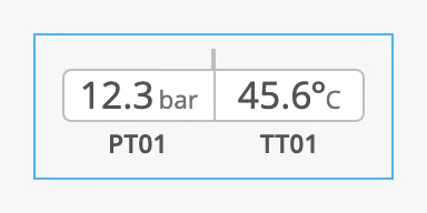
A Transmitter Stack dropped from the palette starts with two sample readings. The blue frame is the component’s box, as the Designer shows it when the component is selected:
Values
Section titled “Values”values is a list with one item per segment, from left to right. Each item has
a value and a unit, and optionally an idTag.
| values | |
|---|---|
| One value | 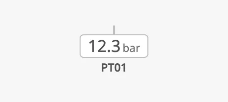 |
| Two values | |
| Three values | |
-
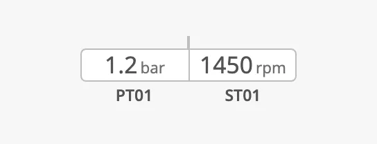
All segments have the same width, that of the widest reading:
-
A
valuethat is empty (null) or not a number is shown as dashes: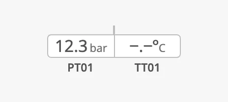
-
When no item has an
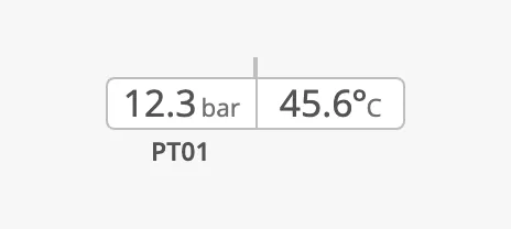
idTag, the row of id tags is left out. When at least one has, the row is there for all segments:No id tags One id tag 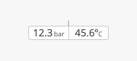
-
With an empty
valueslist nothing is drawn, not even the leader line.
Number Format
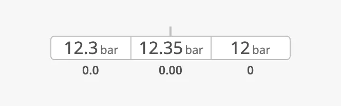
Section titled “Number Format”Each item has its own numberFormat, a Java
DecimalFormat
pattern. It works as on the
Transmitter: the digits after the decimal
point set the number of decimals, and the zeros before it set how many digits
the segment makes room for.
The value 12.345 with the patterns written below the segments:
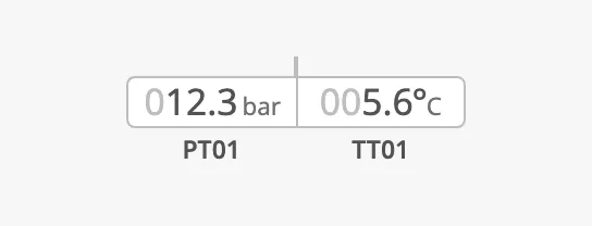
hintedZeros fills the room made by the zeros of the pattern (000.0 here)
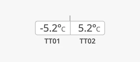
with dimmed zeros, and hasSignSpacer keeps room for a minus sign, so that a
segment has the same width for positive and negative values. hasDegree adds a
degree sign between the value and the unit.
hintedZeros |
hasSignSpacer and hasDegree |
|---|---|
 |
 |
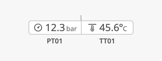
Set hasIcon to true on an item and select an icon with icon.path to show
what is measured:
Properties
Section titled “Properties”| Name | Description | Property Type |
|---|---|---|
| values | The segments, in order. A new component has two sample items. | array |
| values[].value | The reading. Default 0. |
value |
| values[].unit | Text after the reading. Empty by default. | value |
| values[].idTag | Name of the measurement, shown below the segment (above it when orientation is top). Empty by default. |
value |
| values[].numberFormat | DecimalFormat pattern: the number of decimals, and the number of digits to make room for. Default 0.0. |
value |
| values[].hintedZeros | Show the room made by numberFormat as dimmed leading zeros. Default false. |
value |
| values[].hasSignSpacer | Always keep room for a minus sign. Default false. |
value |
| values[].hasDegree | Show a degree sign between the value and the unit. Default false. |
value |
| values[].hasIcon | Show an icon in front of the reading. Default false. |
value |
| values[].icon | The icon. Only shown when hasIcon is true. |
object |
| values[].icon.path | Path of the icon, for example openbridge/pressure. Default openbridge/placeholder. |
value |
Orientation
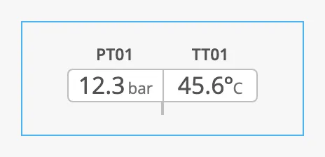
Section titled “Orientation”orientation selects on which side of the line the chip is, and thereby which
way the leader line points: with bottom the chip is below the line and the
leader line points up. With top the id tags are placed above the chip.
The chip and the leader line together are centred in the component’s box. The blue frame in the images is the component’s box:
| orientation | |
|---|---|
top |
 |
right |
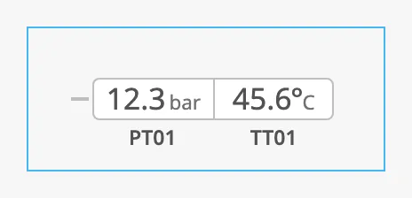 |
bottom (default) |
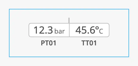 |
left |
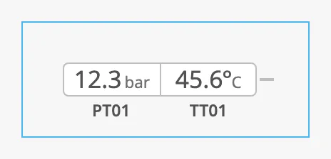 |
The stack does not grow with the box; it is as wide as its segments. Make the box wide enough for the number of values, so that the stack can be selected and does not overlap its neighbours.
Properties
Section titled “Properties”| Name | Description | Property Type |
|---|---|---|
| orientation | Side of the line the chip is on: top, right, bottom or left. Default bottom. |
value |
Properties
Section titled “Properties”| Name | Description | Property Type |
|---|---|---|
| componentSize | Size of the text: regular, medium or large. Default regular. See the note below. |
value |
| style | Standard Perspective style object. | object |
Note: Leave
componentSizeatregular. It enlarges the text without enlarging the chip, so withmediumandlargethe values no longer fit in their segments.
The colours follow the OpenBridge palette of the session:
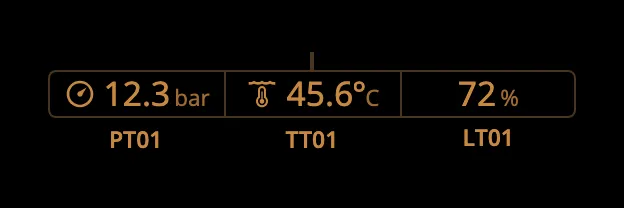
Component Events
Section titled “Component Events”| Event | Description | Event Object |
|---|---|---|
| onValueClick | Fired each time a segment is clicked. Tells which segment it was. | index (position of the segment, from 0), value, unit and idTag of the clicked item in values. |
Examples
Section titled “Examples”Example 1 — Pressure and Temperature at One Point
Section titled “Example 1 — Pressure and Temperature at One Point”- Drop a Transmitter Stack into the coordinate container of the diagram.
It starts with two items in
values. - Set the first item to
unitbar,idTagPT01, and the second tounitC,hasDegreetrue,idTagTT01. - Bind
values[0].valueandvalues[1].valueto the measurements, for example[default]Pump01/Pressureand[default]Pump01/Temperature. - Move the component so that the tip of the leader line touches the pipe.
Example 2 — Open the Trend of the Clicked Reading
Section titled “Example 2 — Open the Trend of the Clicked Reading”-
Configure the
onValueClickevent with a script action:def runAction(self, event):system.perspective.openPopup('trend', 'Popups/Trend', params={'idTag': event.idTag})
The popup gets the id tag of the segment that was clicked, for example PT01.
Found an error or something unclear?
Tell us what is wrong, confusing or missing on this page.
Built on the OpenBridge Design System