App Bar
The App Bar is a row of app buttons, each with an icon and a label, that takes the operator to another page. It is meant for switching between the applications of an integrated system — navigation, machinery, cargo — rather than between the pages of one application. It is found in the App - OpenBridge section of the Perspective Component Palette as App Bar.
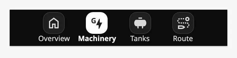
Each button is one entry of items. The button of the app the operator is in is
highlighted. See Items.
The App Bar belongs with the Integration Bar, and has the same dark background. Place it in a docked view that is shared by all pages, so it stays in place while the operator moves between them. See App Components — Overview for how docked views are used.
An App Bar dropped from the palette has no items, and is an empty bar:
items is the list of apps. Each item is an object:
| Name | Description | Property Type |
|---|---|---|
| label | Text under the icon. | value |
| path | URL of the page to go to, as in Page Configuration, for example /machinery. |
value |
| icon | Icon of the button, chosen with the icon picker. | object |
| tooltip | A tooltip shown when the pointer is over the button. See Tooltip. | object |
A click on a button navigates to its path. The App Bar has no component
events.
Current Page
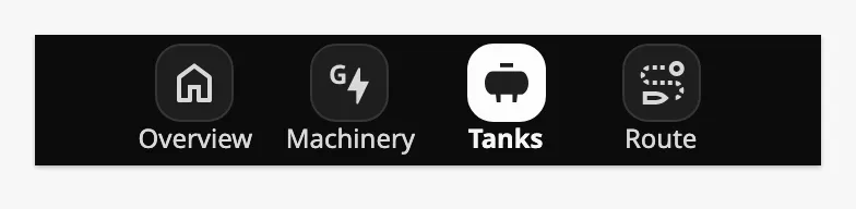
Section titled “Current Page”A button is shown as selected when the URL of the current page starts with
its path. The button of /tanks is therefore also selected on /tanks/ballast,
so that an app stays selected on all of its pages:
Because of this, give every app its own first path segment:
- An item with the path
/is selected on every page. - An item with an empty
pathis also selected on every page. /tankis selected on/tankstoo, since it is compared as text.
Properties
Section titled “Properties”| Name | Description | Property Type |
|---|---|---|
| items | The apps. Empty by default. | array |
Labels
Section titled “Labels”Set showLabel to false to show the icons only. The bar is then 48 px high
instead of 60 px.
| showLabel | |
|---|---|
true (default) |
|
false |
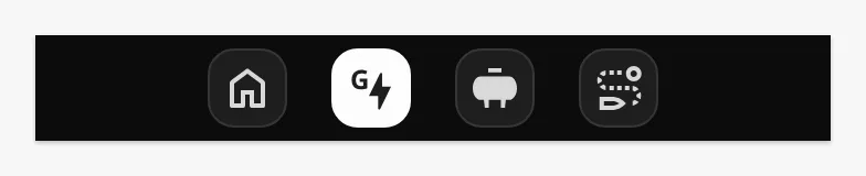 |
Properties
Section titled “Properties”| Name | Description | Property Type |
|---|---|---|
| showLabel | Show the label under each icon. Default true. |
value |
The bar is as wide as the component’s box (the blue frame) and has its own height, from the top of the box. The buttons are centred in it and all have the width of the widest label:
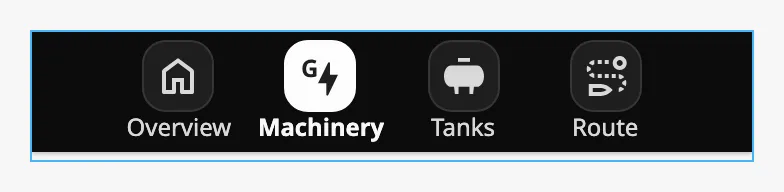
The bar does not shorten or wrap its buttons. A new App Bar is 160 px wide, which is too narrow for more than two apps with labels, and the buttons then stick out of the bar. Make the component wide enough for its items:
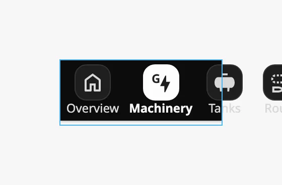
Tooltip
Section titled “Tooltip”Each item can have a tooltip, set in the tooltip object of the item.
tooltip.version selects the kind:
native(default) — a Perspective tooltip. It is shown whentooltip.enabledistrueandtooltip.textis not empty.openbridge— an OpenBridge tooltip. It is always shown while the pointer is over the button.
tooltip sub-properties for native:
| Name | Description | Property Type |
|---|---|---|
| enabled | Show the tooltip. Default false. |
value |
| text | Text of the tooltip. | value |
| delay | Milliseconds the pointer rests on the button before the tooltip is shown. Default 0. |
value |
| sustain | Milliseconds the tooltip stays. 0 keeps it until the pointer leaves. Default 4000. |
value |
| location | Where the tooltip is placed relative to the button. See the list below. Default bottom. |
value |
| tail | Draw a tail that points at the button. Default true. |
value |
| style | Standard Perspective style object, applied to the tooltip. | object |
The values of location are top, top-left, top-right, center,
center-left, center-right, bottom, bottom-left and bottom-right.
tooltip sub-properties for openbridge:
| Name | Description | Property Type |
|---|---|---|
| type | label or icon. Default label. |
value |
| variant | The colour of the tooltip. See the list below. Default normal. |
value |
| label | Text of the tooltip. | value |
| showIcon | Show an icon in the tooltip. Default false. |
value |
| icon | The icon, chosen with the icon picker. Only shown when showIcon is true. |
object |
| style | Standard Perspective style object; its classes are applied to the tooltip. | object |
The values of variant are normal, raised, enhanced, eco, alarm,
warning and caution.
Properties
Section titled “Properties”Properties not covered in the sections above:
| Name | Description | Property Type |
|---|---|---|
| style | Standard Perspective style object. | object |
Component Events
Section titled “Component Events”The App Bar has no component events. It navigates by itself when the operator clicks a button.
Note: In the Designer, navigating does nothing, because the Designer shows a view and not a page. Test the App Bar in a session.
Examples
Section titled “Examples”Example 1 — App Bar in a Bottom Dock
Section titled “Example 1 — App Bar in a Bottom Dock”-
Create a view
Framework/Apps, 60 px high, and add an App Bar as its only component, as wide as the view. -
Set
items:[{"label": "Overview","path": "/overview","icon": {"path": "openbridge/home"}},{"label": "Machinery","path": "/machinery","icon": {"path": "openbridge/generator"}},{"label": "Tanks", "path": "/tanks", "icon": {"path": "openbridge/tank"}}] -
In Page Configuration → Shared Settings, add a bottom dock with this view, Display
visible, Size60and Contentpush. -
Give the pages of each app URLs below its path:
/machinery,/machinery/propulsion,/machinery/power.
The button of an app is now selected on every page of that app.
Found an error or something unclear?
Tell us what is wrong, confusing or missing on this page.
Built on the OpenBridge Design System