Alert Detail
The Alert Detail shows everything about one Ignition alarm: its title and description, when it became active, was acknowledged and cleared, a trend of the tag it is on, the acknowledge comment, and buttons to Acknowledge, Shelve and Go to the equipment. It is found in the Embedding - OpenBridge section of the Perspective Component Palette as Alert Detail.
Which alarm it shows is set by its eventId property: the event id of the
alarm, which the Alert List and the
Alert List Page pass in their onItemClick event. Use it
in a popup or a docked view that opens when the operator clicks an alarm. The
Alert List Page has the same panel built in.
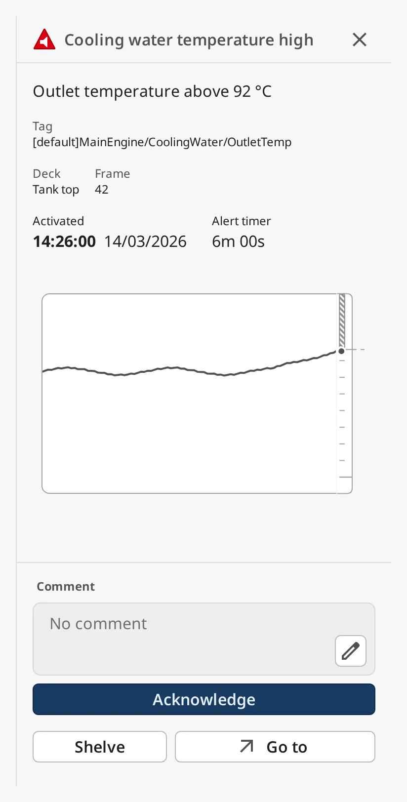
From top to bottom:
- Header — the alert icon, the title and a close button (✕). See Close Button.
- Description and custom fields. See Custom Fields.
- Times — activated, alert timer, acknowledged, shelved, rectified. See Times.
- Trend of the alarm’s tag. See Trend.
- Comment — the acknowledge comment. See Acknowledging.
- Acknowledge, Shelve and Go to. See Acknowledging, Shelving and Go To.
An Alert Detail dropped from the palette is only 160 × 64 px and has no alarm,
so it shows little more than a header with a placeholder icon. Resize it to about 380 × 640 px and set eventId:
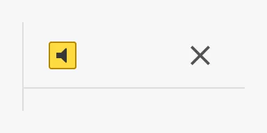
Note: The screenshots on this page were made with an example alarm, not in a gateway session.
Which Alarm Is Shown
Section titled “Which Alarm Is Shown”Set eventId to the event id (a UUID) of the alarm. The gateway looks the alarm
up every second and the component follows its state: acknowledging, clearing
and shelving show up without reloading.
Ways to get the event id:
- the
event.alarmIdof theonItemClickevent of an Alert List or an Alert List Page, - the
selectedEventIdproperty of an Alert List Page, - the id of an alarm returned by
system.alarm.queryStatus:str(alarm.getId()).
An alarm that is both cleared and acknowledged eventually leaves the gateway’s
alarm status: Ignition keeps only the last few events of each alarm there (the
general alarm setting live event limit, default 5), and that state survives
a gateway restart. Once the event is gone, the component looks it up in the
alarm journal: the profile named in journalProfile, or the gateway’s
first journal when that is empty, searching the last journalLookbackHours
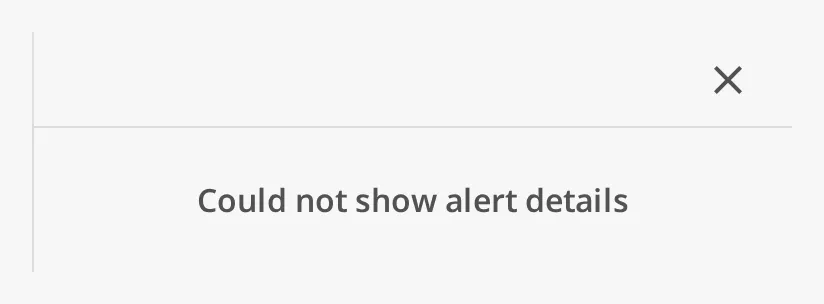
hours (default 24). Only when no alarm with that id is found there either does
the component show Could not show alert details, for instance for a wrong
id or an alarm older than the lookback.
titleSource and descriptionSource choose which alarm fields are shown as the
title and the description; see Text and Time on
the Alert List page for the four fields.
Properties
Section titled “Properties”| Name | Description | Property Type |
|---|---|---|
| eventId | Event id (UUID) of the alarm to show. Default empty. | value |
| titleSource | Alarm field shown as the title: label, name, notes or displayPath. Default label. |
value |
| descriptionSource | Alarm field shown as the description: label, name, notes or displayPath. Default notes. |
value |
States
Section titled “States”The icon in the header and the times follow the state of the alarm. Active and unacknowledged is shown at the top of this page; the other states:
| State | Image |
|---|---|
| Acknowledged, with a comment | 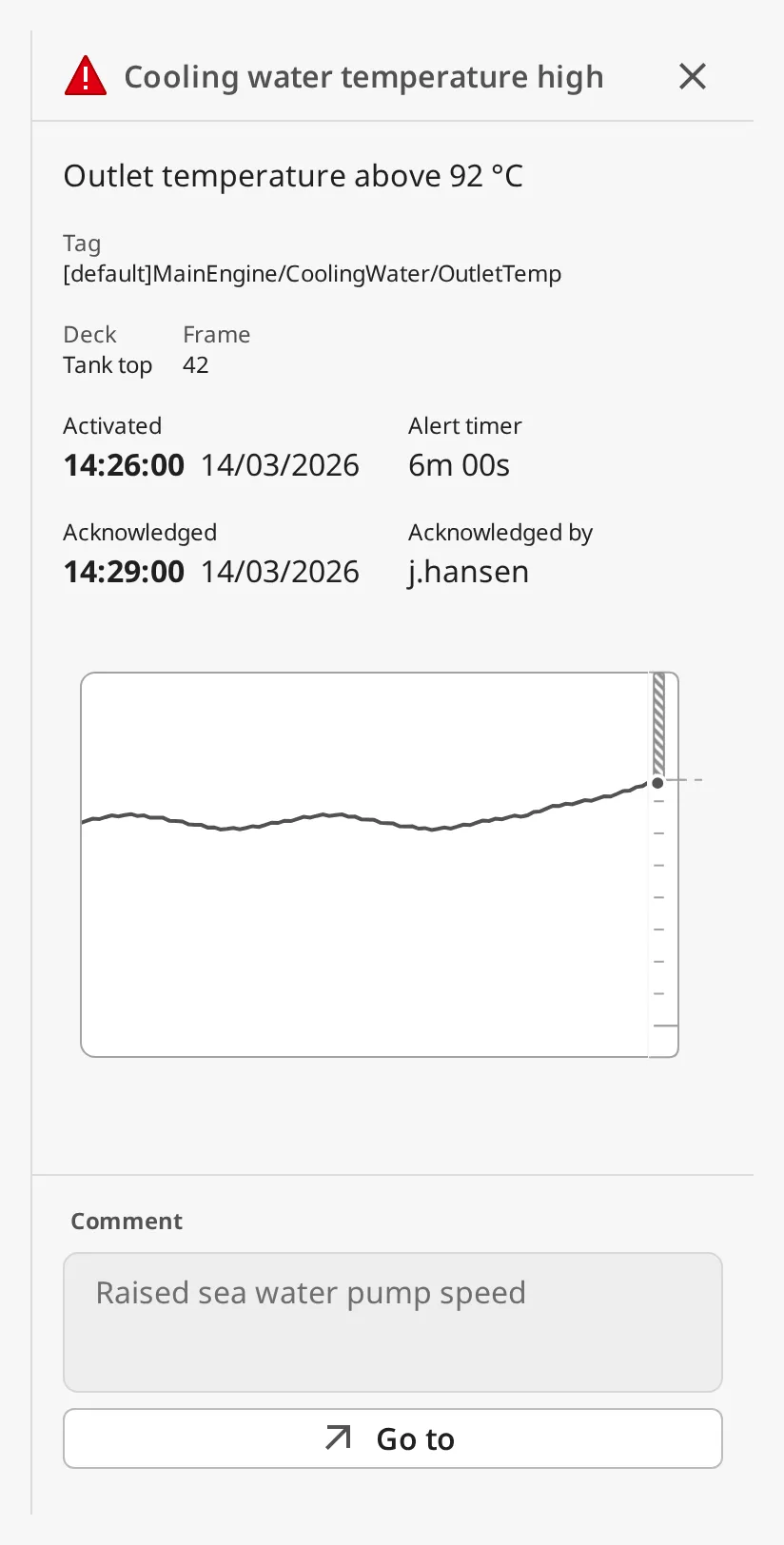 |
| Shelved for 15 minutes, 2 minutes ago | 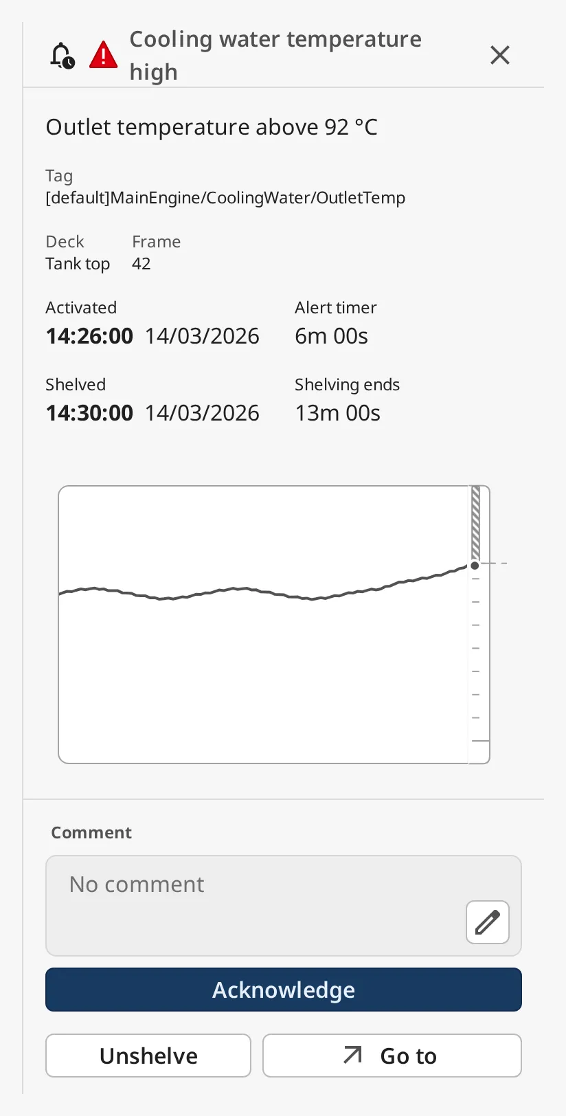 |
| Cleared (rectified) and acknowledged | 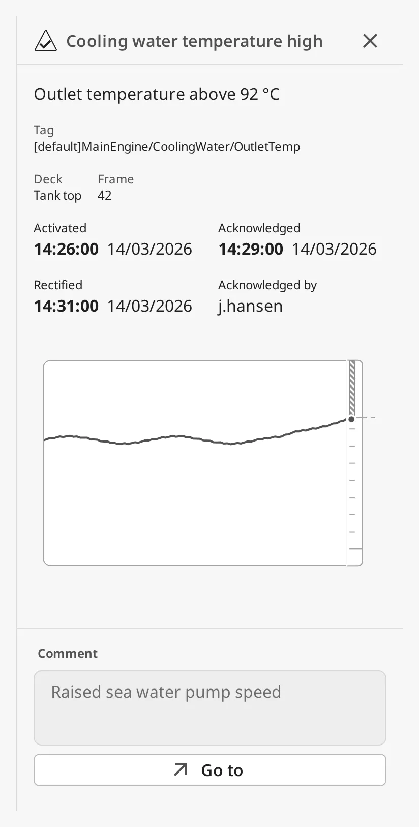 |
A shelved alarm has an extra shelf icon before the alert icon.
| Row | Shown |
|---|---|
| Activated | Always: when the alarm became active. |
| Alert timer | While the alarm is active: how long it has been active, counting up. |
| Shelved | While the alarm is shelved: when it was shelved. |
| Shelving ends | While the alarm is shelved: how long until the shelf ends, counting down. |
| Acknowledged | When the alarm is acknowledged: when. |
| Rectified | When the alarm is cleared: when. |
| Acknowledged by | When the alarm is acknowledged: the user. |
dateFormat sets how the times are written; the time is shown in bold with the
date after it:
| Value | Image |
|---|---|
DD/MM/YYYY HH:mm:ss |
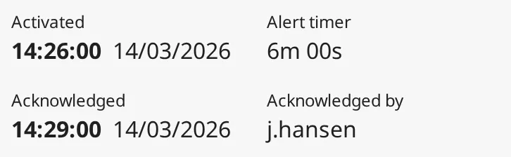 |
MM/DD/YYYY hh:mm:ss a |
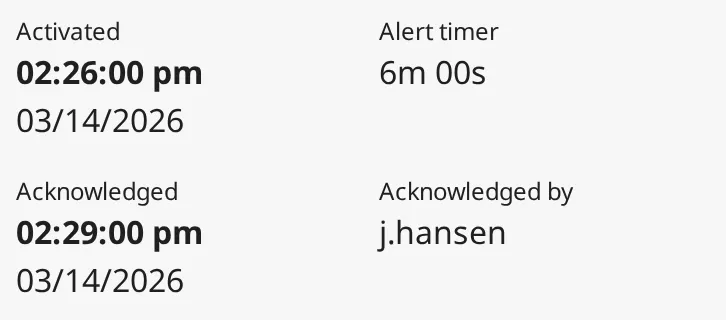 |
HH:mm |
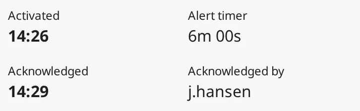 |
hh:mm a |
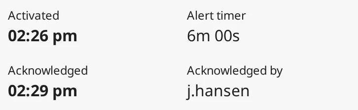 |
showTimeInUtc writes the times in UTC instead of the workstation’s time zone.
Properties
Section titled “Properties”| Name | Description | Property Type |
|---|---|---|
| dateFormat | Format of the times: DD/MM/YYYY HH:mm:ss, MM/DD/YYYY hh:mm:ss a, HH:mm or hh:mm a. Default DD/MM/YYYY HH:mm:ss. |
value |
| showTimeInUtc | Show times in UTC instead of the local time zone. Default false. |
value |
The trend shows the tag history of the tag the alarm is on, over the last
historyWindowSeconds (default 3 hours), read again every historyPollSeconds
(default 30 s). The dot at the right is the latest value.
- The vertical scale runs from the tag’s Eng Low to Eng High; without them it fits the values.
- For an alarm with setpoints, the range that raises the alarm is drawn as a hatched caution band on the scale: above the setpoint for an above alarm, below it for a below alarm, between or outside the two setpoints for between and outside alarms.
- Hovering a point of the trend shows its time and value with the tag’s engineering unit.
- The trend is only drawn when the tag has history: turn on History Enabled on the tag. Without history the trend is left out.
Properties
Section titled “Properties”| Name | Description | Property Type |
|---|---|---|
| historyWindowSeconds | How much history the trend shows, in seconds. Default 10800, at most 2678400 (31 days). |
value |
| historyPollSeconds | How often the history is read again, in seconds. Default 30, at least 1. |
value |
| journalProfile | Alarm journal used to find a cleared and acknowledged alarm. Empty: the gateway’s first journal. | value |
| journalLookbackHours | How far back that journal is searched, in hours. Default 24. |
value |
Acknowledging
Section titled “Acknowledging”Acknowledge acknowledges the alarm on the gateway, in the name of the signed-in user, with the comment shown above the button. It is shown while the alarm is unacknowledged.
To write a comment first, click the pencil in the Comment box. A dialog opens; Ok puts the text in the box, and Acknowledge then stores it with the alarm. Once the alarm is acknowledged, the box shows the stored comment and can no longer be edited. A comment is stored with at most 2000 characters.
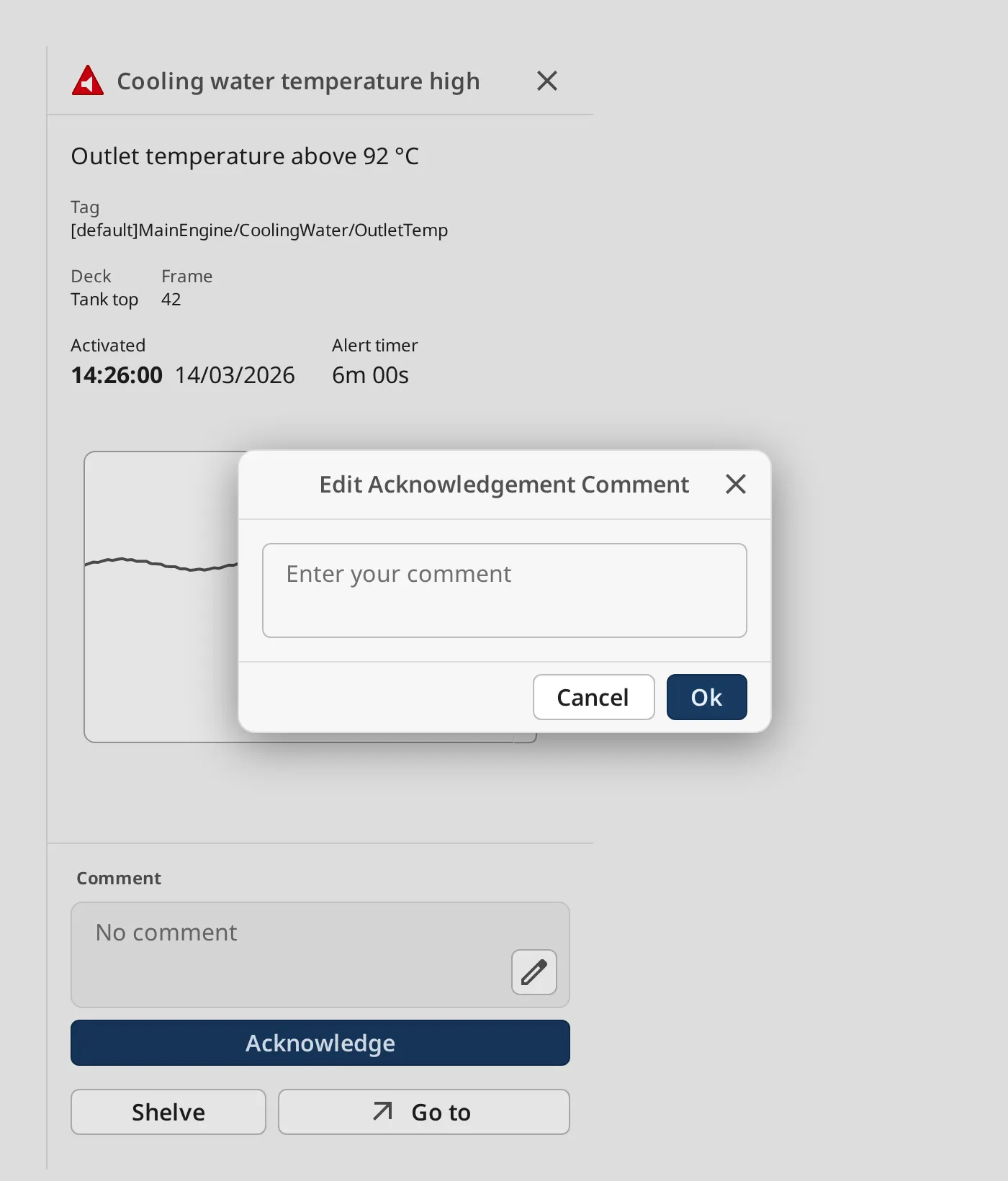
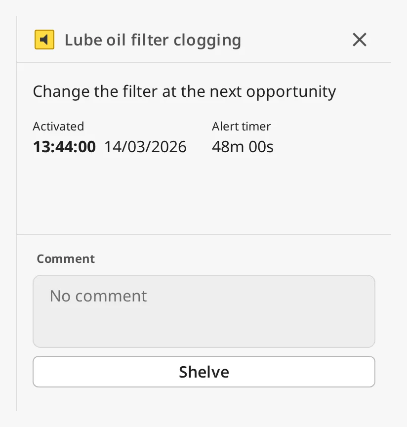
Which alarms can be acknowledged follows alertConvention, as on the Top Bar
(see Acknowledging). With bam, a low or diagnostic
alarm has no Acknowledge button and its comment cannot be edited:
With canAcknowledge set to false the button is disabled, and the gateway
refuses acknowledge requests from this component:
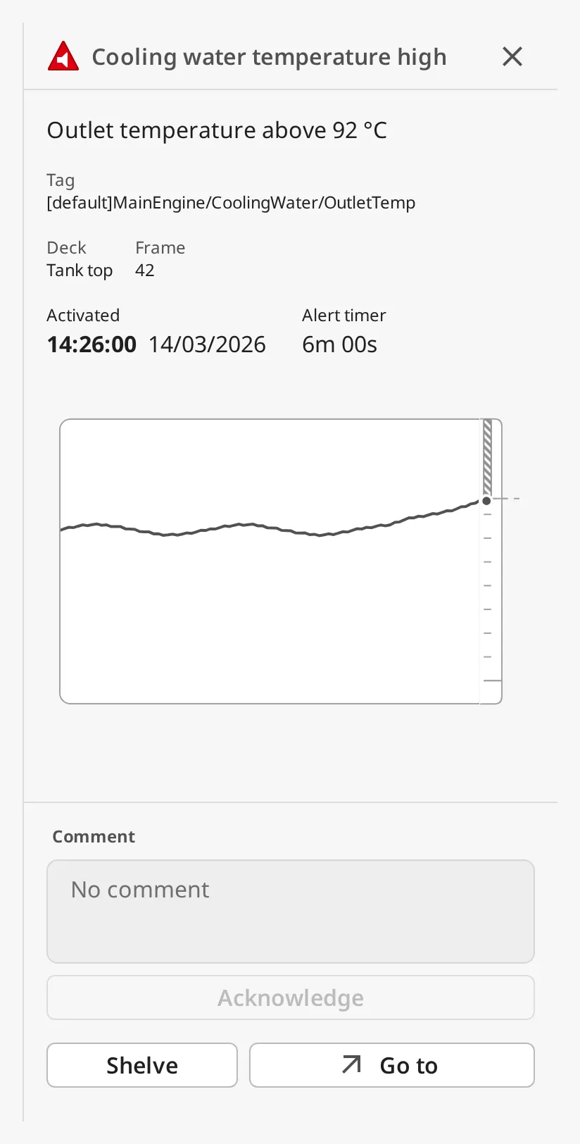
canComment = false removes the Comment box; the alarm is then acknowledged
without a comment. canComment is only shown when canAcknowledge is true.
Properties
Section titled “Properties”| Name | Description | Property Type |
|---|---|---|
| canAcknowledge | Whether the operator may acknowledge. When false the button is disabled and the gateway rejects acknowledging. Default true. |
value |
| alertConvention | Which alarms can be acknowledged: levels or bam. Default levels. |
value |
| canComment | Show the Comment box and acknowledge with its comment. Default true. Only shown when canAcknowledge is true. |
value |
Shelving
Section titled “Shelving”Shelve hides the alarm for a while: a shelved alarm is left out of the Top Bar, the Alert List and the Unacked and All active tabs of the Alert List Page, and appears on its Shelved tab. The button opens a dialog where the operator chooses how long, from 5 minutes to 1 week (default 15 minutes):
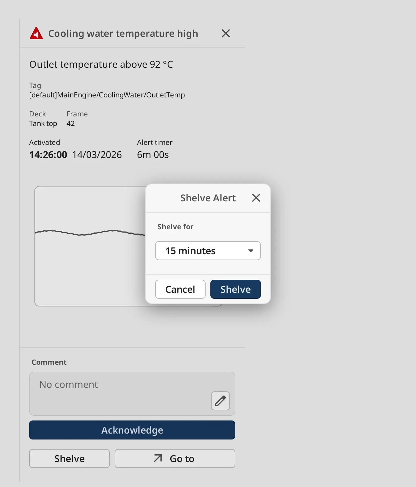
While the alarm is shelved the button reads Unshelve, which ends the shelf at once. Shelve is offered while the alarm is active and unacknowledged; Unshelve as long as it is shelved.
Shelving works on the alarm’s source. If the shelf was made elsewhere for a path with a wildcard, Unshelve lifts that shelf, and so unshelves every alarm it covers.
Alarms from Another Gateway
Section titled “Alarms from Another Gateway”An alarm from a remote tag provider is shelved by the gateway it comes from, and that gateway refuses remote shelving by default. If it refuses, the alarm stays unshelved and the panel says Could not shelve this alert. To allow it, open the gateway the alarm comes from and go to Config › Security › Service Security (in 8.1, Config › Gateway Network › Service Security). Under Alarms, turn on Shelving Allowed for the security zone that the other gateway’s connection falls in (Default if no zone matches it). Remote acknowledging is a separate setting on the same page.
With canShelf set to false the button is hidden and the gateway refuses
shelving from this component.
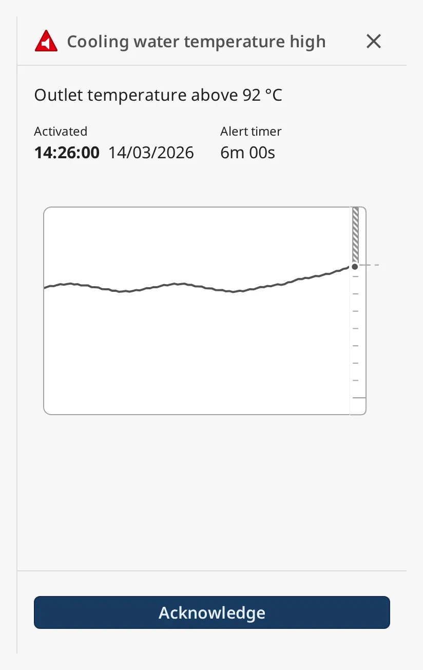
With canShelf and canComment both false, and no custom fields or Go to:
Properties
Section titled “Properties”| Name | Description | Property Type |
|---|---|---|
| canShelf | Whether the operator may shelve this alarm. Default true. |
value |
Custom Fields
Section titled “Custom Fields”To show more about the alarm under the description, for instance the full tag path or where the equipment is, configure the getCustomData extension function on the component. It is called with:
alert— the Ignition alarm event,tagPath— the path of the tag the alarm is on;tagPath.toStringFull()gives for example[default]MainEngine/CoolingWater/OutletTemp.
Return a list of rows; each row is a list of fields, and each field a dictionary
with a label and a value. The overview at the top of this page has two
rows: Tag, and Deck and Frame.
def getCustomData(self, alert, tagPath): return [ [{'label': 'Tag', 'value': tagPath.toStringFull()}], [{'label': 'Deck', 'value': 'Tank top'}, {'label': 'Frame', 'value': '42'}], ]The function is called again with the trend, every historyPollSeconds.
Go to opens the page of the equipment that raised the alarm. Configure the
getNextUrl extension function, with the same arguments as getCustomData,
and return the page URL as text, or None to hide the button:
def getNextUrl(self, alert, tagPath): # '[default]Ballast/Pump01/DischargePressure' -> '/ballast' system = tagPath.toStringFull().split(']')[-1].split('/')[0] return '/' + system.lower()Without the function the button is not shown.
Close Button
Section titled “Close Button”The ✕ in the header does not close anything by itself. The Alert Detail fires an
onCloseClick event when it is clicked, but the component does not declare that
event, so the Designer does not list it in this version, and the button cannot be
connected to closing a popup yet. Give the popup its own close button.
Properties
Section titled “Properties”| Name | Description | Property Type |
|---|---|---|
| style | Standard Perspective style object. | object |
Extension Functions
Section titled “Extension Functions”| Function | Called | Returns |
|---|---|---|
| getCustomData | Every historyPollSeconds (default 30 s). |
Rows of extra fields. See Custom Fields. |
| getNextUrl | Every historyPollSeconds (default 30 s). |
The page Go to opens, or None. See Go To. |
Component Events
Section titled “Component Events”| Event | Description | Event Object |
|---|---|---|
| onAckAlarmClick | Fired when the operator presses Acknowledge, right after the acknowledgement is sent to the gateway. The gateway still refuses it for a user without the acknowledge permission. | See below |
| onCloseClick | Fired when the operator clicks the close button (✕) in the header. Use it to close the popup or dock the Alert Detail is in. | — |
The event object of onAckAlarmClick:
| Name | Description | Property Type |
|---|---|---|
| eventId | The event id of the acknowledged alarm (the eventId property). |
value |
| comment | The comment the operator typed with the acknowledgement; empty when there is none or canComment is off. |
value |
Examples
Section titled “Examples”Example 1 — Alarm Popup from an Alert List
Section titled “Example 1 — Alarm Popup from an Alert List”- Create a view
Alarms/Detailof 380 × 700 px with a parametereventId. Add an Alert Detail that fills it, and bind itseventIdtoview.params.eventId. - On an Alert List, configure
onItemClickwith a script action:
def runAction(self, event): system.perspective.openPopup( 'alarmDetail', 'Alarms/Detail', params={'eventId': event.alarmId}, title='Alarm', )Clicking another alarm in the list replaces the alarm in the popup.
Example 2 — Detail in a Docked View
Section titled “Example 2 — Detail in a Docked View”- In Page Configuration, add a right dock with Dock ID
alarm, the viewAlarms/Detail, DisplayonDemandand Size380. - On the Alert List, configure
onItemClickto open it with the alarm:
def runAction(self, event): system.perspective.openDock('alarm', params={'eventId': event.alarmId})Found an error or something unclear?
Tell us what is wrong, confusing or missing on this page.
Built on the OpenBridge Design System