Tab Row
The Tab Row is a row of tabs of which one is selected, for switching between the sections of a view or between open items. It is found in the Input - OpenBridge section of the Perspective Component Palette as Tab Row.

From left to right: the tabs, each with an optional icon, a title and optional badges, with the selected tab highlighted; and the optional add button. See Tabs and Closing and Adding Tabs.
How values are written back and the behavior in the Designer are shared with the other input components and are described in Input Components — Common Features. This page covers what is specific to the Tab Row.
A Tab Row dropped from the palette has no tabs and draws nothing. The blue frame is the component’s box:
The Tab Row only holds the selection. It does not show any content itself: bind
the content to selectedTabId (see
Example 1). For a lighter selector without a
background, use the Pivot Item Group.
tabs is the list of tabs, from left to right. The tabs share the width of the
component equally and are 48 px high.

Each tab is an object:
| Name | Description | Property Type |
|---|---|---|
| id | Identifies the tab; written to selectedTabId when the tab is selected. Must be unique. |
value |
| title | Text of the tab. | value |
| showSubtitle | Show the subtitle under the title. Default false. |
value |
| subtitle | A second, smaller line of text. Only shown when showSubtitle is true. |
value |
| hasLeadingIcon | Show an icon before the title. Default false. |
value |
| leadingIcon | The icon, chosen with the icon picker. Only shown when hasLeadingIcon is true. |
object |
| badges | Badges shown after the title. See Badges. Empty by default. | array |
| disabled | The operator cannot select or close this tab. Default false. |
value |
A tab also has the properties hasBadge, showLeadingBadgeIcon, badgeIcon,
badgeCount, badgeType and badgeSize. They are deprecated: use badges
instead, and leave them as they are.
Tabs with icons. leadingIcon is an icon picker: it has a path, for example
openbridge/home. See Icons.

Tabs with subtitles. showSubtitle is set per tab:

A disabled tab is dimmed and does not react to the operator. The Tab Row has no
disabled property of its own: to disable the whole row, disable every tab.

Properties
Section titled “Properties”| Name | Description | Property Type |
|---|---|---|
| tabs | The tabs. Empty by default. | array |
Selection
Section titled “Selection”selectedTabId holds the id of the selected tab. When the operator clicks a
tab, the Tab Row writes the tab’s id to selectedTabId and then fires
onTabSelected. This also happens on a click on the tab that is already
selected. A number or a boolean is written as such: with the ids 1 and 2,
the number 2 is written, not the text.
If selectedTabId is empty or does not match any tab, no tab is selected:

Set selectedTabId on a new component, so that a tab is selected when the view
opens. Bind it bidirectionally to keep a tag or a view property in step with it.
See Values.
Properties
Section titled “Properties”| Name | Description | Property Type |
|---|---|---|
| selectedTabId | The id of the selected tab. Written when the operator selects a tab. Empty by default. |
value |
Badges
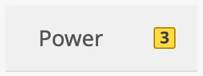
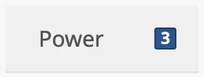
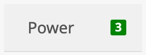
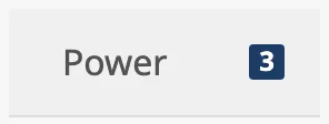
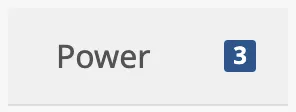
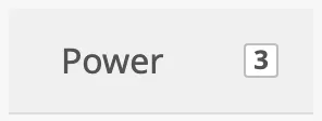
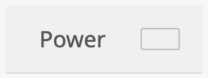
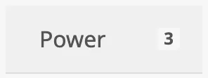
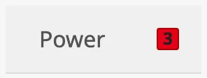
Section titled “Badges”A tab can show one or more badges after its title, for instance the number of
alerts in the section. badges is a list; each badge is an object:
| Name | Description | Property Type |
|---|---|---|
| type | Colour and meaning of the badge; see below. Default regular. |
value |
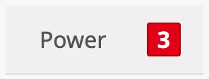
| size | regular or large. Default regular. |
value |
| count | The number shown in the badge. Default 0. |
value |
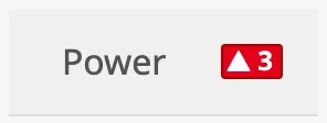
| showIcon | Show an icon in the badge, before the number. Default false. |
value |
| badgeIcon | The icon, chosen with the icon picker. Only shown when showIcon is true. |
object |

The Tab Row does not count anything itself. Bind count to an expression or a
tag that holds the number.
| type | |
|---|---|
level-critical |
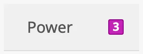 |
level-high |
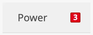 |
level-medium |
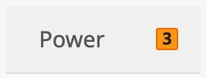 |
level-low |
 |
level-diagnostic |
 |
alarm |
|
warning |
|
caution |
|
running |
 |
notification |
 |
enhance |
 |
regular (default) |
 |
empty |
 |
automation |
 |
outline |
 |
The empty type shows no number.
| size | |
|---|---|
regular (default) |
|
large |
 |
A badge with showIcon set to true:
Closing and Adding Tabs
Section titled “Closing and Adding Tabs”Set hasClose to true to show a close button on every tab:

When the operator clicks the close button, the Tab Row removes the tab from
tabs and fires onTabClosed. If the closed tab was the selected one, the
tab that takes its place is selected — or the last tab, if the closed one was
last — and its id is written to selectedTabId. When the last remaining tab
is closed, selectedTabId becomes null. The Delete key closes the tab that
has the keyboard focus. The close button of a disabled tab does nothing.
Note: Closing writes to
tabs. Iftabsis bound, make the binding bidirectional or remove the tab from its source inonTabClosed; otherwise the tab comes back when the binding writes its value again.
Set hasAddNewTab to true to show an add button at the end of the row:

The button only fires onAddNewTab. The Tab Row does not add a tab by itself:
add one to tabs in a script on the event (see
Example 2).
Properties
Section titled “Properties”| Name | Description | Property Type |
|---|---|---|
| hasClose | Show a close button on every tab. Default false. |
value |
| hasAddNewTab | Show an add button after the tabs. Default false. |
value |
Layout
Section titled “Layout”The tabs share the width of the component equally. Set hug to true for tabs
that do not stretch to fill the row. The blue frame in the images is the
component’s box:
| hug | |
|---|---|
false (default) |
 |
true |
 |
The content of a tab is placed at its left. Set centerContent to true to
centre it:
| centerContent | |
|---|---|
false (default) |
 |
true |
 |
A title that does not fit in its tab is cut off with an ellipsis, so make the component wide enough for its tabs.
Properties
Section titled “Properties”| Name | Description | Property Type |
|---|---|---|
| hug | Do not stretch the tabs to fill the width of the component. Default false. |
value |
| centerContent | Centre the icon, title and badges in each tab. Default false. |
value |
Properties
Section titled “Properties”Properties not covered in the sections above:
| Name | Description | Property Type |
|---|---|---|
| style | Standard Perspective style object. | object |
The colours follow the palette of the session. See Appearance.

Component Events
Section titled “Component Events”Unlike most input components, the Tab Row does not have onActionPerformed. It
has three events of its own:
| Event | Description | Event Object |
|---|---|---|
| onTabSelected | Fired when the operator clicks a tab, after selectedTabId is written. |
id, index and tab |
| onTabClosed | Fired when the operator closes a tab, after tabs and selectedTabId are written. |
id, index and tab |
| onAddNewTab | Fired when the operator clicks the add button. | — |
In the event object, id is the id of the tab as text, index is its
position in tabs counted from 0 (for onTabClosed: before it was removed),
and tab is the tab itself.
def runAction(self, event): system.perspective.print(event.id)Examples
Section titled “Examples”Example 1 — Sections of a View
Section titled “Example 1 — Sections of a View”-
Drop a Tab Row at the top of the view and make it 480 px wide.
-
Set
tabs:[{"id": "overview", "title": "Overview"},{"id": "power", "title": "Power"},{"id": "tanks", "title": "Tanks"}] -
Set
selectedTabIdtooverview. -
Add a container for each section below it, and bind the position.display (or
meta.visible) of each to an expression such as{../TabRow.props.selectedTabId} = 'power'.
Example 2 — Tabs the Operator Opens and Closes
Section titled “Example 2 — Tabs the Operator Opens and Closes”-
Set
hasCloseandhasAddNewTabtotrue. -
Add a script to the
onAddNewTabevent that appends a tab and selects it:def runAction(self, event):tabs = list(self.props.tabs)tabId = "trend%d" % (len(tabs) + 1)tabs.append({"id": tabId, "title": "Trend %d" % (len(tabs) + 1)})self.props.tabs = tabsself.props.selectedTabId = tabId
The close button needs no script: the Tab Row removes the tab and selects a neighbour itself.
Example 3 — Alert Count on a Tab
Section titled “Example 3 — Alert Count on a Tab”- On the tab, add an item to
badgesand set itstypetolevel-high. - Bind the
countof the badge to the tag or expression that holds the number of active alerts of that section.
The badge shows the number also when it is 0; to hide it then, bind badges
of the tab to an expression that returns an empty list when the count is 0.
Found an error or something unclear?
Tell us what is wrong, confusing or missing on this page.
Built on the OpenBridge Design System