Tabbed Card
The Tabbed Card is a card with a row of tabs at the top. Each tab has its own content, and the operator switches between them without leaving the page. It is a container: you place components inside it, or show a view in each tab. It is found in the App - OpenBridge section of the Perspective Component Palette as Tabbed Card.
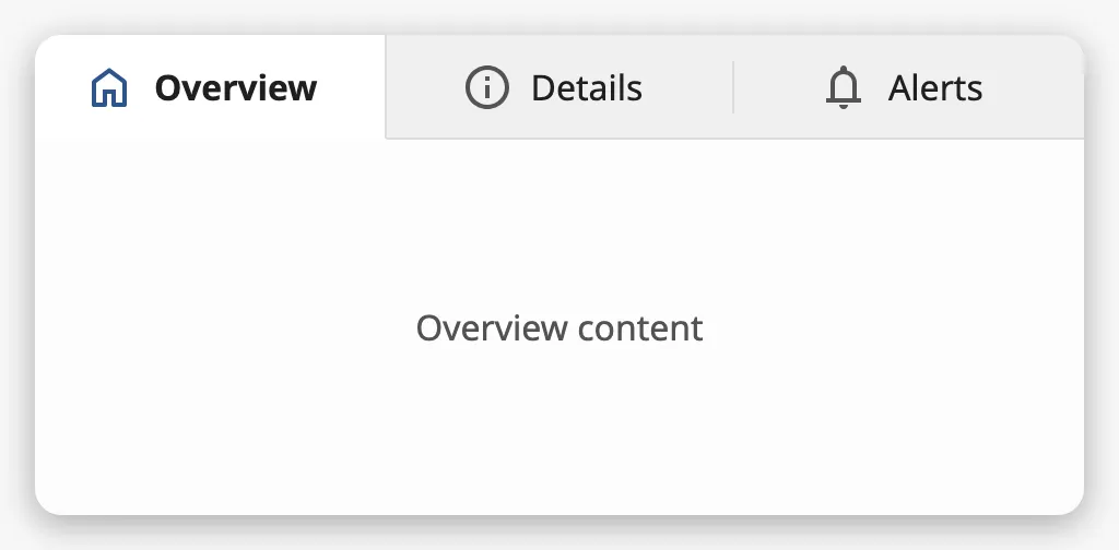
The parts of the card:
- Tabs — one per entry of
tabs, with a title and an optional icon. The selected tab is highlighted. See Tabs. - Content — the content of the selected tab. See Content.
See App Components — Overview for how the card fits in an application, and Card for a card without tabs.
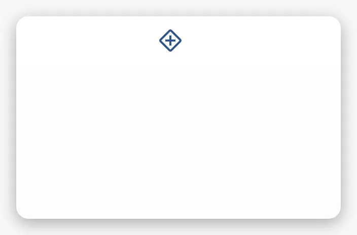
A Tabbed Card dropped from the palette has one tab, with the placeholder icon and no title:
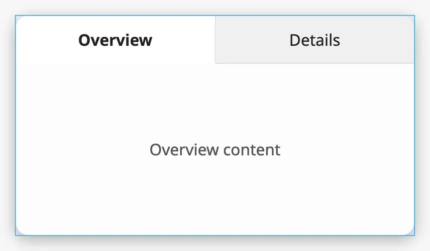
The card fills the component’s box (the blue frame):
tabs is the list of tabs. Each tab is an object:
| Name | Description | Property Type |
|---|---|---|
| title | Text of the tab. | value |
| icon | Icon before the title, chosen with the icon picker. Clear icon.path for a tab without an icon. |
object |
| viewPath | A view to show as the content of the tab. Empty by default. See Content. | value |
| viewParams | Parameters passed to that view. | object |
| Two tabs | 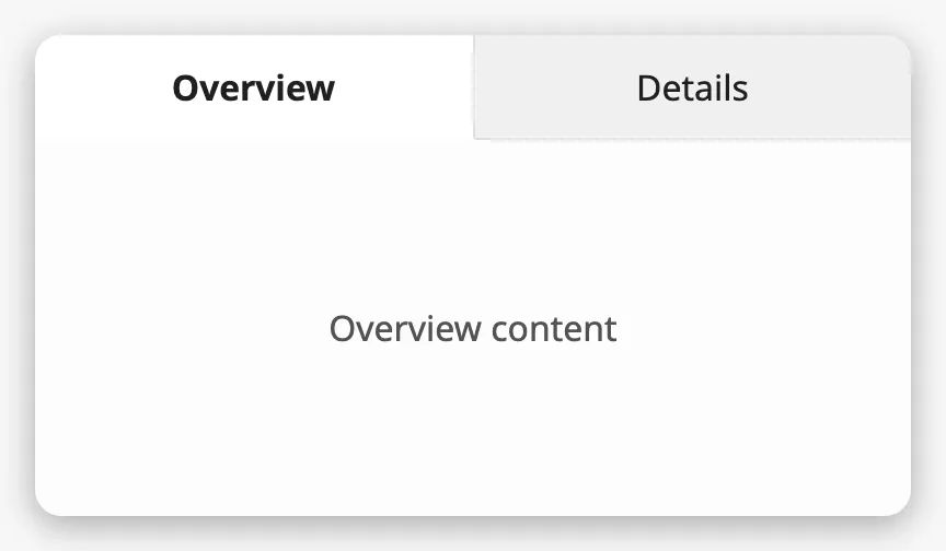 |
| Three tabs | 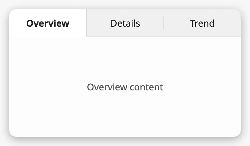 |
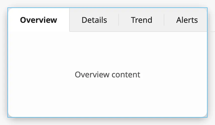
The card is designed for one to five tabs with short titles. The tabs share the width of the card; when they need more room than the card has, they stick out of it rather than being shortened:
A tab with an icon.path shows that icon before its title. Use icons on either
all tabs or none.
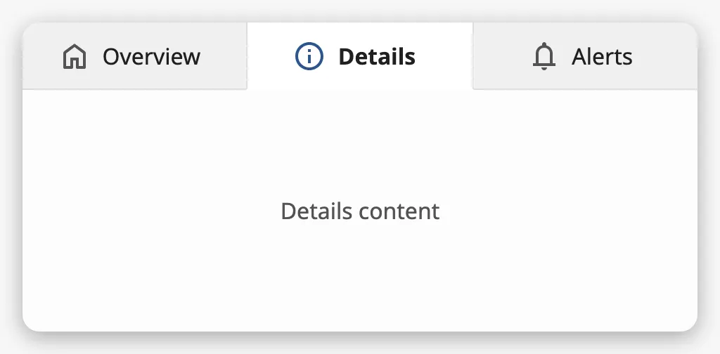
A tab added in the Designer gets the placeholder icon. Clear icon.path to
remove it.
Note: Keep the
iconobject on every tab, with an emptypathwhen the tab has no icon. If theiconproperty is deleted from a tab, the card fails to render.
Selected Tab
Section titled “Selected Tab”selectedTab is the number of the tab that is shown, counted from 0.
selectedTab |
|
|---|---|
0 |
|
1 |
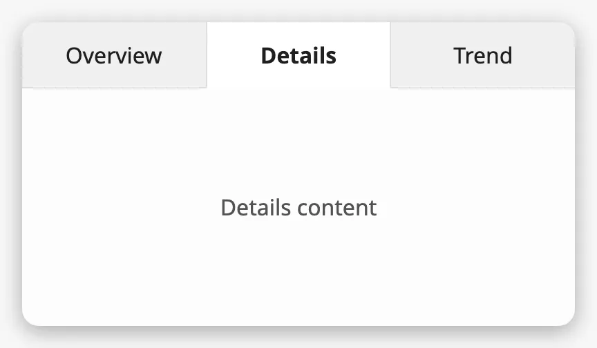 |
When the operator clicks a tab — or moves to it with the arrow keys, Home or
End while the tabs have focus — the card fires onActionPerformed and
writes the number of the tab to selectedTab. Bind selectedTab
bidirectionally to keep a tag or a view property in step with it; it can also be
set from a binding or a script to show a tab.
If selectedTab is not the number of a tab, no tab is selected and the card is
empty.
Properties
Section titled “Properties”| Name | Description | Property Type |
|---|---|---|
| tabs | The tabs. One tab with the placeholder icon by default. | array |
| selectedTab | Number of the tab shown, from 0. Written when the operator changes tab. Default 0. |
value |
Content
Section titled “Content”There are two ways to give a tab its content.
Components in the Card
Section titled “Components in the Card”Drop a component onto the card. Every child of the card has two position properties, shown in the Property Editor when the child is selected:
| Name | Description | Property Type |
|---|---|---|
| tabIndex | Number of the tab the component belongs to, from 0. Default 0. |
value |
| useDefaultSlot | Show the component in every tab. Only used when hasDefaultSlotOnly is true. Default false. |
value |
A child is shown when its tab is selected, stretched to fill the card below the tabs. Use one child per tab: to show several components in a tab, make the child a Flex Container or a Coordinate Container and place the components in that.
To work on the content of another tab in the Designer, set selectedTab to that
tab.
A View per Tab
Section titled “A View per Tab”Set viewPath on a tab to show a view as its content, with viewParams as its
parameters. A tab with a viewPath shows the view and ignores the components
with that tabIndex.
One Content for All Tabs
Section titled “One Content for All Tabs”With hasDefaultSlotOnly set to true the card has a single content area that
is the same for every tab. It shows the children whose useDefaultSlot is
true; the other children are not shown. The tabs still select, and
selectedTab is still written, so bind the content to selectedTab to change
what it shows.
Properties
Section titled “Properties”| Name | Description | Property Type |
|---|---|---|
| hasDefaultSlotOnly | Show one content area for all tabs instead of one per tab. Default false. |
value |
Properties
Section titled “Properties”Properties not covered in the sections above:
| Name | Description | Property Type |
|---|---|---|
| hasTabIcons | Currently has no effect: the icons are shown when at least one tab has an icon.path. Default false. |
value |
| style | Standard Perspective style object. | object |
Component Events
Section titled “Component Events”| Event | Description | Event Object |
|---|---|---|
| onActionPerformed | Fired when the operator selects another tab, just before selectedTab is written. |
— |
The event object is empty, and self.props.selectedTab may still hold the
previous tab when the script runs. To act on the new tab, use a property change
script on selectedTab instead.
Examples
Section titled “Examples”Example 1 — Card with Two Tabs
Section titled “Example 1 — Card with Two Tabs”-
Drop a Tabbed Card into the view.
-
Set
tabs:[{"title": "Overview", "icon": {"path": ""}},{"title": "Details", "icon": {"path": ""}}] -
Drop a Flex Container onto the card. Its position property
tabIndexis0, so it is the content of Overview. -
Set
selectedTabto1, and drop a second Flex Container onto the card. Set itstabIndexto1. -
Set
selectedTabback to0.
Example 2 — A View in Each Tab
Section titled “Example 2 — A View in Each Tab”-
Create the views
Engine/OverviewandEngine/Trend. -
On the Tabbed Card, set
tabs:[{"title": "Overview","icon": {"path": "openbridge/home"},"viewPath": "Engine/Overview","viewParams": {"engine": 1}},{"title": "Trend","icon": {"path": "openbridge/info"},"viewPath": "Engine/Trend","viewParams": {"engine": 1}}]
Found an error or something unclear?
Tell us what is wrong, confusing or missing on this page.
Built on the OpenBridge Design System